
Branding for Indigofire Coffee co
Indigofire Coffee Co. was created to fill a distinct gap in the coffee market—a brand that brings true luxury, refinement, and authenticity to every cup. Based in Austin, Texas, the brand sought to offer more than just high-quality coffee; it aimed to create meaningful rituals through thoughtful design, elevated storytelling, and a focus on sourcing excellence. Our objective was to develop a complete brand identity and packaging system that would position Indigofire as a premium choice for discerning coffee lovers—those who value consistency, depth, and sophistication in their daily routines.
With a vision of standing apart from both mass-market chains and the oversaturated “hipster craft” scene, Indigofire is built for those who seek more from their coffee—those who understand that luxury isn’t about excess, but about refinement, intentionality, and care at every step of the process.
2025
Year
Interstellar Coffee, Inc
Client
Coffee, Café
Client Type
Austin, Texas
Location(s)
Identity Design, Verbal Identity, Packaging Design
Services

Shifting the brand Strategy
At its core, Indigofire is defined by three core personality traits: luxurious, clean, and refined. These characteristics guided every design decision, from the logo and typography to the packaging structure and materials.
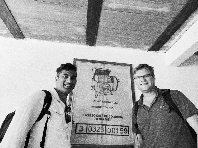
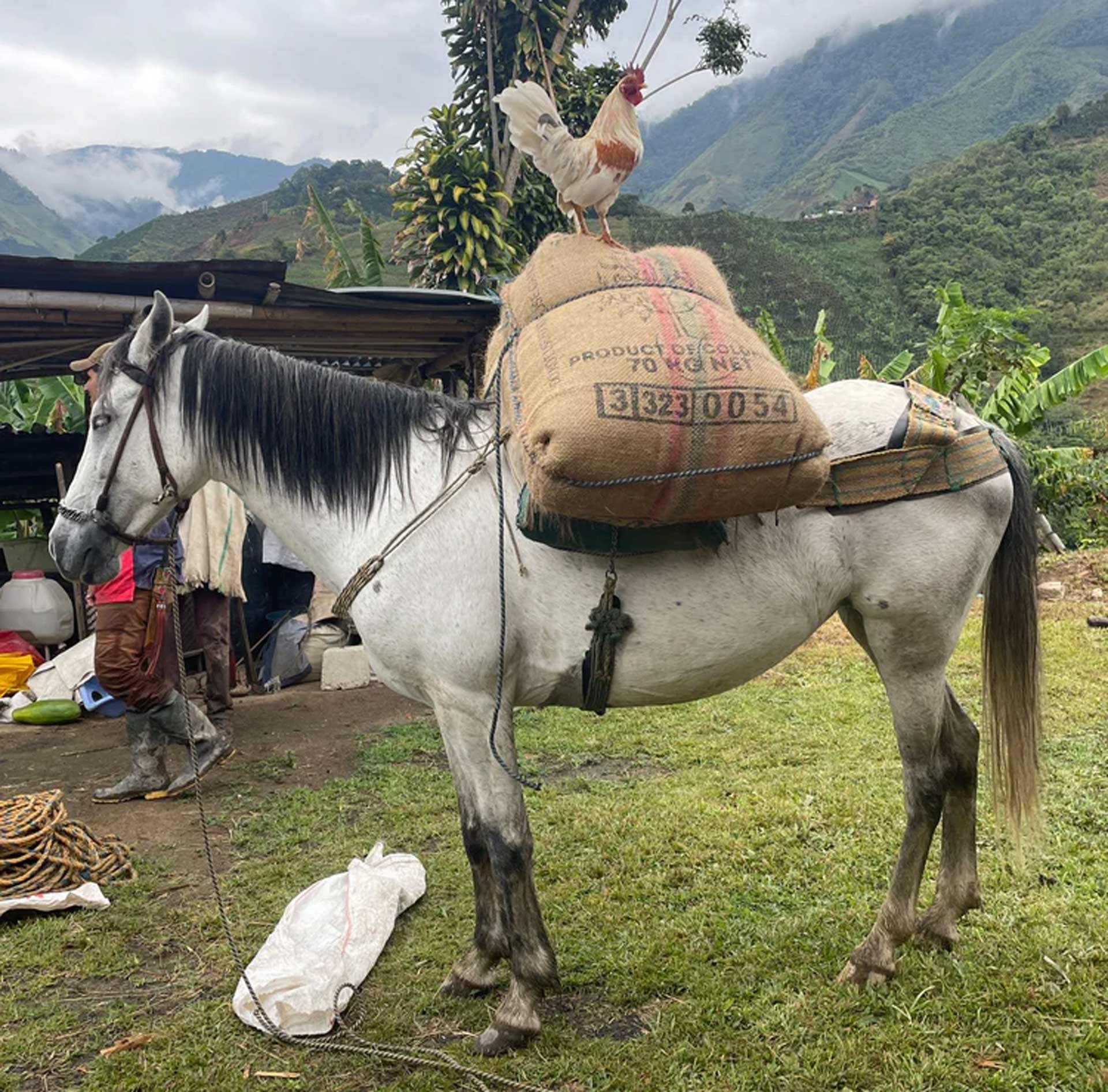
The foundation of the brand strategy rests on the belief that the coffee industry has strayed too far into superficial aesthetics and fast-growth business models. Indigofire was created in response—a brand that brings the focus back to the bean itself, elevating every step of the process from sourcing to roasting to the final pour. By working directly with small, family-owned farms and prioritizing expert roasting techniques, Indigofire offers a product that’s as rich in story as it is in flavor.
Audience Profiles
The brand was designed to connect with multiple patron types, each with specific desires and expectations:
Primary Bagged Bean Patron: Experienced coffee drinkers who appreciate quality and are open to discovering new flavor profiles without unnecessary embellishments.
Primary Coffee Shop Patron: Busy professionals seeking a quick but exceptional cup of coffee during their daily routines, with no tolerance for compromise on taste or quality.
Secondary Bagged Bean Patron: Experience-driven consumers who savor every detail of an immersive coffee ritual and are more than willing to pay a premium for a multi-sensory, luxurious moment.
Secondary Coffee Shop Patron: Socially driven customers looking for an inviting, elevated space to gather, work, or meet with friends and colleagues, often becoming loyal, repeat visitors.
Indigofire’s core messaging appeals directly to these groups by emphasizing intentionality, source quality, and a sense of understated prestige
Luxurious
Clean
Refined


Brand Identity Design
The visual identity of Indigofire was built around a symbolic narrative of excellence, ritual, and timeless sophistication. The primary logo consists of a sleek, custom wordmark paired with a distinctive icon: an infinity loop intertwined with two stylized coffee blossoms, crowned with a regal symbol. This emblem captures the brand’s core values of enduring quality, origin connection, and elevated craft. It also serves as a visual shorthand for Indigofire’s promise of continuous pursuit of excellence, grounded in heritage but relevant to today’s refined tastes.
Secondary marks, including a monogram and seal-style icons, offer flexibility across a range of applications—from social media avatars to embossed packaging details. These assets enable the brand to remain visually consistent while still offering variety across touchpoints.
Typography plays a significant role in reinforcing the brand’s character. A pairing of an elegant serif with a geometric sans-serif strikes a careful balance between tradition and modernity. The color palette further deepens this effect, with a rich, signature indigo anchoring the design, complemented by warm neutrals and soft golds that evoke luxury without ostentation. Throughout the identity system, recurring visual motifs—such as the coffee blossom and crown—quietly echo the brand’s story of care, excellence, and natural origin.


Coffee packaging Design
Indigofire’s packaging design brings the brand’s story to life through a fully immersive, multi-layered experience. Every element of the packaging was developed to align with the values of luxury, clarity, and refinement.
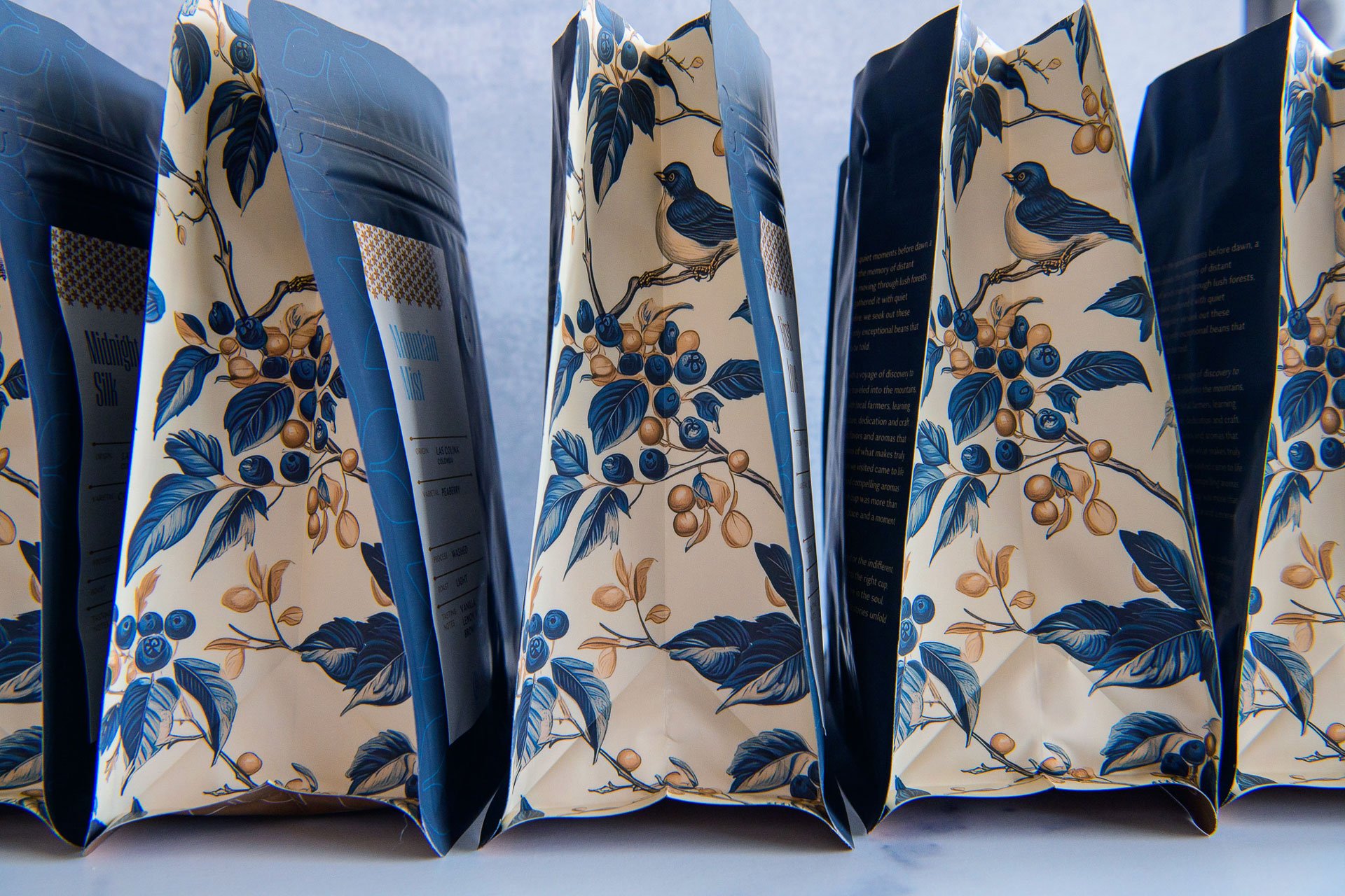
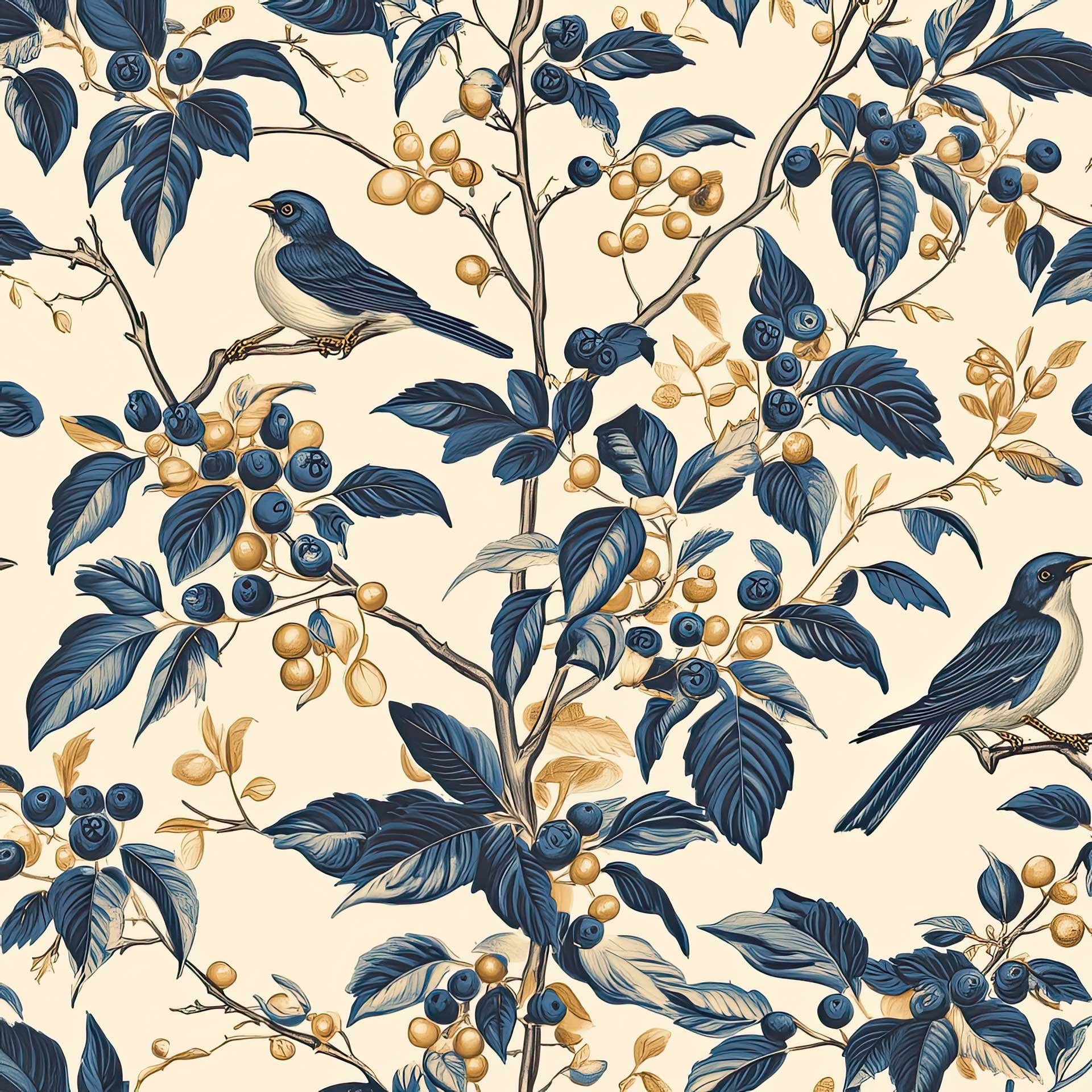
The coffee bags are designed to be both visually striking and tactilely satisfying. The side panels feature lush, hand-detailed botanical illustrations depicting coffee plants and birds, rendered in a rich indigo and soft gold palette. These illustrations emphasize the brand’s deep connection to nature and its careful sourcing from small farms. The front panels present a minimal and orderly layout, showcasing origin details, roast information, and tasting notes with clarity and precision. The design allows customers to quickly understand the coffee’s attributes while appreciating its visual beauty.
On the back panel, a thoughtfully written brand narrative invites readers to slow down, savor, and engage with the story behind each bag. The copy is poetic yet accessible, reinforcing the sense of ritual and meaning behind the coffee.
One of the standout packaging features is a custom wallpaper pattern created with the aid of AI. This repeating floral motif, inspired by the coffee blossom in the logo, is used subtly across the packaging suite and digital materials, adding another layer of sophistication and coherence to the brand’s visual world.
Material selection was equally intentional. The packaging incorporates soft-touch matte finishes paired with metallic inks to create a high-end, tactile experience that feels as luxurious as the product inside. Every bag is designed to feel like a special object, enhancing the ritual of making and enjoying coffee at home.
“Working with Bullhearted was as natural as our coffee and our love of it. Joseph not only absorbed our vision, he expanded the horizon.”
Project Recap
Indigofire Coffee Co.’s branding and packaging work together to form a seamless, elegant, and inviting brand universe. The result is a sophisticated coffee experience that connects deeply with customers who value quality, ritual, and authenticity. From logo to label, every design decision was made to evoke a sense of timeless luxury—inviting patrons to slow down, savor, and appreciate the soulful beauty of coffee done right.