
Branding for Bayou Restaurant
Great ideas have a way of surviving. They linger in the back of the mind and wait for the right moment to resurface. In 2011 I worked with Chef Matt Black to birth a concept called Bayou in Harrisburg, Pennsylvania. We built a quaint, soulful brand that found traction and a loyal following before eventually closing its doors.
Fourteen years later the phone rang. Chef Black had moved west to Great Falls, Montana. The mountains were calling for heat. He wanted to resurrect Bayou in his new home. The challenge was to take a brand born in the Keystone State and adapt it for the Big Sky Country without losing its soul. We had one month to evolve the identity and expand it into a full expression of Cajun lifestyle.
2025
Year
Bayou
Client
Full Service Restaurant (FSR)
Client Type
Great Falls, MT
Location(s)
Visual Identity, Verbal Identity, Menu Design, Apparel, Art Direction, Collateral
Services
Shifting the brand Strategy
We approached this resurrection with a focus on personality. A Cajun kitchen in Montana creates an immediate juxtaposition. We leaned into that tension. The brand needed to feel hospitable yet fiery. We defined the personality traits as Soulful, Spirited, and Resilient.
The strategy centered on the idea of "Born & Braised." This positioning bridges the gap between the heritage of the cuisine and the rugged nature of the new location. We moved away from the cliche tropes of Mardi Gras beads and plastic cups. We aimed for a brand voice that speaks with the warmth of a gumbo pot and the steadiness of a mountain range. The goal was to create a sense of belonging where southern heat meets northern cold.
Soulful
Spirited
Resilient
Restaurant Visual Identity Design
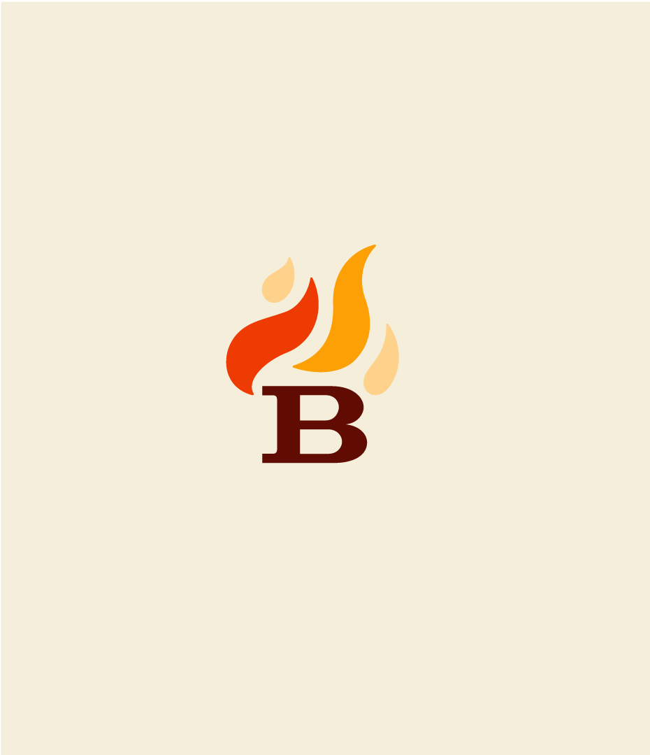
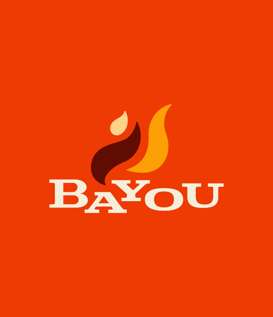
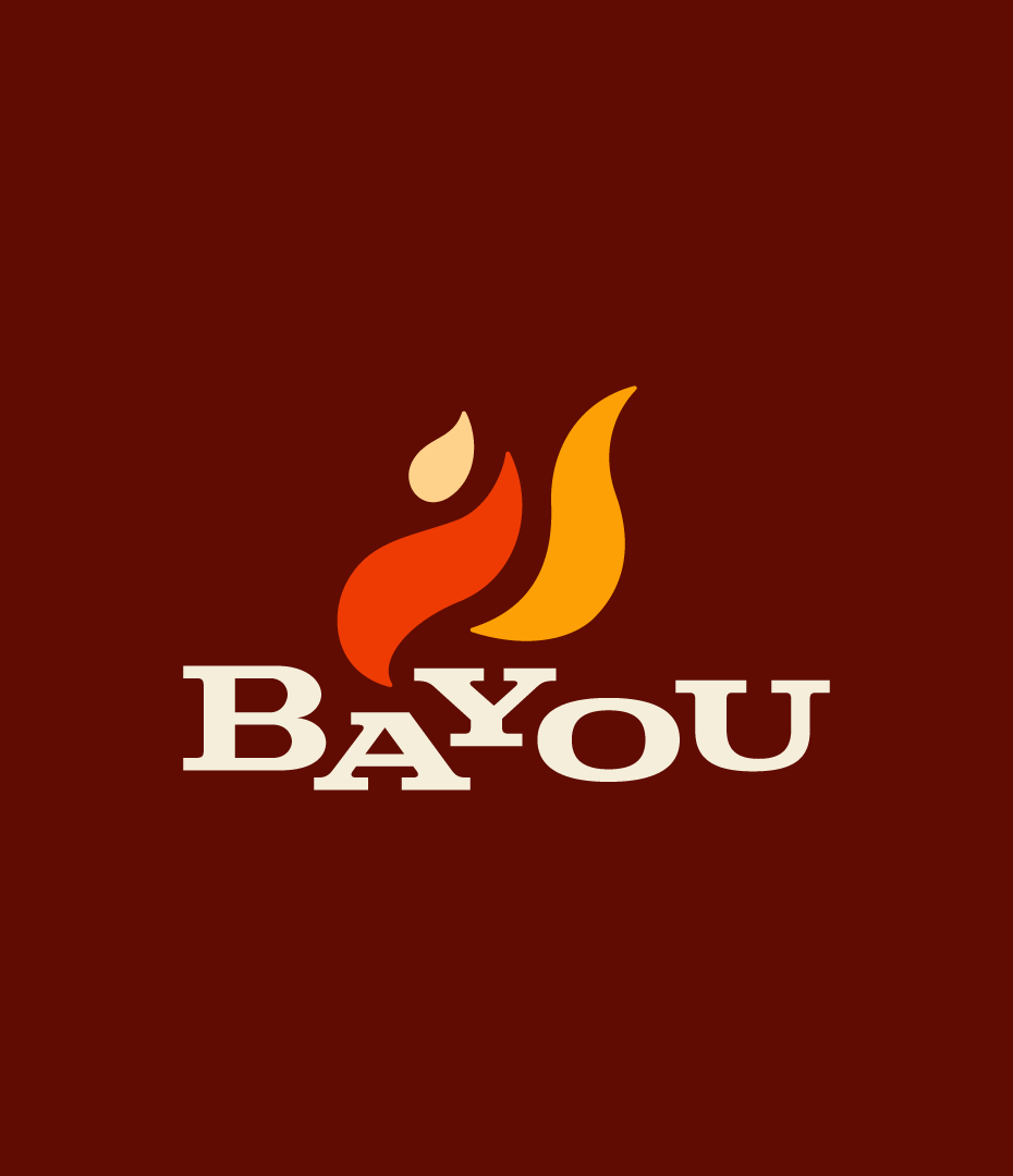
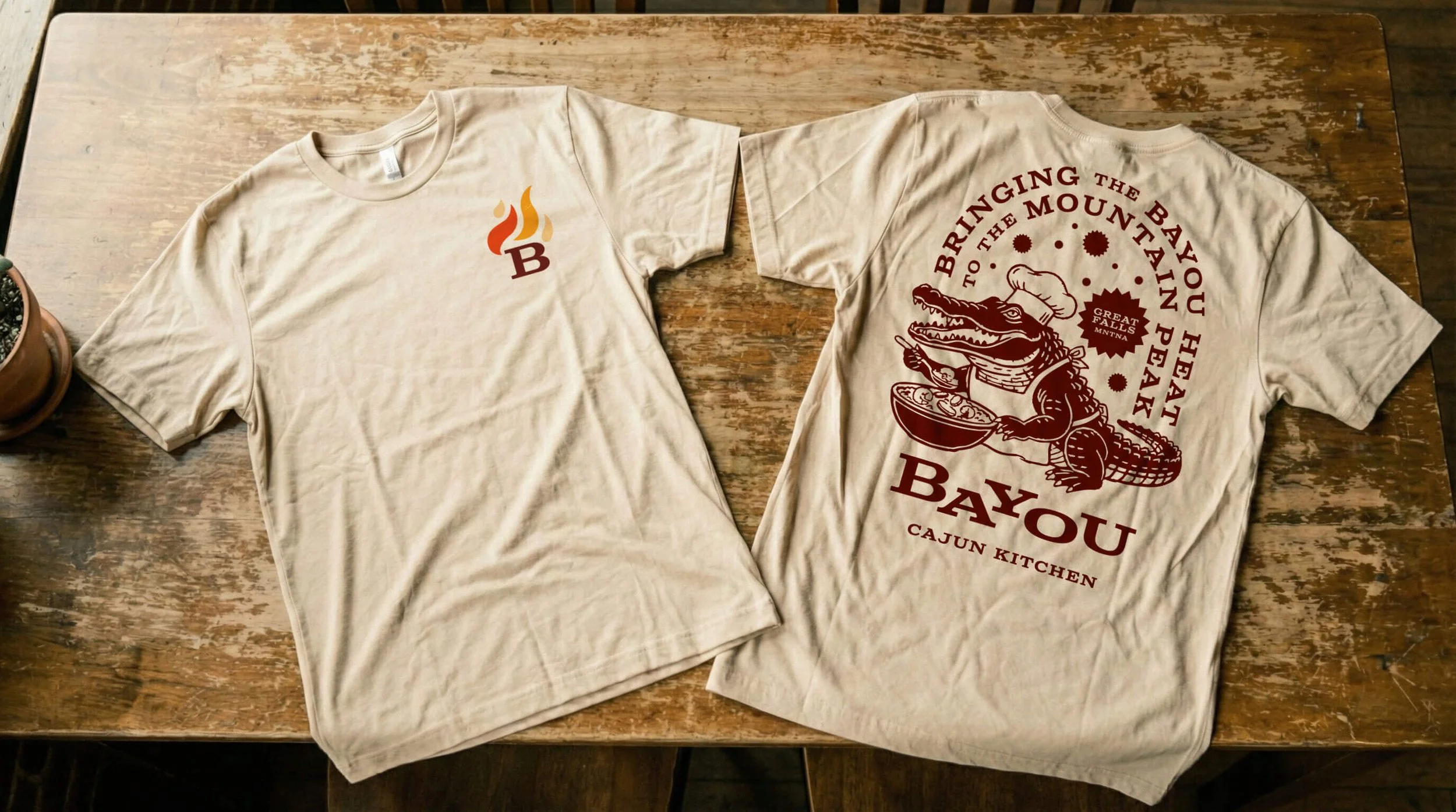
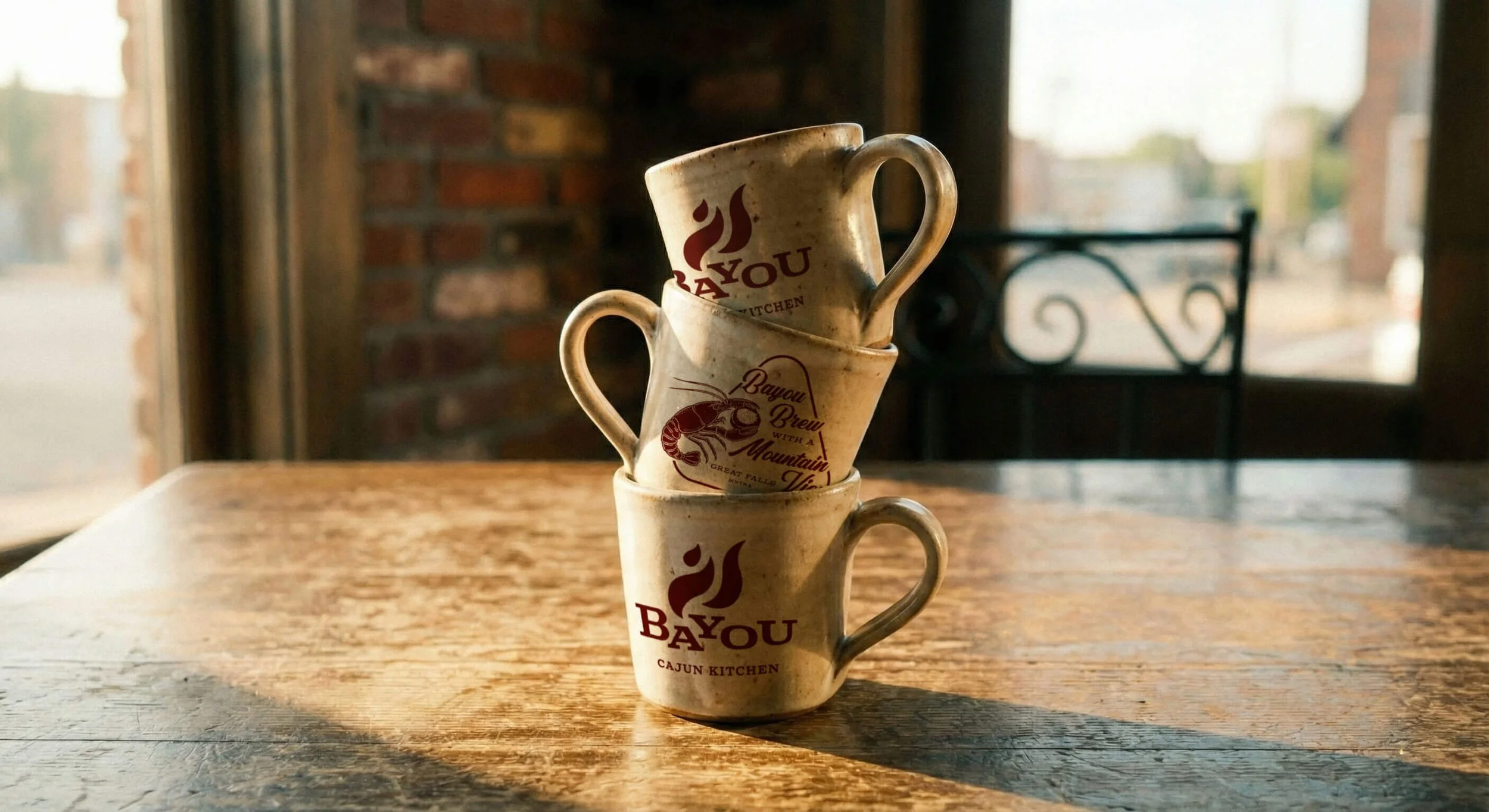
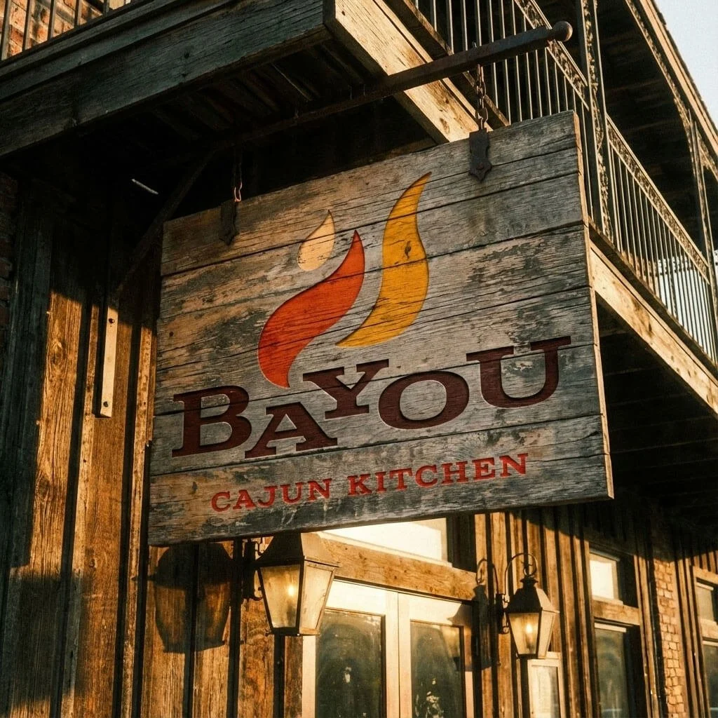
The original identity served its purpose in 2011. The 2025 iteration required refinement. We kept the core equity of the flame but matured the execution. The new mark features a bold, serif "B" crowned with a tripartite flame. The curves of the fire mimic the organic movement of the bayou waters and the heat rising from the kitchen.
We cleaned up the lines to ensure scalability. The typography shifted to a robust serif font that feels established and historical. This typographic choice communicates a sense of legacy despite the new location. The visual language balances elegance with grit. It feels at home on a heavy ceramic mug or a fine paper menu.
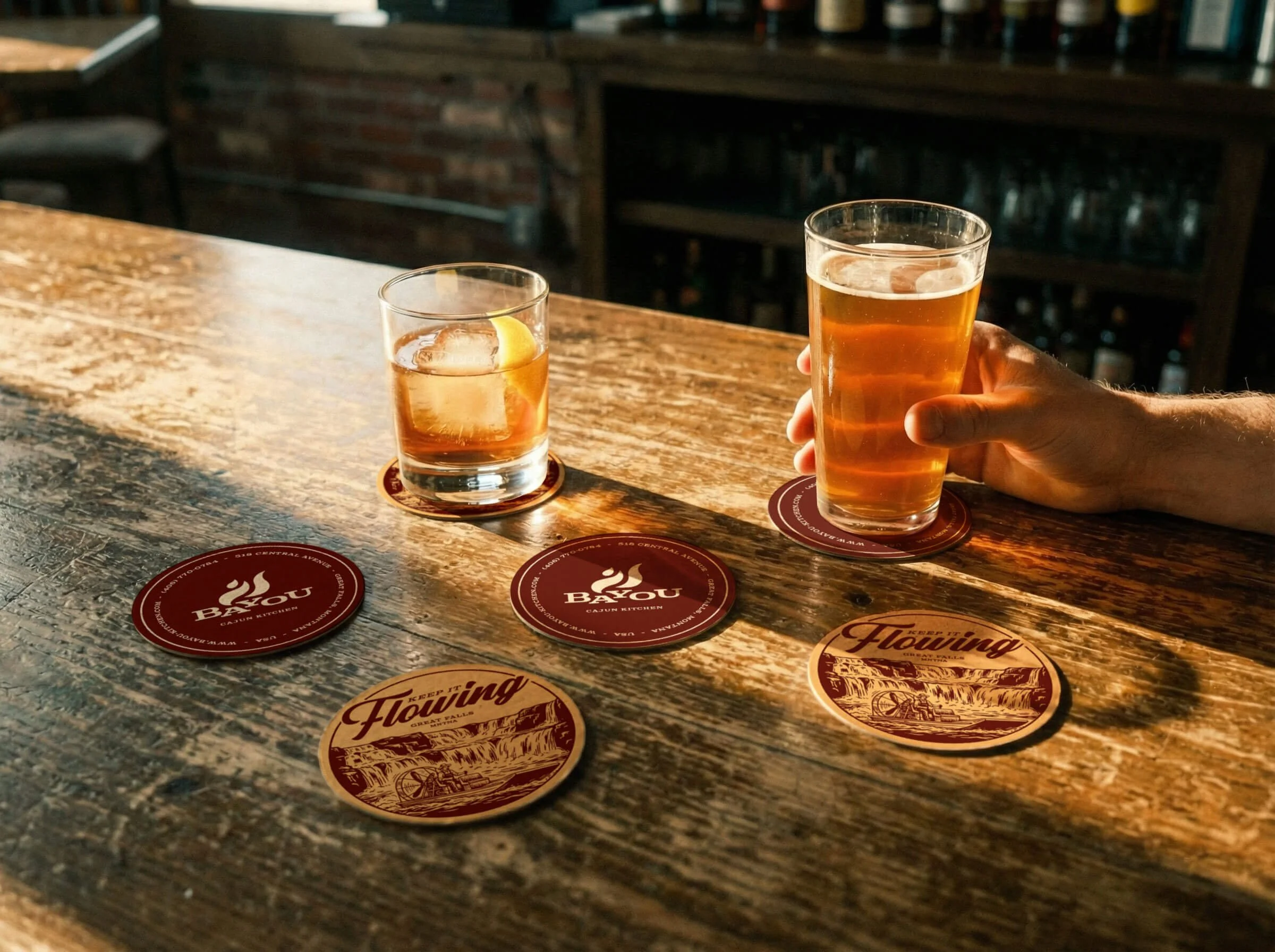
Restaurant Color palette
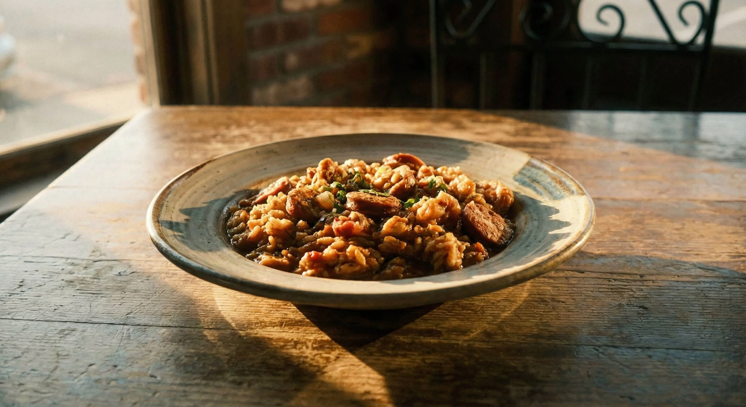
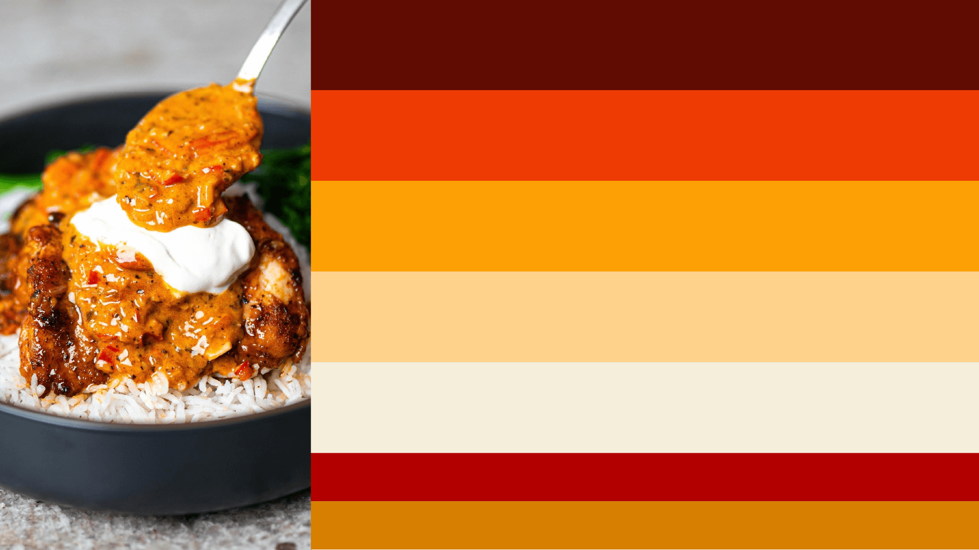
Color communicates flavor before the food ever arrives. We looked directly at the product for inspiration. The palette is pulled straight from a bowl of jambalaya.
We anchored the brand in a deep, roasted roux brown. This provides the foundation. From there we layered in a spicy cayenne orange and a vibrant pepper red to represent the heat. We balanced these intense tones with a creamy rice off-white and a warm, golden cornbread yellow. These colors create a visceral reaction. They trigger the appetite and signal the richness of the cuisine. The palette feels organic and derived from the earth and the fire.
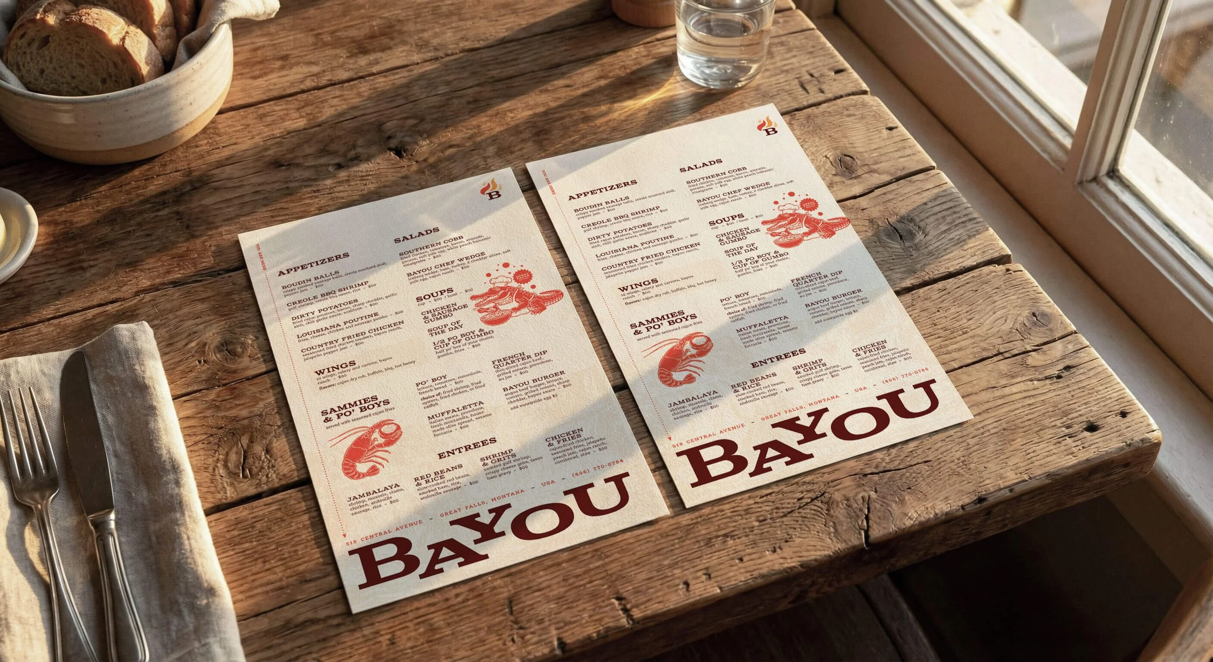
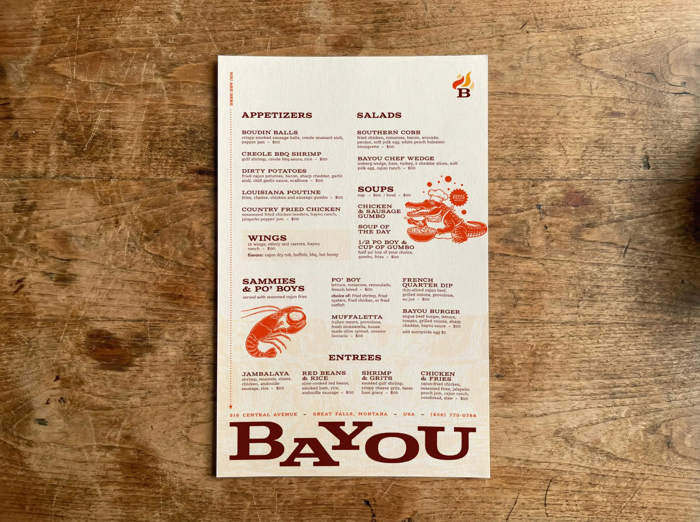
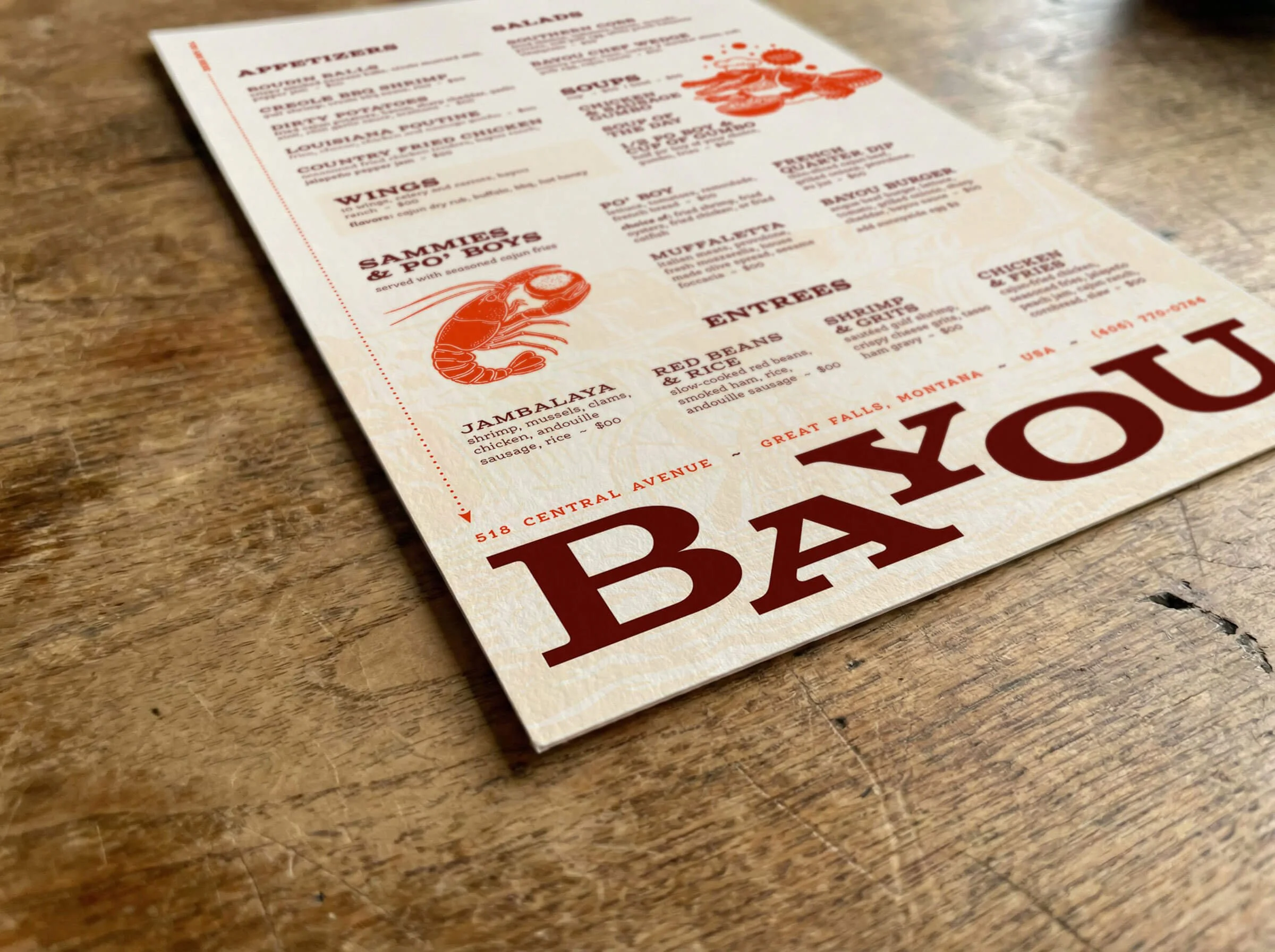
Restaurant Menu Design
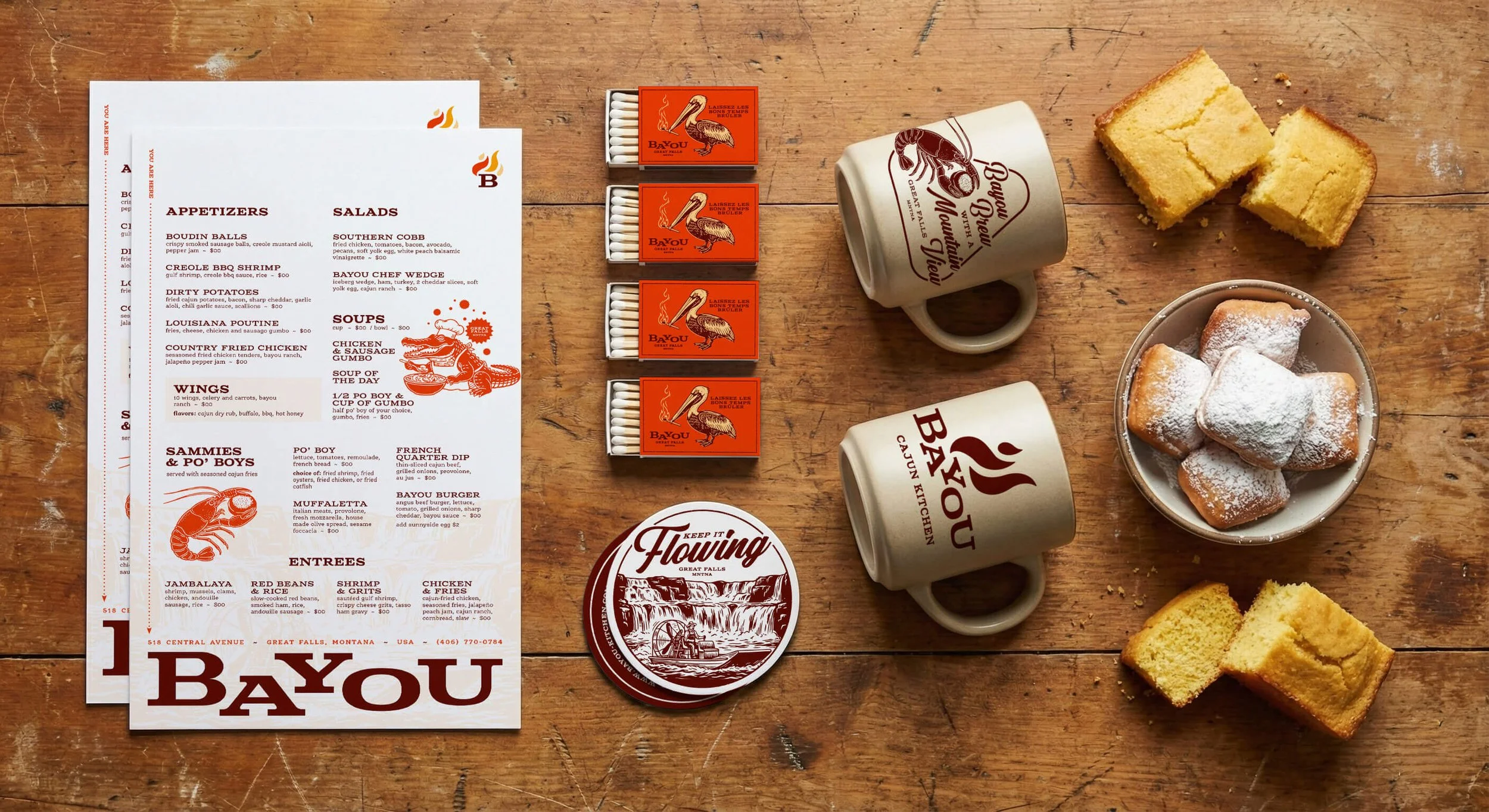
The menu serves as the primary tactile interaction for the Patron. We designed it to feel like a artifact of the brand’s hospitality. The layout utilizes a single-column structure for the appetizers and dual columns for the entrees to guide the eye naturally.
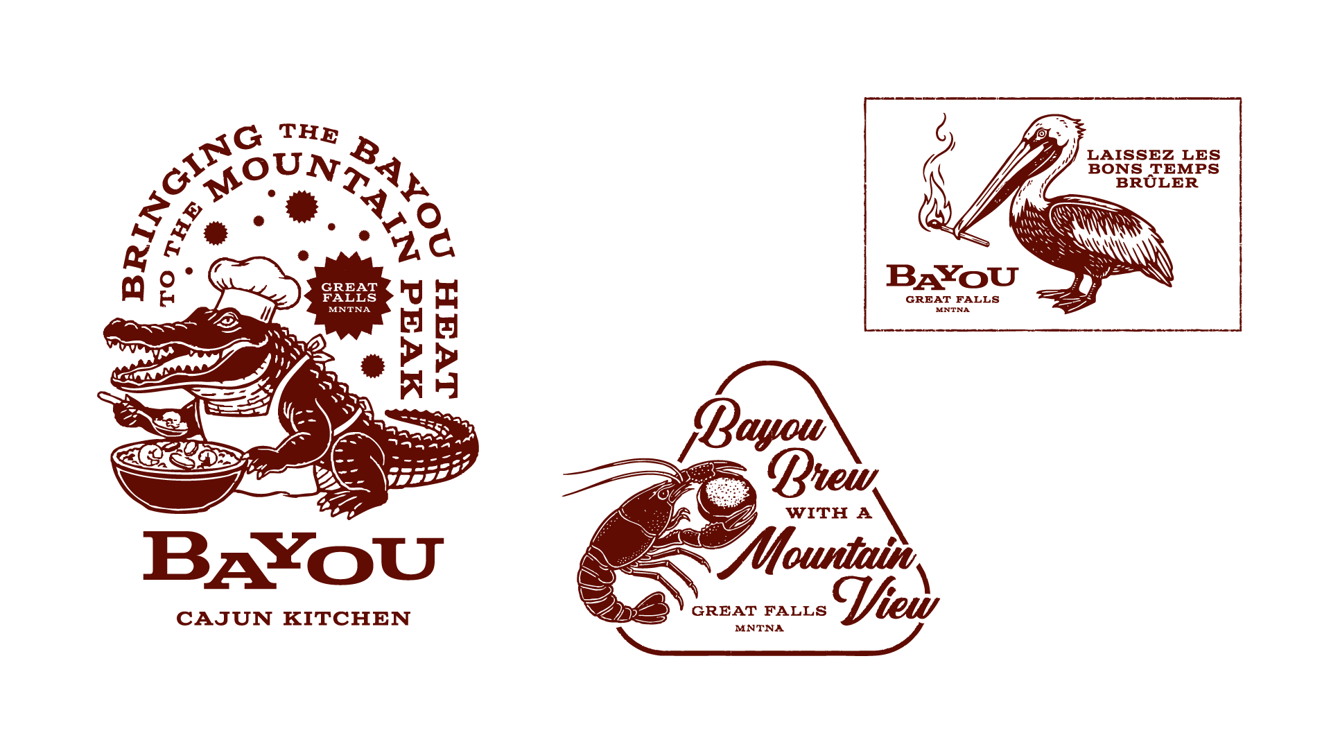
We used the creamy off-white paper stock to let the typography breathe. The section headers in the deep roux brown command attention. Illustrations of a crawfish and an alligator chef break up the text density. We included the slogan "Bringing the Bayou Heat to the Mountain Peak" directly on the page to reinforce the geographical narrative. The design prioritizes clarity and readability while maintaining the rustic aesthetic.
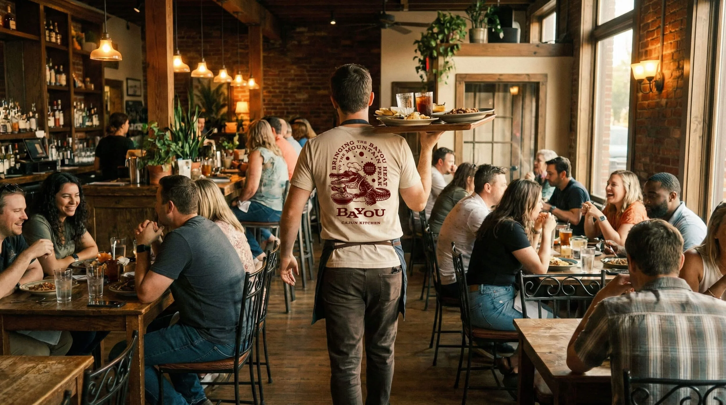
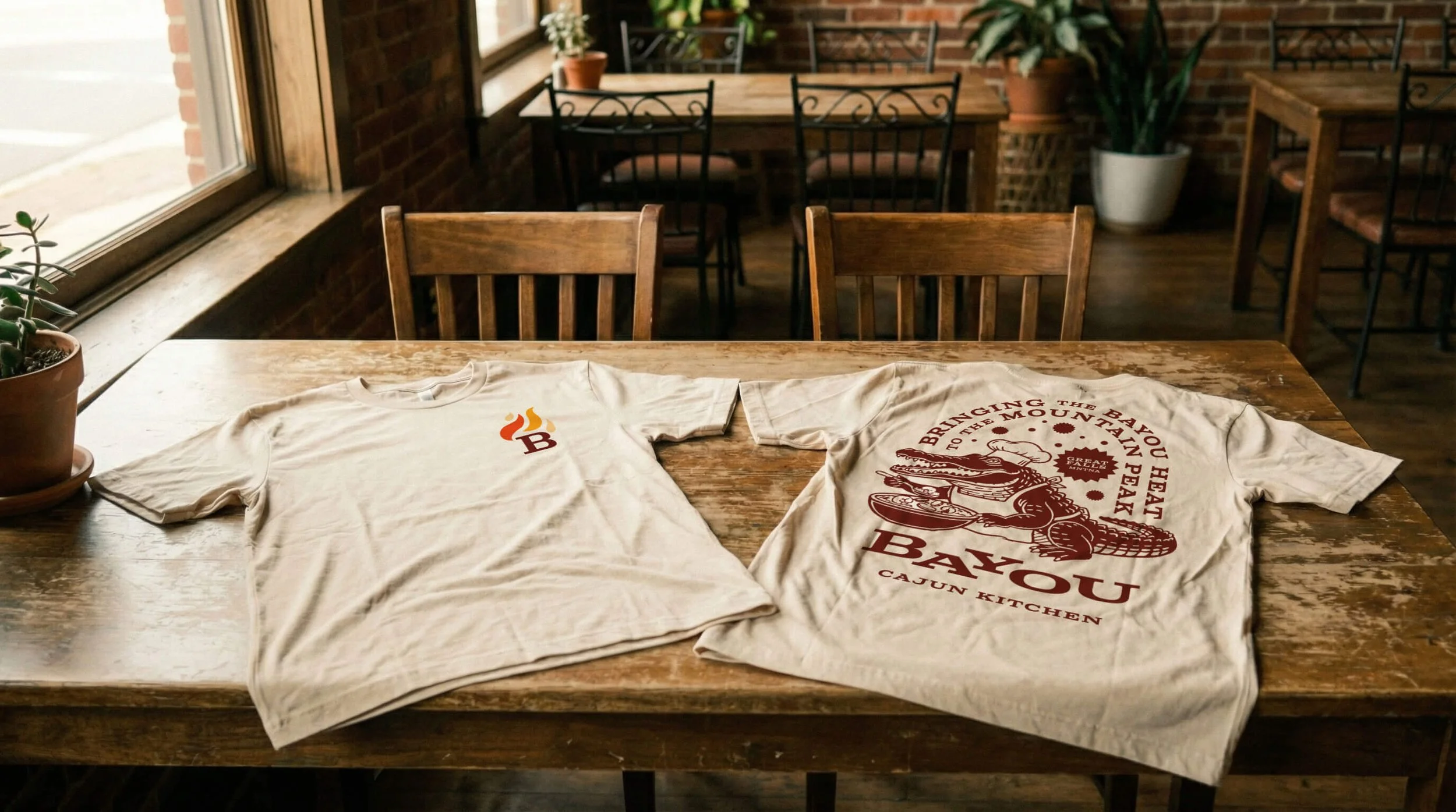
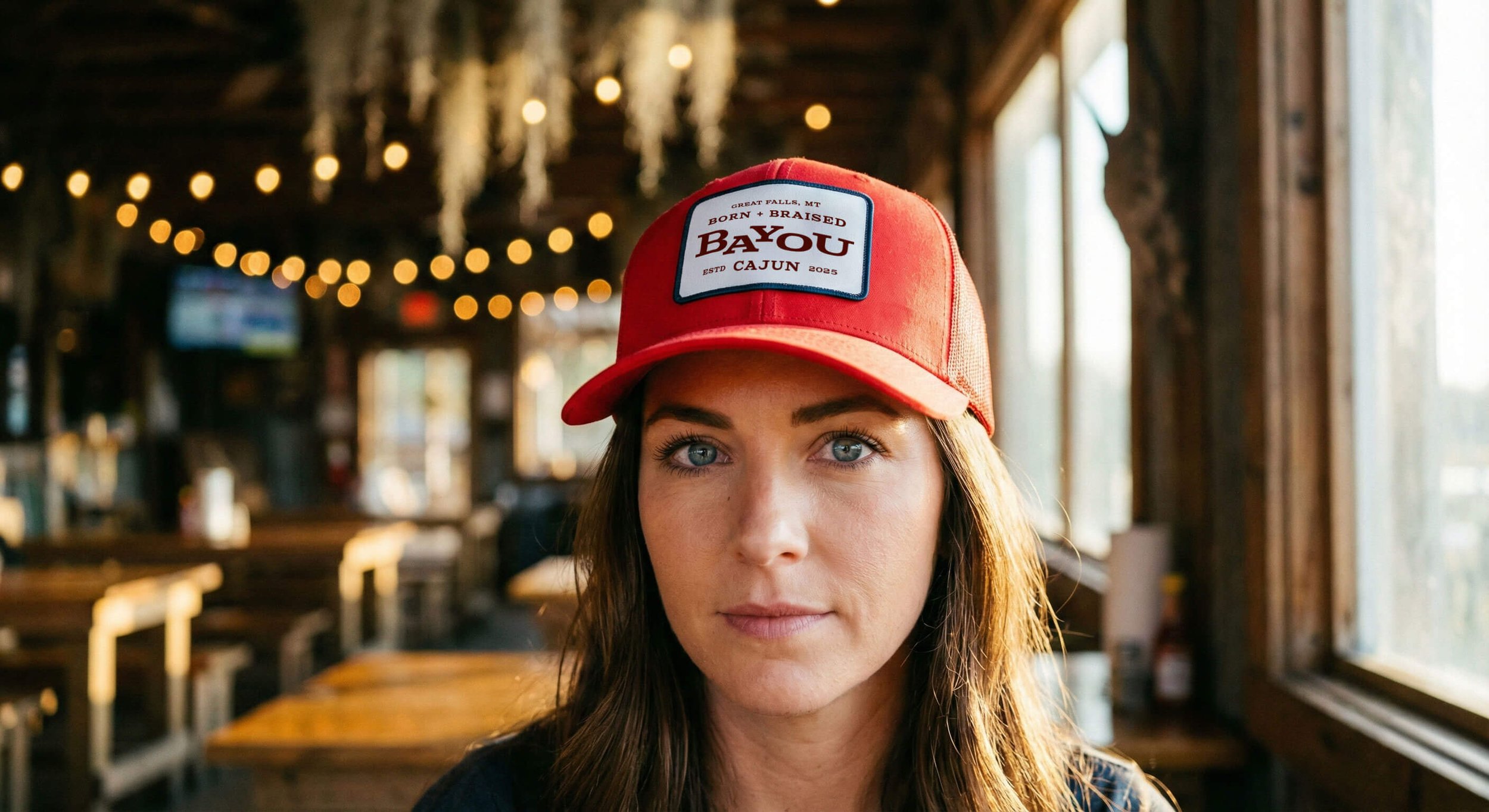
Restaurant apparel Design
A uniform should build pride in the team. We designed apparel that functions as lifestyle merchandise. The red trucker hat features a woven patch with the "Born & Braised" mantra. It fits the rugged Montana aesthetic perfectly.
For the shirts we utilized the back panel as a canvas for storytelling. The illustration of the alligator chef stirring the pot sits below the arched text. This creates a walking billboard for the brand’s attitude. The apparel bridges the gap between back-of-house utility and streetwear. Staff members wear the brand. Patrons buy the brand to take a piece of the identity home.
Restaurant touchpoints Design
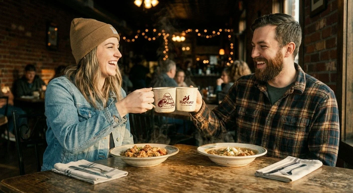
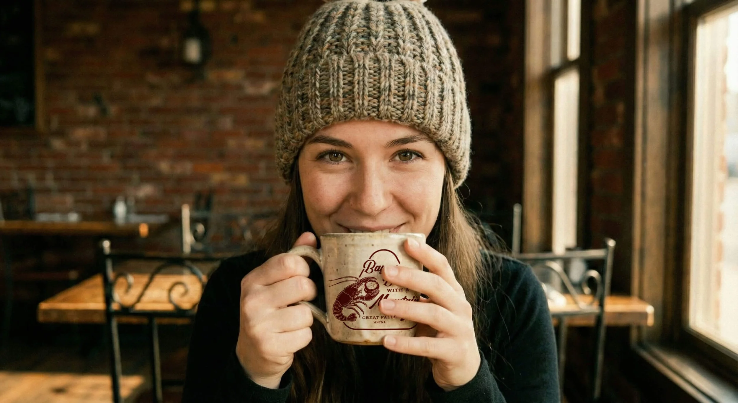
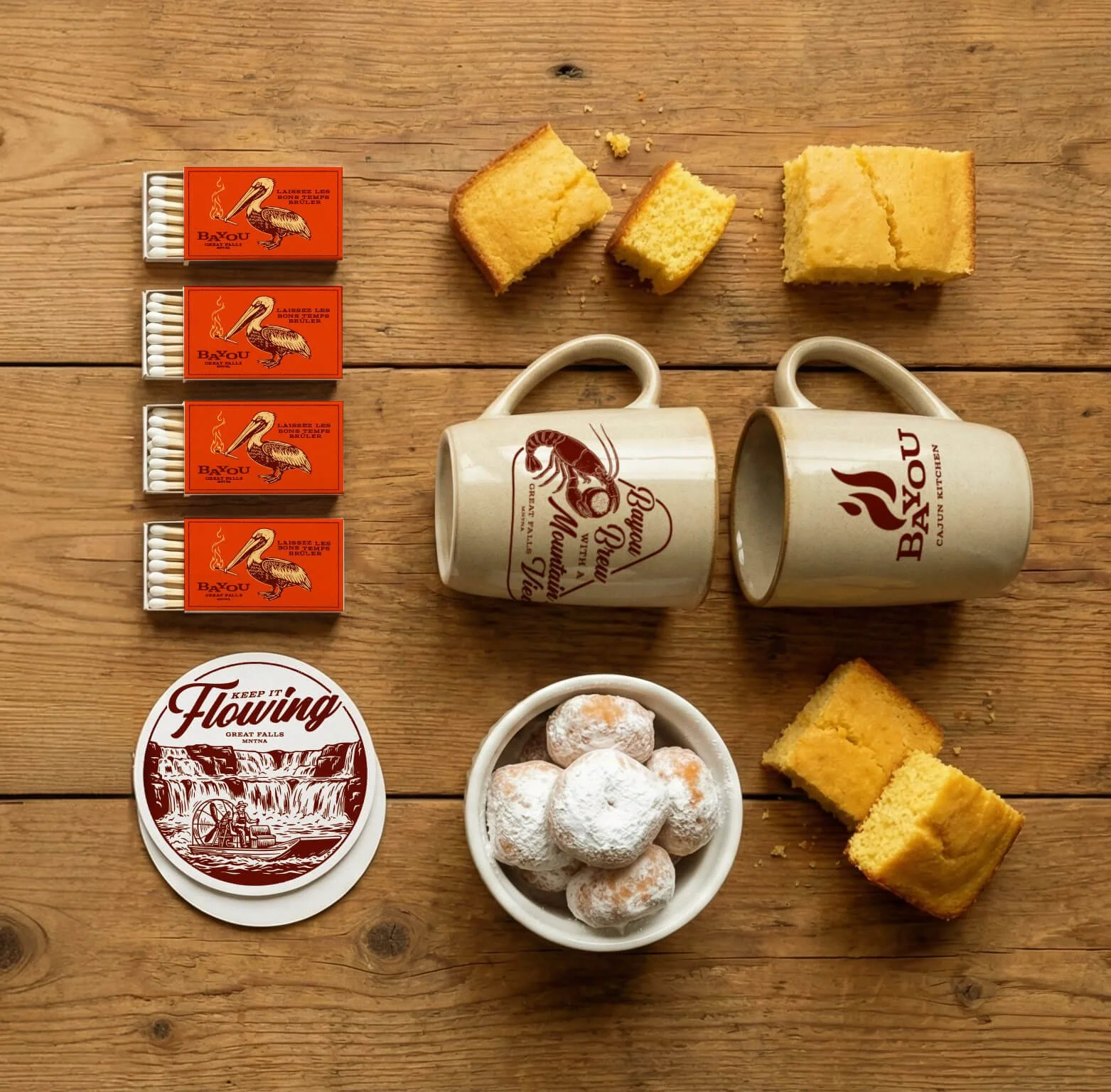
Every physical object creates an opportunity to deepen the narrative. We designed custom ceramic mugs that feel substantial in the hand. An illustration of a crawfish holding a beignet creates a sense of place and moment. Coupled with phrase “Bayou Brew with a Mountain View” establishes the coffee as uniquely authentic. These mugs turn coffee service into a brand ritual.
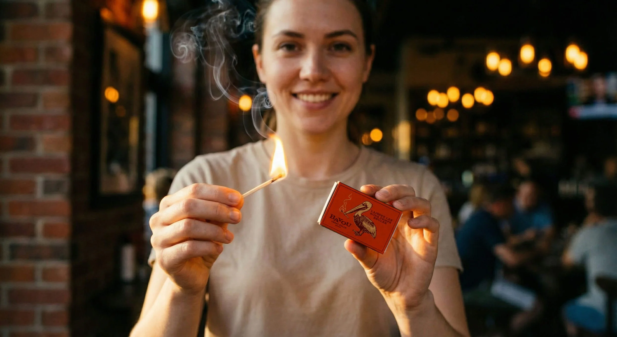
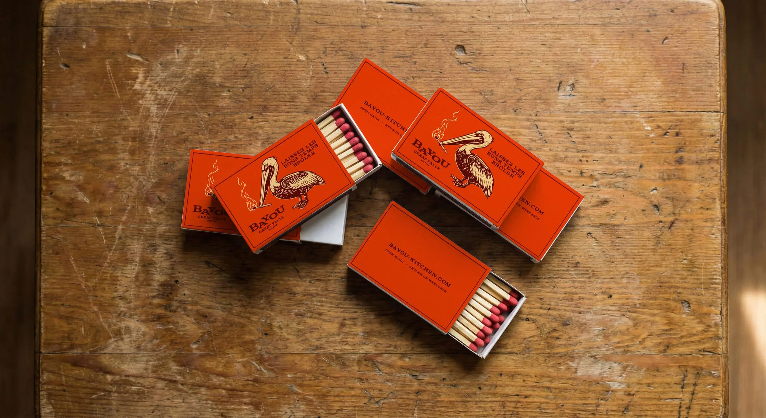
We also created custom matchboxes. The design features a pelican holding a lit match with the French phrase "Laissez Les Bons Temps Brûler" (Let the Good Times Burn). This small detail transforms a utilitarian object into a keepsake. It reinforces the spirited personality of the brand and gives the Patron a tangible connection to the fire that fuels the kitchen.
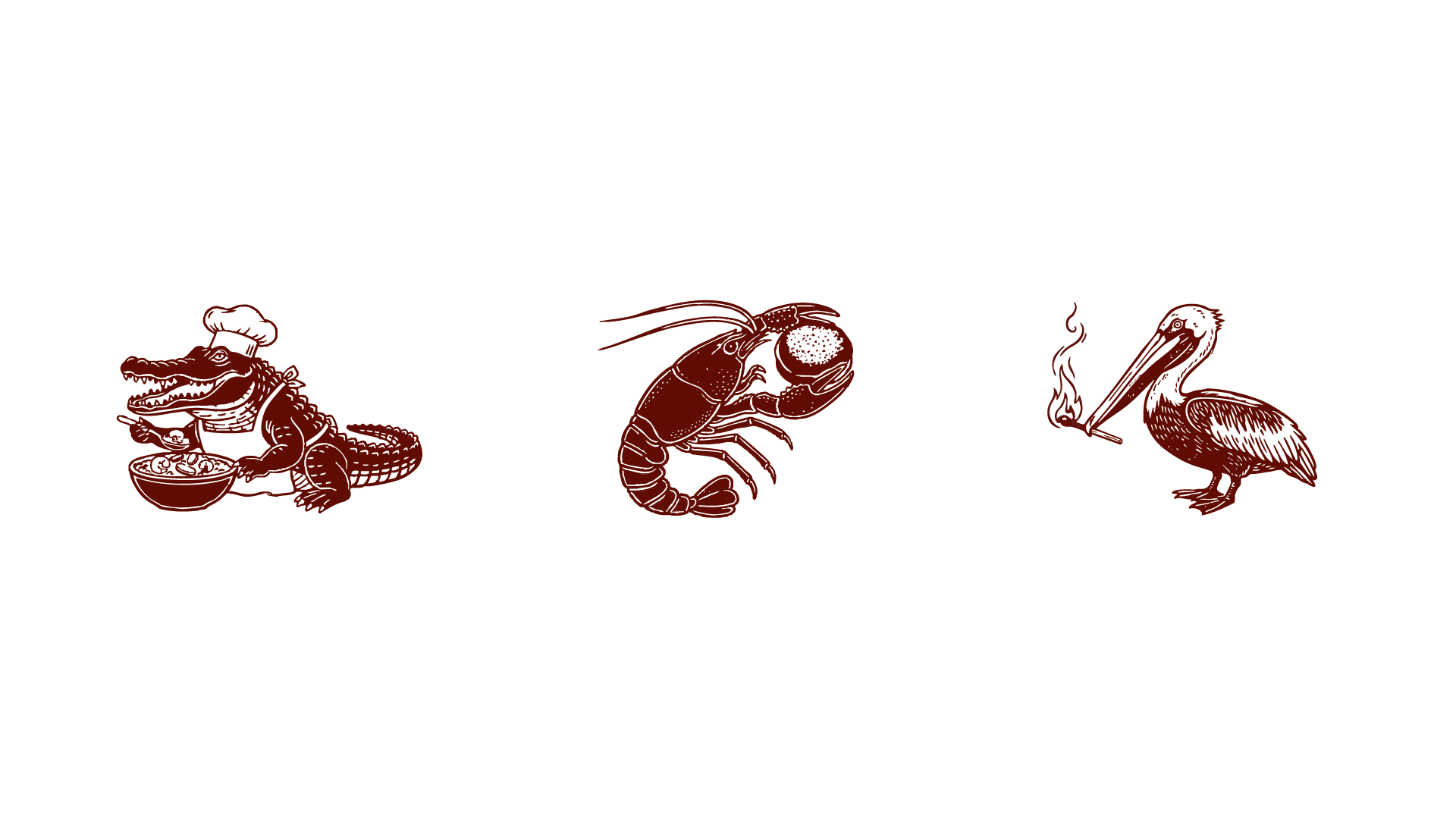
Restaurant Illustrations
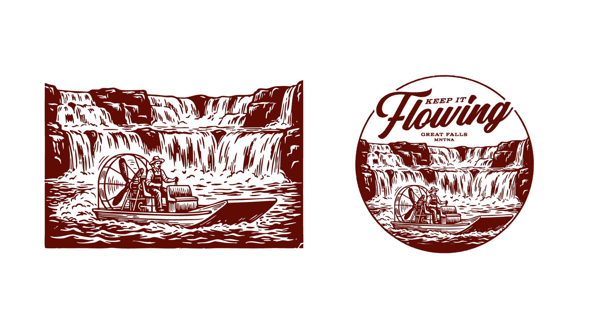
A brand needs more than a logo to tell a full story. We developed a suite of woodcut-style illustrations to expand the visual vocabulary. The hero illustration depicts a steamboat navigating the falls with the text "Keep It Flowing." This image specifically ties the water-based culture of the bayou to the waterfalls of Montana.
We added the character of the alligator chef to inject humor and personality. The crawfish illustration serves as a nod to the staple ingredient of the cuisine. These illustrations appear on coasters, menus, and apparel. They add texture and history to the visual identity. They make the brand feel lived-in and authentic.
Project Recap
Bayou is proof that a strong concept can survive hibernation. Chef Matt Black took a dormant seed from Pennsylvania and planted it in the soil of Montana. Through a disciplined month of strategy and design we cultivated a brand that honors its roots while embracing its new environment.
We evolved the visual identity to be sharper and more mature. We built a color palette that tastes like the food. We designed touchpoints that build emotional connection. Bayou now stands as a beacon of heat in the north. It is a Bullhearted brand ready to charge ahead in its new chapter.