

Brand Evolution for La Segunda
La Segunda Bakery & Café has been a cornerstone of Tampa, Florida, for over a century, famed for its authentic Cuban bread and vibrant cultural legacy. But even icons need a fresh perspective to stay relevant in a shifting market. The challenge was clear: honor La Segunda’s rich history while breathing fresh life into the brand for a modern audience. This is the story of how strategy, creativity, and a commitment to authenticity led to a transformative rebranding.
2018
Year
La Segunda Bakery & Cafe
Client
QSR - Quick Serve Restaurant, Specialty, Bakery
Client Type
2 - Tampa, Florida
Location(s)
Branding, Interiors/Environments, Menu Design, Packaging, Strategy, Verbal Identity, Visual Identity
Services

Assessing the previous identity design
The original La Segunda brand identity, while steeped in its century-long history, struggled to connect with today’s consumer landscape. The typography was a clear indicator of this challenge: its outdated style placed the brand firmly in a bygone era, making it difficult to resonate with modern sensibilities. The overall design lacked clarity and readability, a critical shortcoming for any visual identity tasked with communicating across various touchpoints. Whether on storefronts, menus, or packaging, the typography’s inefficiencies compounded, creating an experience that was visually disjointed and hard to engage with at a glance.
Compounding these issues was an inconsistent use of colors and styles, which muddled the brand’s ability to present a cohesive and memorable presence. This inconsistency diluted La Segunda’s visual equity and made it difficult for customers to instantly recognize or connect with the brand. Instead of highlighting the bakery’s authenticity and cultural significance, the fragmented design anchored it in the past, making it feel dated rather than timeless. These challenges made a compelling case for a refreshed identity—one that could honor the legacy while bringing clarity, cohesion, and modern relevance to the forefront.
Shifting the brand Strategy
At the heart of this rebranding journey was a deep dive into what makes La Segunda exceptional. This wasn’t just about Cuban bread or coffee; it was about the soul of Tampa and a connection that spans generations. The strategy focused on amplifying La Segunda’s cultural relevance and elevating it from beloved local favorite to an iconic regional treasure.
Heritage Meets Modernity: The team worked to preserve the bakery’s authenticity while shaping a brand that resonates with today’s consumers. The Cuban bread, a hero product, became a narrative centerpiece.
Audience Alignment: Beyond locals, La Segunda sought to engage a broader audience, tapping into regional tourism and the increasing demand for authentic cultural experiences.
Unified Vision: Every element of the brand would weave a consistent story, connecting the past, present, and future of La Segunda.
Heritage
Locally Rooted
Contemporary
Restaurant Brand Identity Design
The refreshed identity brought visual harmony to a brand that spans a bakery, café, and retail presence. It’s bold yet warm, exuding the authenticity and heritage La Segunda is known for.
Inspired by the bakery’s historic roots, the logo pays homage to Ybor City design elements while embracing a clean, modern aesthetic. The hand-drawn typography nods to tradition, while vibrant colors evoke the lively spirit of the melting pot culture of the area.
The design system leverages textures, patterns, and imagery that transport you to the streets of Ybor while rooting it in history. Despite its historic inspiration, the identity feels contemporary and fresh. It’s not just a logo; it’s a visual experience that tells a story.

Restaurant MENU Design
Menus are more than lists of food; they’re gateways to exploration. The menu design prioritized clarity while celebrating the artistry and history of La Segunda’s offerings. They effectively put the bread front and center, then built from that base to weave a brilliant tale.
Clean, intuitive navigation ensured ease for customers without sacrificing visual impact. The suite of menus complemented one another while standing on their own as an unforgettable piece that delivered information while building the brand.
Signature items like the Cuban sandwich and guava pastries were highlighted with photography and descriptive copy, inviting customers to dive into the culinary legacy.


Restaurant Packaging Design
Packaging became an extension of the brand’s storytelling, ensuring that every purchase was a shareable moment. Packaging for Cuban bread and pastries reflected the core identity, with vibrant accents and timeless typography. This alone was a massive step forward as the three foot long Cuban bread had become an local icon.
Beyond practicality, the packaging conveyed a sense of pride and nostalgia, reinforcing La Segunda’s role as a cultural staple. Each piece carried not only the look, but also an fresh tone of voice that reinforced the brand’s uniqueness.
Thoughtful material choices echoed the brand’s commitment to quality and care for the community.


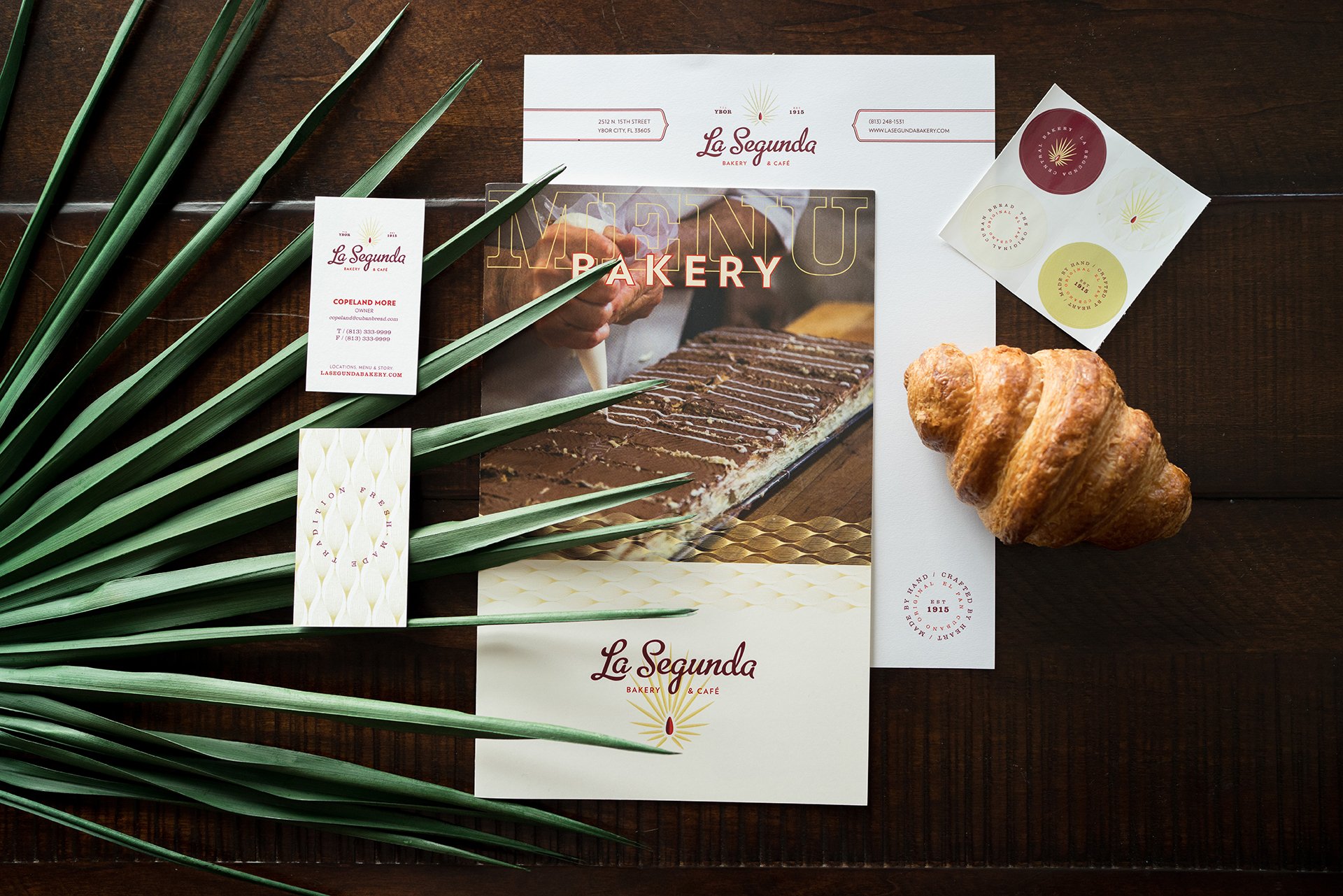
Restaurant Brand collateral
We approached La Segunda’s collateral design with the same care and cultural reverence that shaped the brand identity. Every piece of printed and physical communication became an opportunity to express the bakery’s Cuban-American roots while modernizing its visual presence. The stationery system balanced historical textures and typography with clean, contemporary layouts—bridging the bakery’s 100-year legacy with a bold, forward-looking tone.
Uniforms and staff apparel became an extension of the brand personality, infusing daily operations with authenticity and pride. Neutral-toned shirts and aprons featured the refreshed logo and a warm color palette inspired by Cuban tilework and café culture. The result: a cohesive suite of collateral that celebrates tradition while signaling growth, unifying the guest experience across every touchpoint.


Project Recap
The La Segunda rebranding is proof that heritage and innovation don’t have to be at odds. By leaning into its authentic roots and embracing a future-forward approach, the brand redefined its position in the market while staying true to its purpose. For restaurant leaders looking to embark on a rebranding journey, here’s what to remember:
Celebrate What Makes You Unique: Authenticity is your strongest differentiator. Don’t dilute it—amplify it.
Craft a Unified Vision: From menus to packaging, consistency across touchpoints is non-negotiable.
Think Beyond Aesthetics: A brand is more than a logo. Strategy, storytelling, and emotional resonance are the true markers of success.
Let the La Segunda story inspire you to grab the reins of your brand and steer it boldly into the future.


Mr. More, 3rd Generation Owner
“[They] captured the heart of my family and this brand that we have built for over a century. We look forward to continuing this tradition for years to come with a brand we love and believe in.”