
What Cracker Barrel, Domino’s, and Long John Silver’s Teach Us About Restaurant Rebrands

Three big-name restaurant brands made brand moves recently. One tried to modernize and got called out. Another doubled down on clarity and found fresh momentum. The third updated their image just enough to grow into a new lane without breaking stride.
Cracker Barrel veered off course. Domino’s stayed the path. Long John Silver’s adjusted the sails with precision.
This isn’t about design taste. It’s about brand thinking. It’s about what happens when leaders forget that branding is more than a look—it’s a relationship built on trust, behavior, memory, and meaning.
Cracker Barrel made the wrong kind of noise. Long John Silver’s made a confident correction. Domino’s kept things tight and true. If you lead a restaurant brand and you’re planning a rebrand or refresh, don’t just watch what these brands did. Learn what made each decision land—or miss.
Cracker Barrel lost touch with its emotional center

Cracker Barrel rebrand that sparked backlash and ultimately a reversion to the original brand identity
Cracker Barrel didn’t just change a logo. They removed key elements that guests had grown up with. Gone was the phrase “Old Country Store.” Gone was the man leaning on a barrel. Interiors were remodeled with brighter walls, fewer antiques, and a cleaner feel.
That may sound like an upgrade on paper. But in practice, it erased the emotional texture that gave the brand its gravity.
Cracker Barrel has always been a comfort brand. A road trip stop you didn’t have to explain. The rockers, the peg game, the gift shop clutter, the worn-in charm. That’s what guests connected to. It was never about elegance or edge. It was about a shared sense of place.
When they stripped that away, people didn’t feel modernized. They felt displaced. The backlash was immediate and intense. Patrons revolted. Social commentary exploded. Share prices dropped. Eventually, the brand pulled back and paused the rollout. But the signal had already been sent.
When you disconnect your brand from its emotional core, you don’t just confuse people. You create doubt. And doubt is hard to clean up after the fact.
Long John Silver’s made a strategic, measured update

Long John Silver’s rebrands by changing the fish icon to a chicken to reposition its offering.
Their change was quiet, but clear. The fish in their logo was swapped for a chicken silhouette. The tagline now reads “Chicken + Seafood.”
That’s it. No name change. No sweeping identity overhaul. Just a clear nod to a menu category that was already performing well.
This move worked because it honored what was already true inside the brand. Chicken was selling. Customers liked it. This wasn’t a stunt. It was an acknowledgment.
Even better, the change added without subtracting. It didn’t ask longtime guests to reorient. It simply gave them more to see. More reason to stay.
That’s how you evolve. Not by chasing relevance. By clarifying value.
Domino’s delivered refinement, not disruption
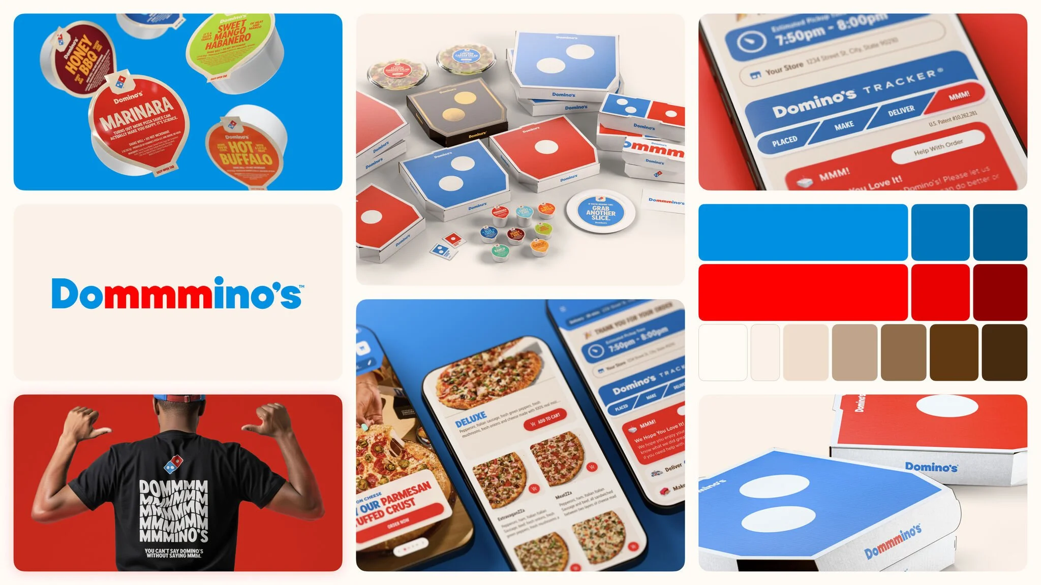
Domino’s evolved their brand with stronger typography in a successful brand evolution.
Thirteen years since their last rebrand. The refresh touched everything—packaging, fonts, color palette, even the jingle. But the domino stayed. The brand spirit stayed. The promise stayed.
They built forward instead of starting over.
Every decision felt connected to the Domino’s people already knew. That’s what made it work. Nothing needed to be explained or defended. The updated identity spoke clearly and moved with energy. It fit the brand Domino’s had become without stepping on the foundation they built it on.
That’s what smart evolution looks like.
Branding doesn’t fail because it changes. It fails when the change has no soul
A rebrand without a clear reason isn’t strategy. It’s decoration. When brands make those moves without understanding their emotional contract with customers, they cause confusion. Sometimes resentment.
Cracker Barrel faced that. Domino’s avoided it. Long John Silver’s managed it with care.
If you lead a restaurant brand, your job isn’t to impress people with design. It’s to create clarity. To show people you know who you are, who they are, and what kind of relationship you want to have.
Before you change a single visual, ask yourself:
What emotional cues define how people connect with this brand?
What signals must stay visible no matter how the brand evolves?
What’s changing because it needs to—and what’s changing just to look new?
Do I have real data backing this shift, or am I guessing?
Do I know how our core guests will feel about this? Really feel?
If the answers aren’t rock solid, stop. You’re not ready to rebrand.
Go back to the foundation. Revisit your purpose. Reconnect with your Patron. Build alignment across your organization.
Then, and only then, make the change.
Final word
Cracker Barrel forgot their roots. Domino’s honored theirs. Long John Silver’s made room to grow.
If your brand is considering a shift, don’t just focus on how it will look. Focus on how it will live. And how it will feel to the people who already love you.
Rebrands don’t fail because they’re bold. They fail because they’re hollow.
Build yours from the inside out. Then let the rest follow.