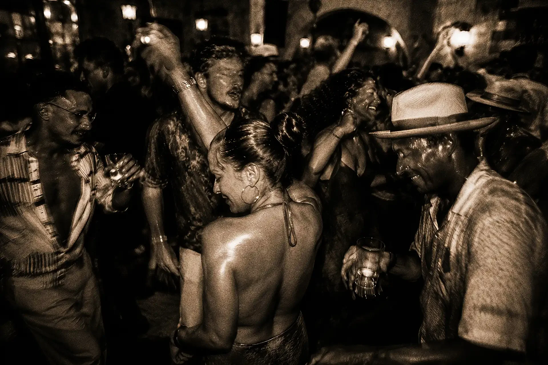
branding for Bar Amarilla
Bar Amarilla is a hotel bar concept created for San Francisco, designed to feel like a destination within the hotel rather than another extension of the lobby.
The idea began with an unlikely geographic pairing: Havana and San Francisco. On opposite sides of the continent, the cities share more than you might expect. Both are defined by hills and water, colorful architecture, strong cultural identities and a sense of place that has survived waves of change. Both can feel romantic without being precious about it.
Bar Amarilla lives somewhere between them.
Cuba provides the warmth, rhythm and hospitality. California gives the concept its setting and a distinctly West Coast point of view. The result is neither a Cuban theme bar nor a California cocktail lounge. It borrows from both places to create something that feels appropriate to San Francisco while carrying the spirit of Havana.
Year
2023
Client
STMT Partners
Client Type
Hotel, Hospitality
Location(s)
San Francisco, CA
Category
Hotel F&B
Research, Brand Strategy, Naming, Brand Identity, Menu Systems, Packaging, Uniform, Plateware/Glassware
Services
brand Strategy
The strategic challenge was to make Cuba meaningful to a bar in San Francisco without turning the concept into costume.
Rather than reaching immediately for the familiar visual shorthand of cigars, vintage cars and tropical nostalgia, we looked for connections between the two places. Color became one of the strongest. Cuba is washed in sun-faded reds, ochres, yellows and warm stucco. California has its own version of that palette, most notably in the golden poppy.
That flower became an important bridge between the two worlds. Its intense yellow-orange carries the warmth we associated with Havana while being unmistakably Californian. The palette grew from there: golden yellow, deep red, warm neutrals and dark wood.
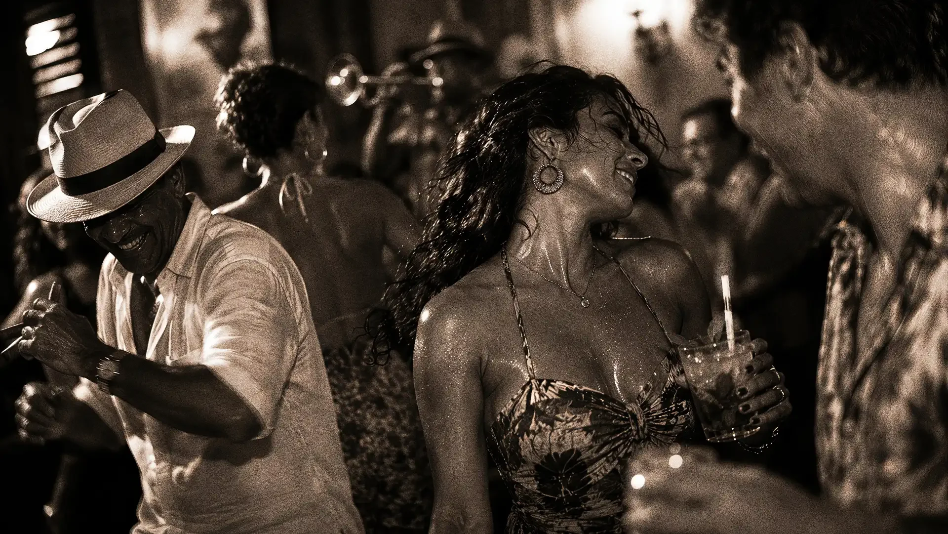
The same thinking shaped the guest experience. Bar Amarilla should feel energetic without becoming a nightclub, sophisticated without becoming formal and transportive without pretending the guest has suddenly left San Francisco.
It is Havana interpreted through California rather than Havana recreated in California.
Culturally Rooted
Passionate
Tropical

Restaurant brand naming & identity design
The name Amarilla comes from the Spanish word for yellow, giving the concept an immediate relationship to its defining color while allowing the Cuban influence to enter naturally through language.
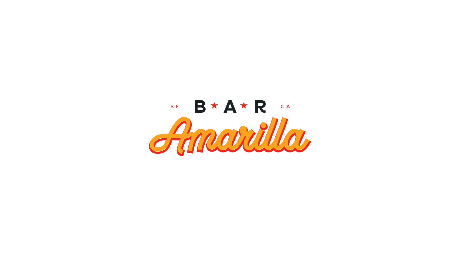
The primary identity combines a loose, expressive Amarilla script with a more structured BAR wordmark. There’s tension between the two: one has movement and personality, while the other feels almost architectural. Small SF and CA details anchor the mark firmly in San Francisco.
A secondary shield gives the system another layer.
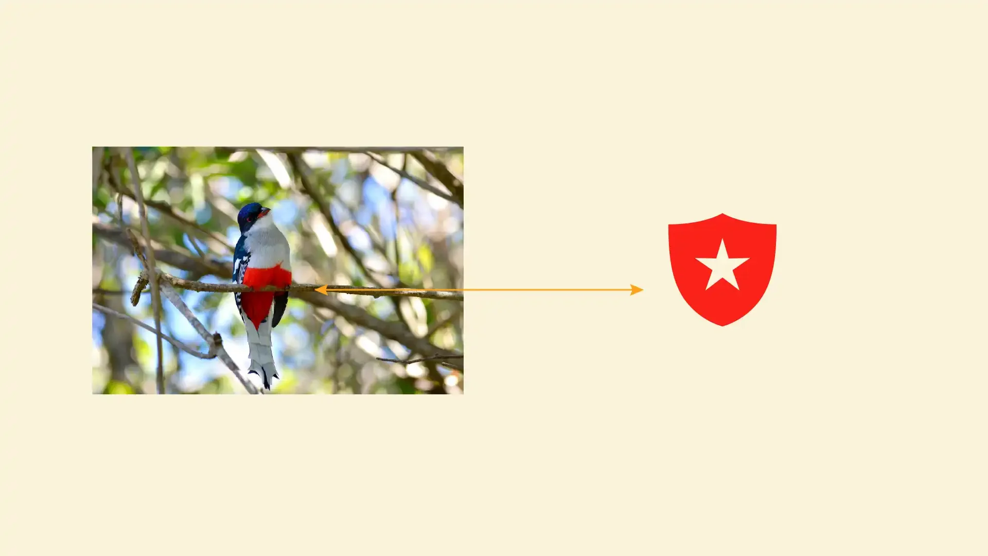
Its form was inspired by Cuba’s national bird, the Tocororo. Most recognizable for its blue, white and red plumage, the bird has a distinctive red breast whose silhouette suggested the shape of a shield. We abstracted that form into a compact badge containing the Amarilla “A,” with references to Bar and San Francisco surrounding it.
That gave us two identities with different jobs. The script carries the personality of the bar; the shield works almost like a maker’s mark, useful at smaller scales and in moments where the full identity would feel forced.
The resulting system feels familiar without belonging to a particular decade. There are hints of old Havana, roadside California, mid-century hospitality and hand-painted storefront graphics, but none are allowed to take over.
Restaurant signage & concept development
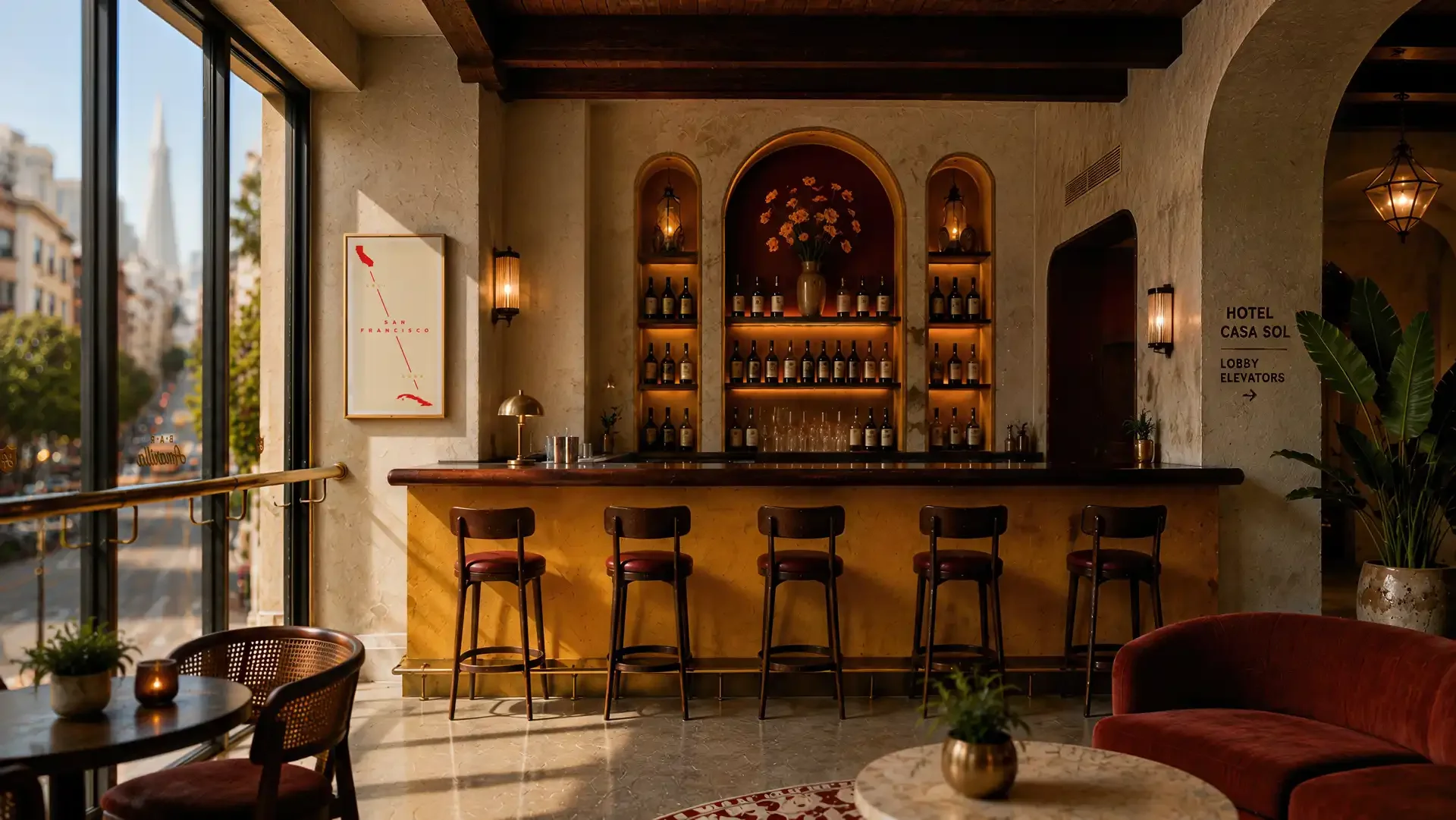
The interior was designed to make Bar Amarilla visibly distinct from the hotel surrounding it. Rather than allowing the bar to disappear into the lobby, we treated it almost as a small building placed inside another building.
Golden yellow defines the bar itself, capped by a rich wood countertop and surrounded by warm, tactile plaster inspired by the aged stucco façades of Havana. Deep reds appear in upholstery and architectural moments, while brass, dark wood and warm lighting give the room its depth.
Arched back-bar niches introduce a more overt Cuban architectural reference without turning the room into scenery. Golden poppies appear behind the bar, reinforcing the California side of the concept in a way that feels natural rather than symbolic.
The large street-facing windows are equally important. They keep San Francisco present. The city remains visible from the bar, so the concept never needs to pretend it exists somewhere else.
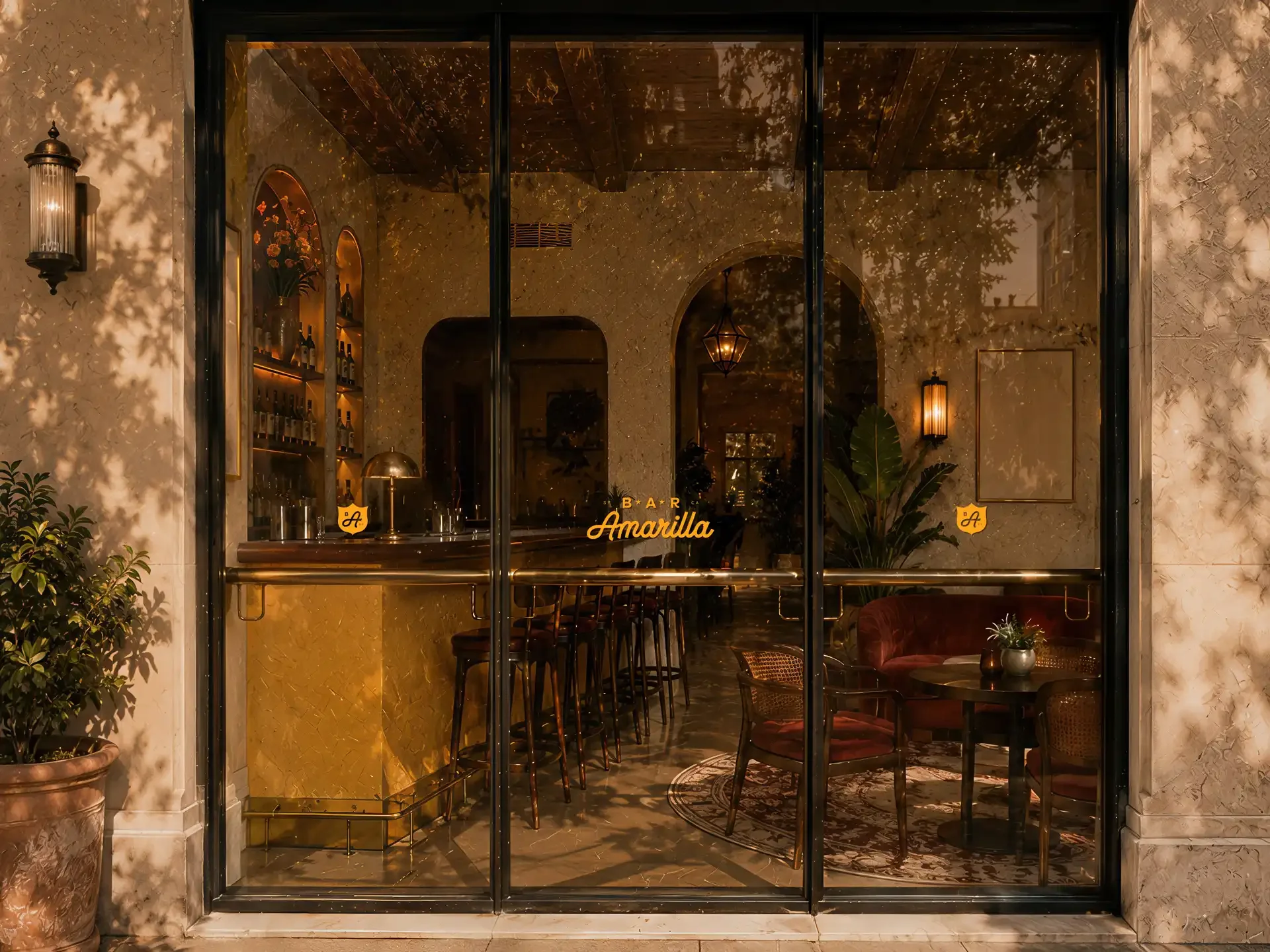
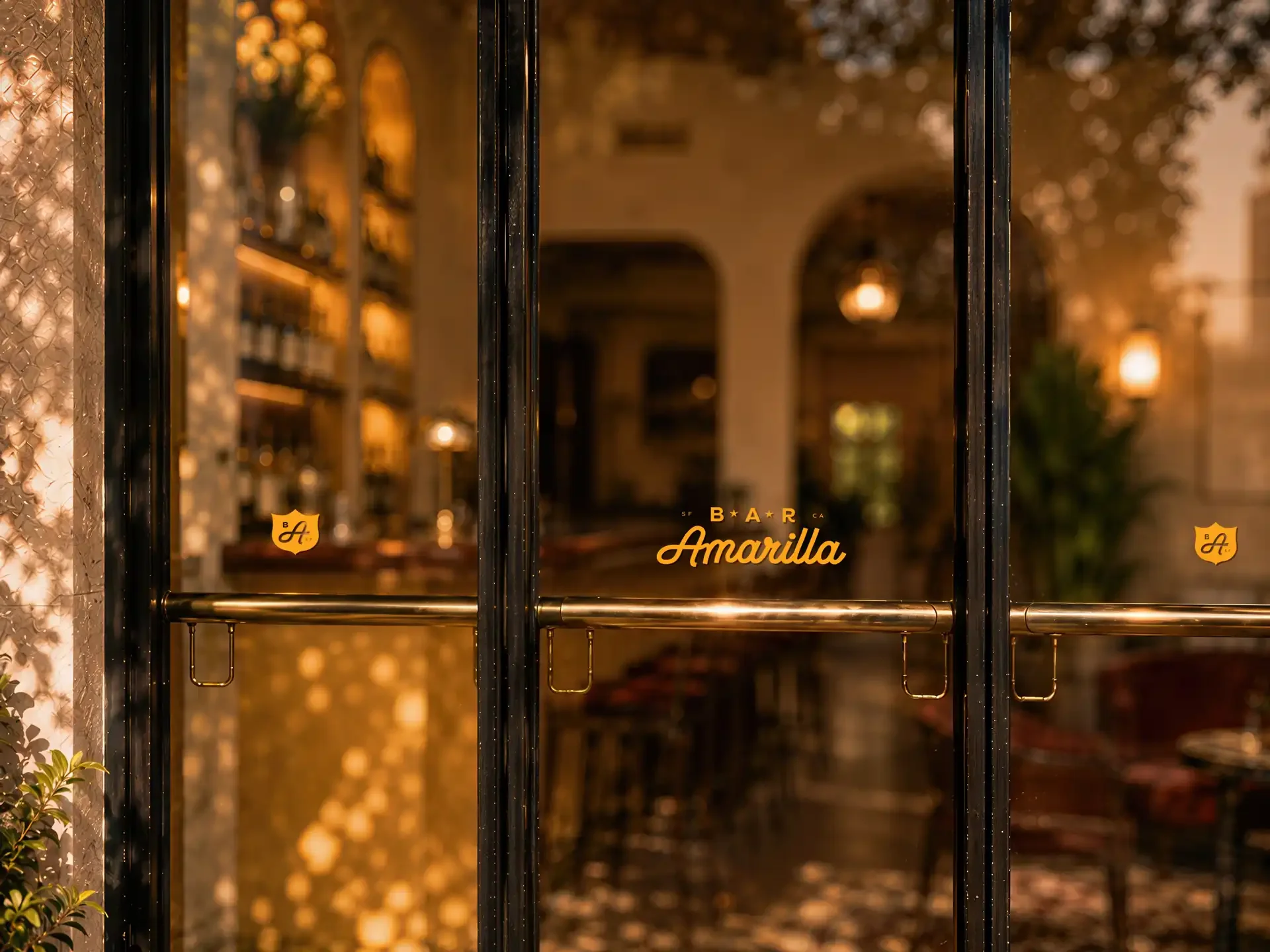
Signage follows the same principle. The identity appears on the glass almost like an old storefront mark, allowing Bar Amarilla to announce itself to the street while the interior glows behind it. From outside, the bar feels like a place discovered within the hotel rather than a hotel amenity advertised to passersby.
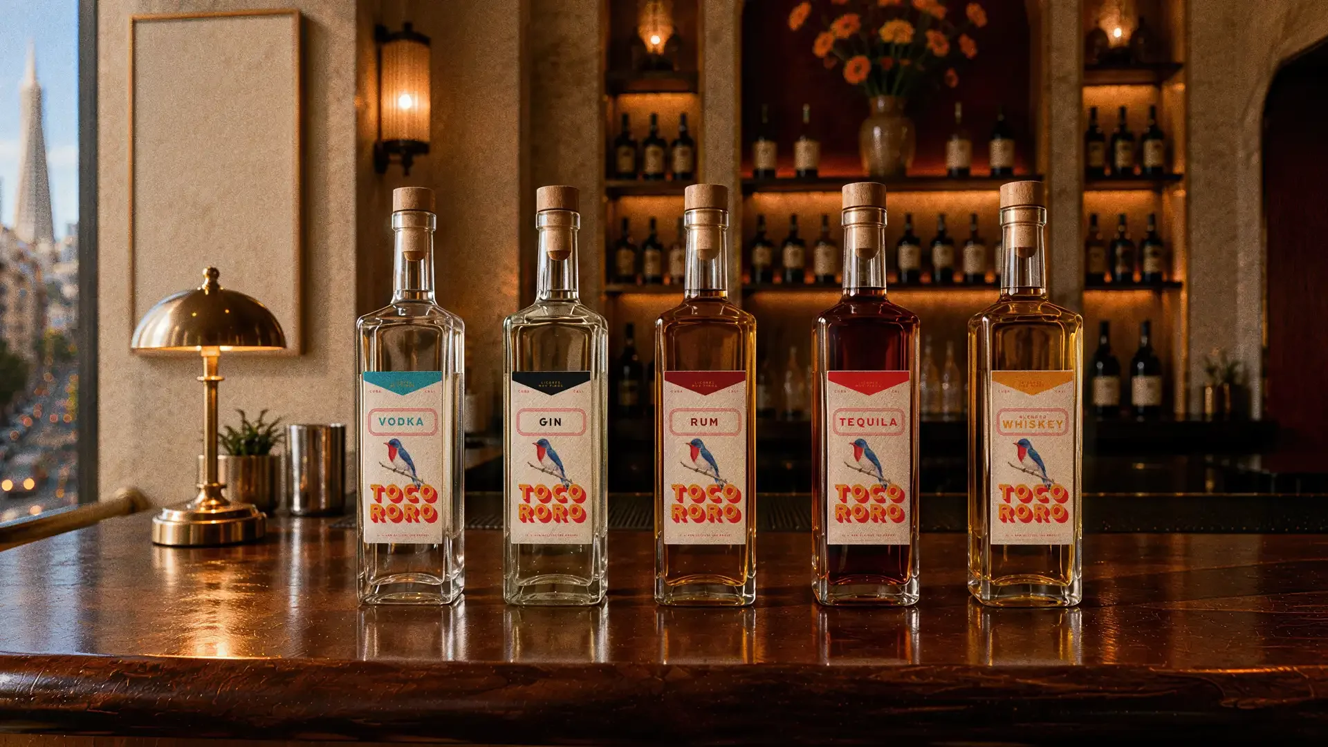
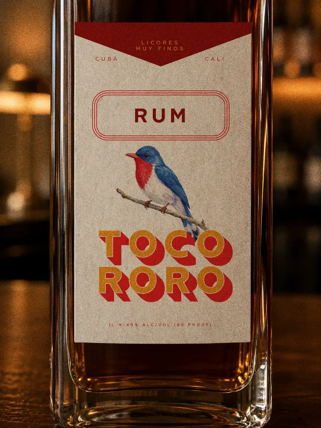
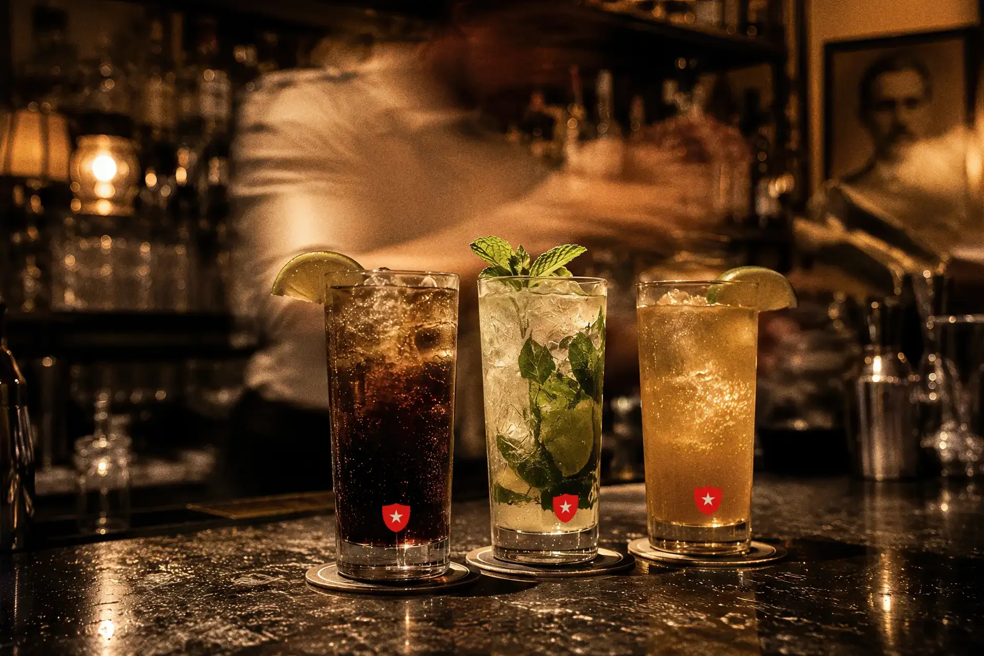
We extended Bar Amarilla beyond the bar itself by imagining a proprietary house spirits collection.
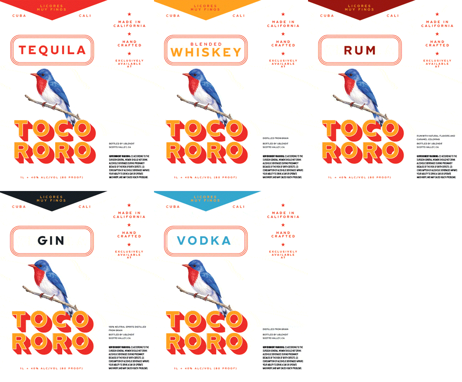
Tocororo takes its name directly from Cuba’s national bird and turns one of the inspirations behind the Amarilla identity into a brand of its own. Vodka, gin, rum, tequila and whiskey share a common bottle architecture and label system, creating a family that feels credible behind the bar rather than like promotional merchandise.
The labels use an illustrated Tocororo as their centerpiece, surrounded by typography and graphic details pulled from the broader Amarilla system. Each expression introduces its own color while maintaining the same structure, allowing the bottles to read individually and as a collection.
Placed together on the bar, they become part packaging and part environmental branding.
That was important. The best branded environments aren’t created by putting a logo on every available surface. They’re built when the things people naturally encounter—the bottle being poured, the coaster beneath the glass, the menu in their hands—belong unmistakably to the same world.
Restaurant packaging design
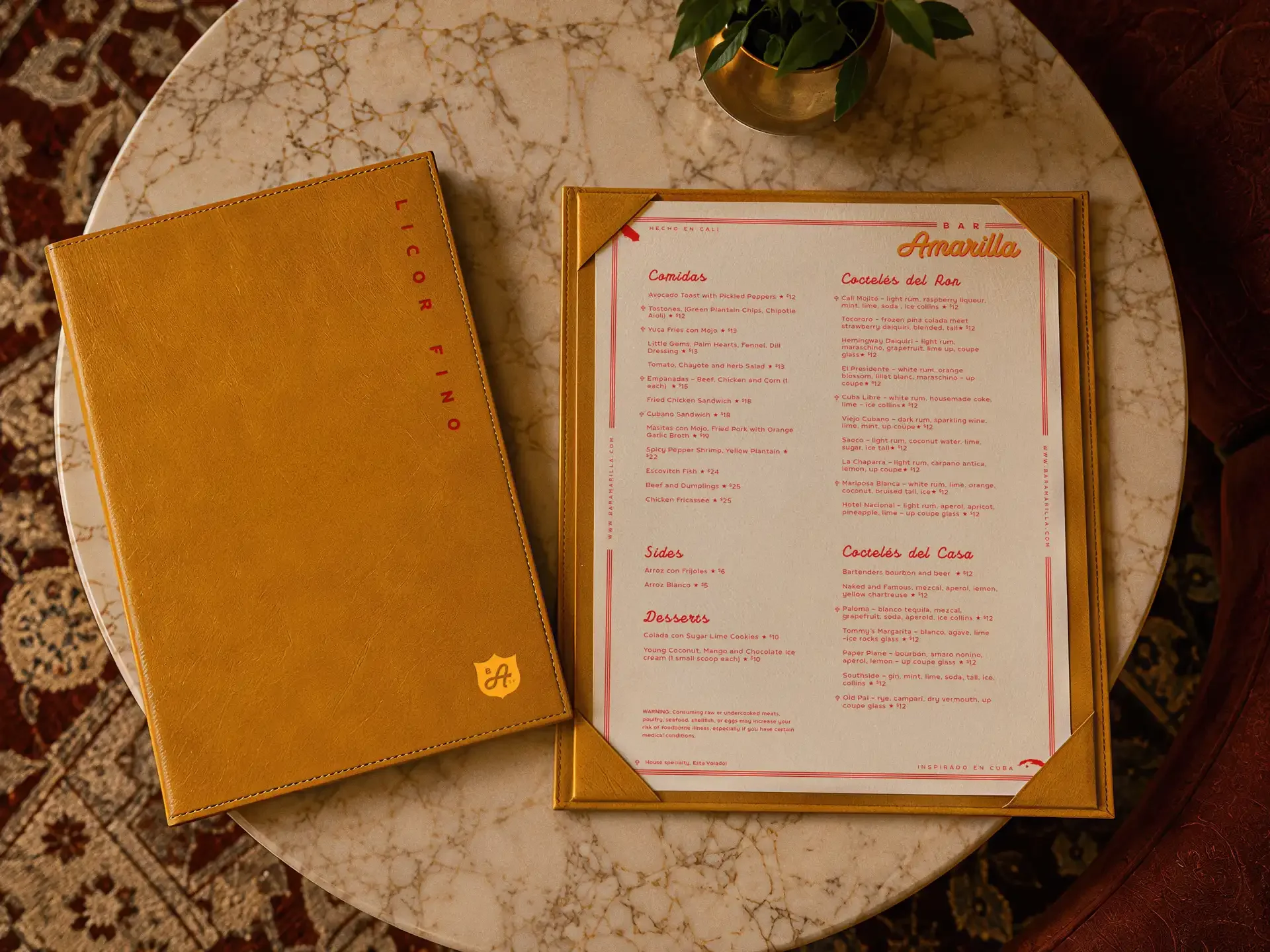
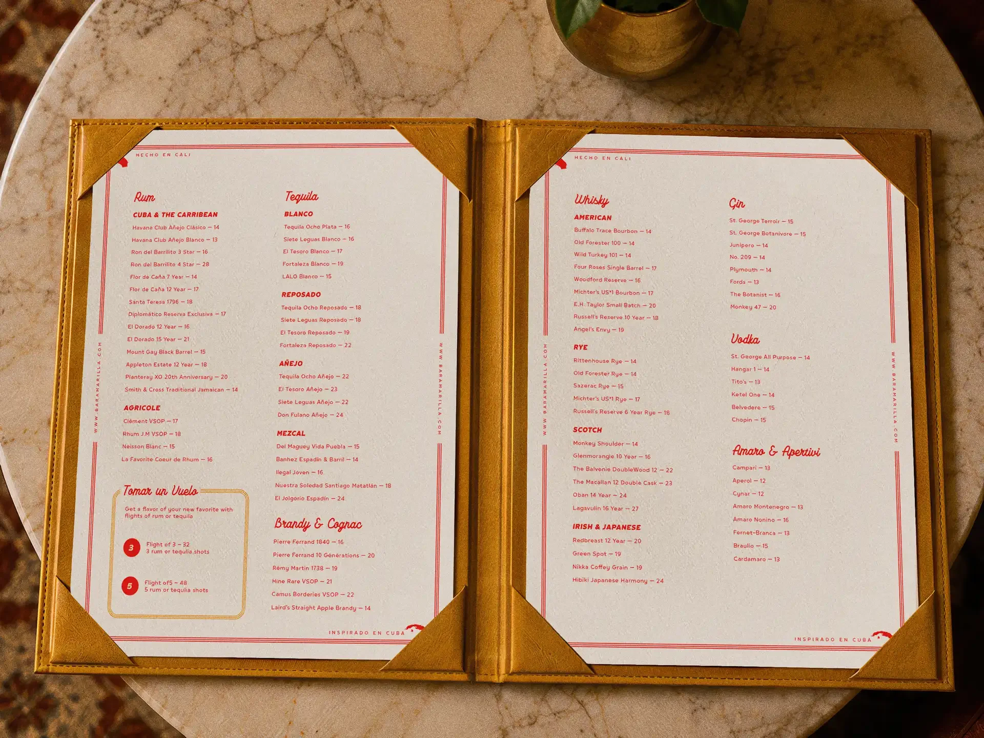
The menu system carries the visual language into the most handled piece of the brand.
Golden leather covers bring the signature Amarilla color into the physical experience, while cream paper and red typography keep the interior pages warm, legible and relatively restrained. Fine rules, small geographic references and Spanish language details give the pages personality without interfering with their primary job: helping someone decide what to drink.
The spirits list places particular emphasis on rum and agave spirits alongside whiskey, gin, vodka, brandy and aperitivi. It gives the beverage program enough breadth for a sophisticated hotel bar while allowing the Cuban influence to shape the collection.
The system is intentionally quieter than the primary identity. The guest has already entered the world by the time the menu reaches their hands. It doesn’t need to keep shouting the concept at them.
Restaurant MENU Design
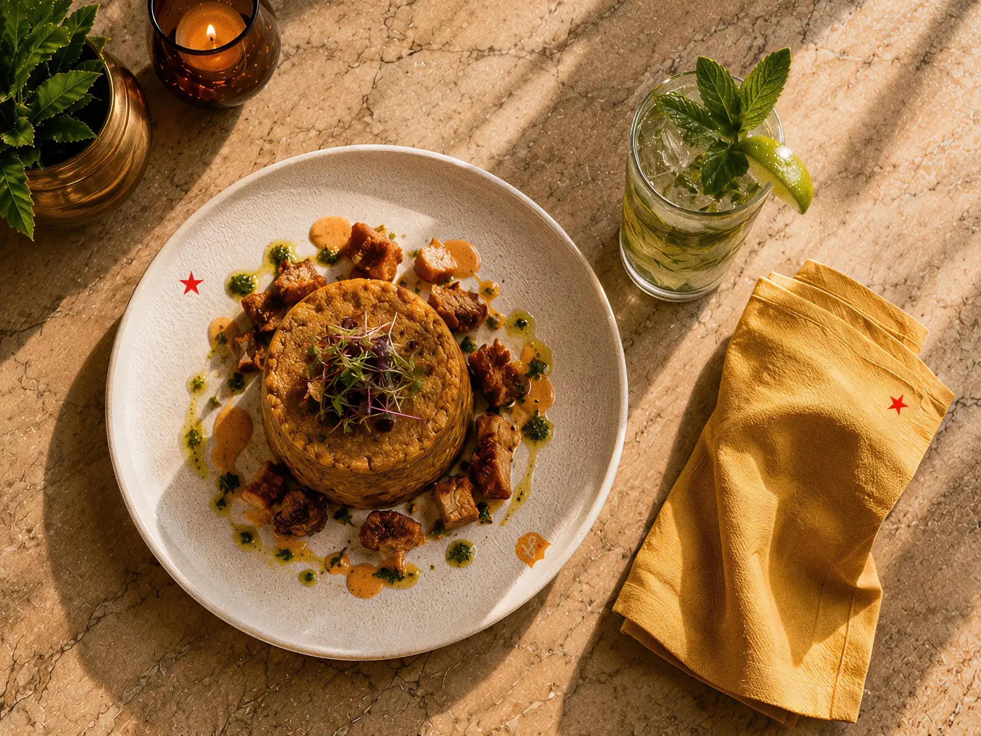
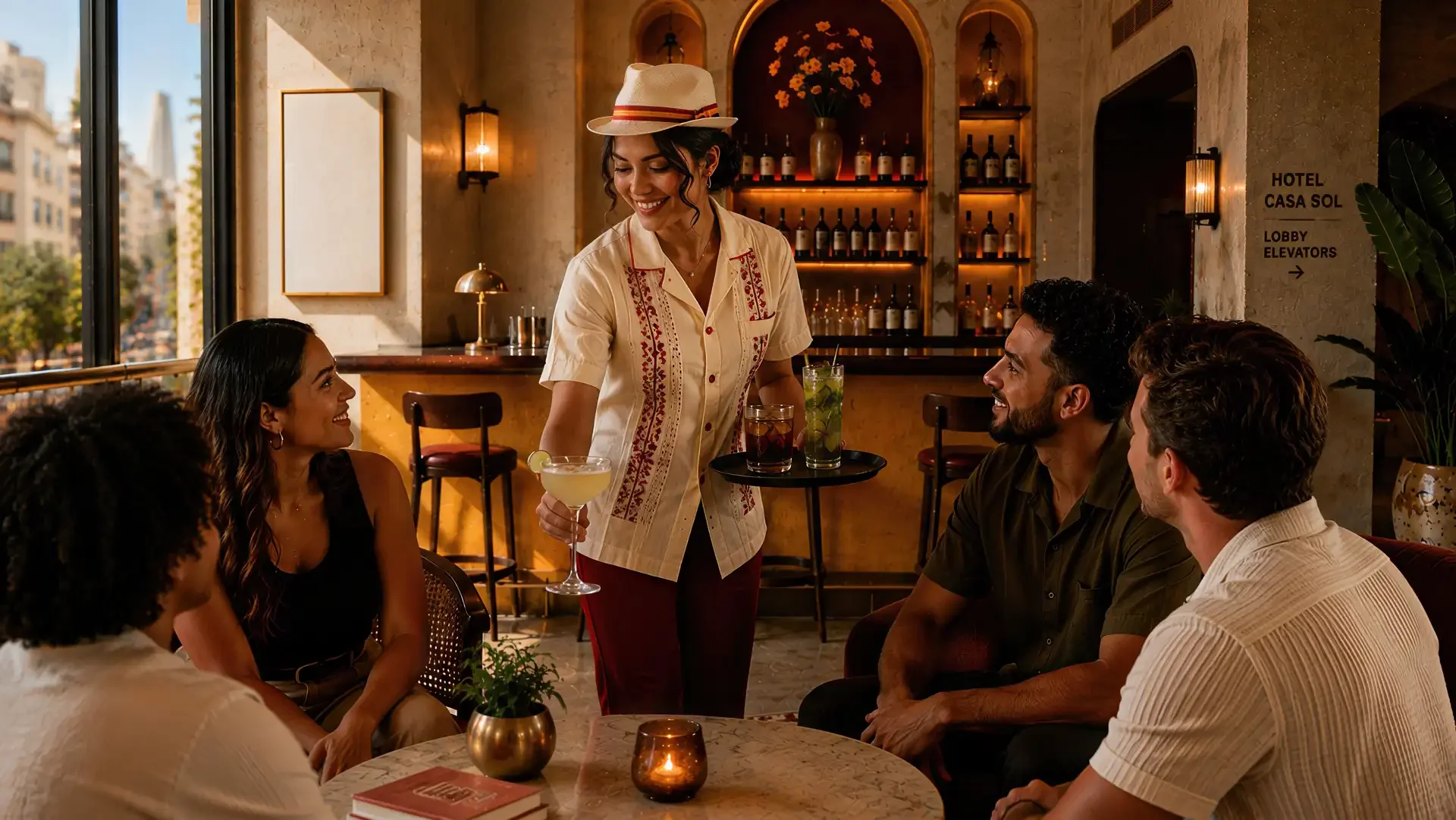
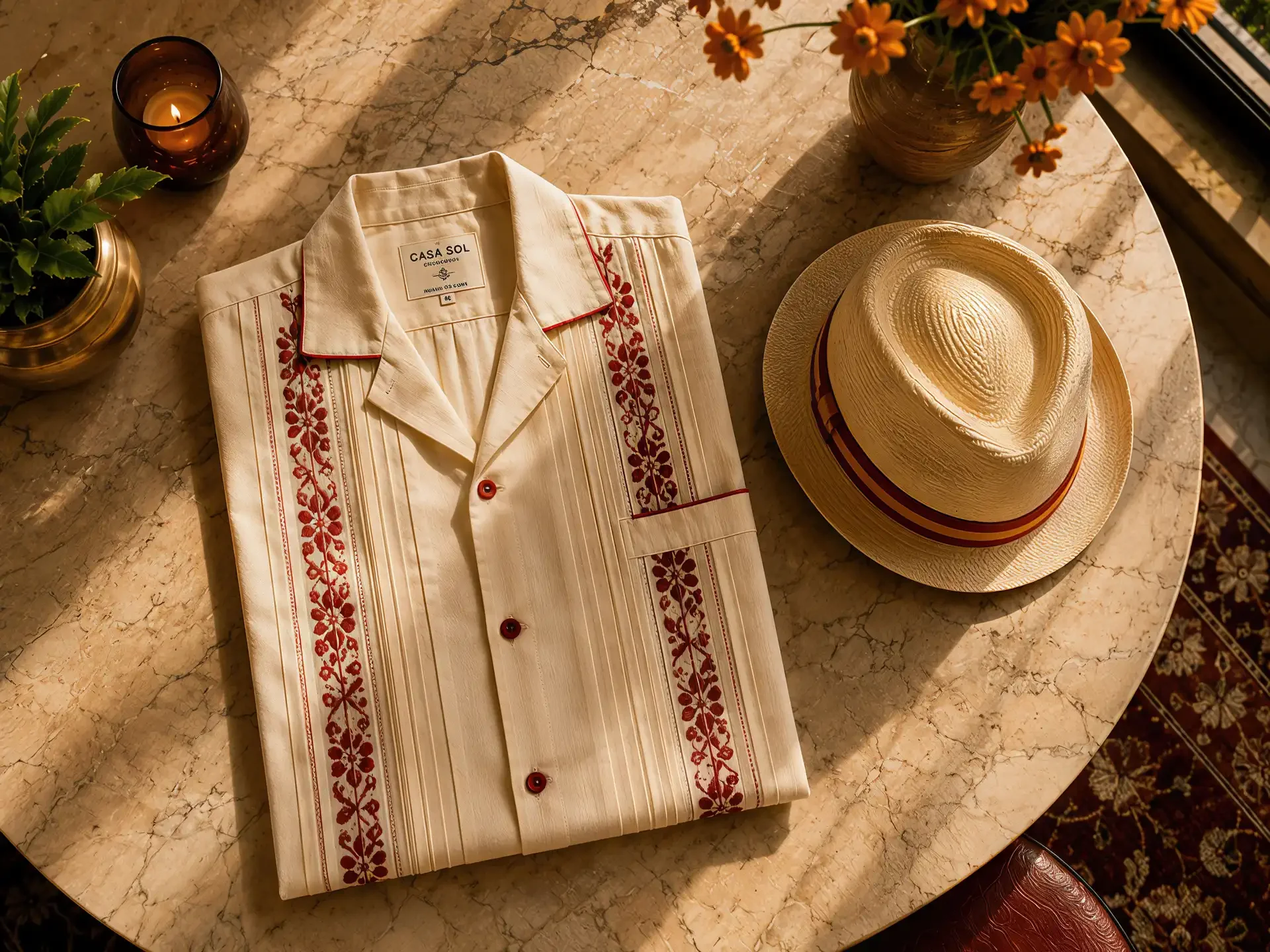
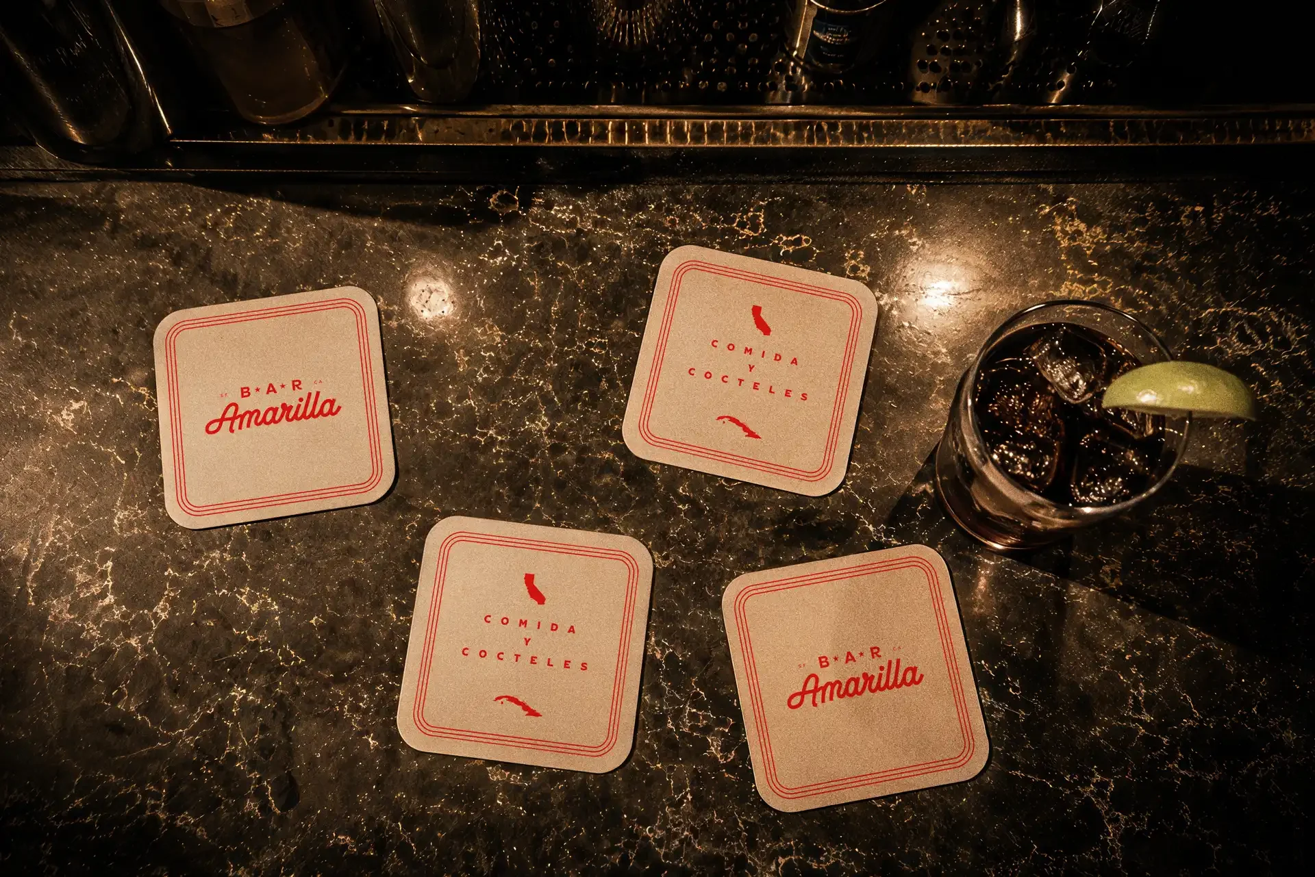
The final layer brings Bar Amarilla down to the scale of individual interactions.
Uniforms draw from the guayabera without becoming theatrical, using the familiar silhouette as a starting point and introducing Amarilla’s yellow and red through considered accents. The goal is for the staff to belong to the environment while still looking like people working in a contemporary San Francisco bar.
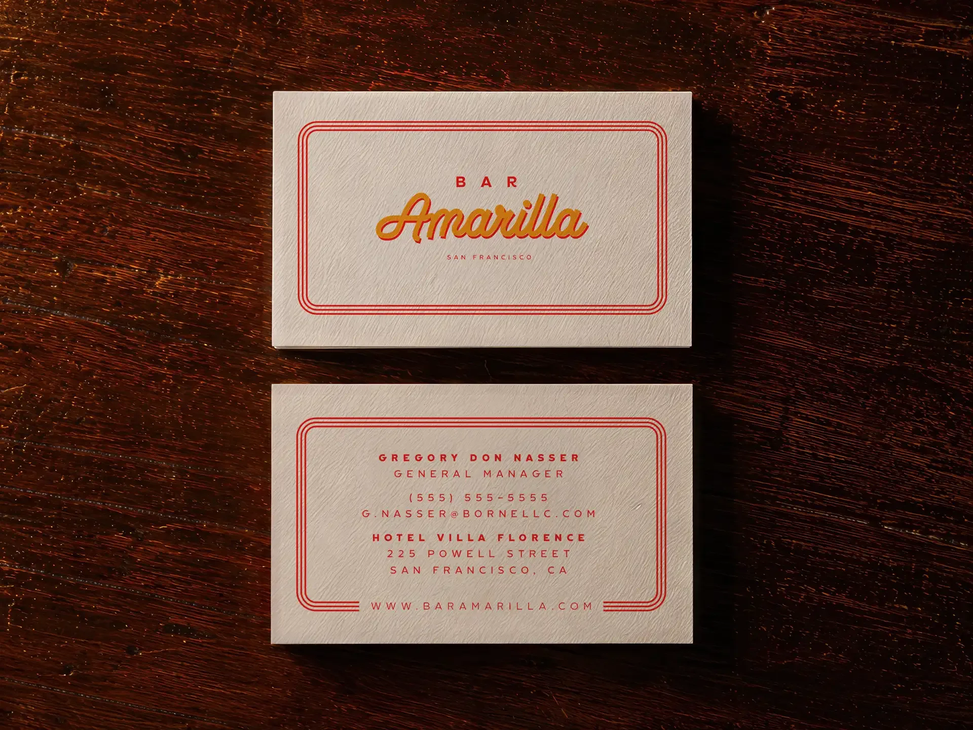
Coasters, business cards, glass graphics and other small-format pieces use the identity more freely. The Amarilla script appears on some while others rely on Spanish copy, the shield or simple graphic devices from the larger system. Together they prevent the brand from becoming overly uniform.
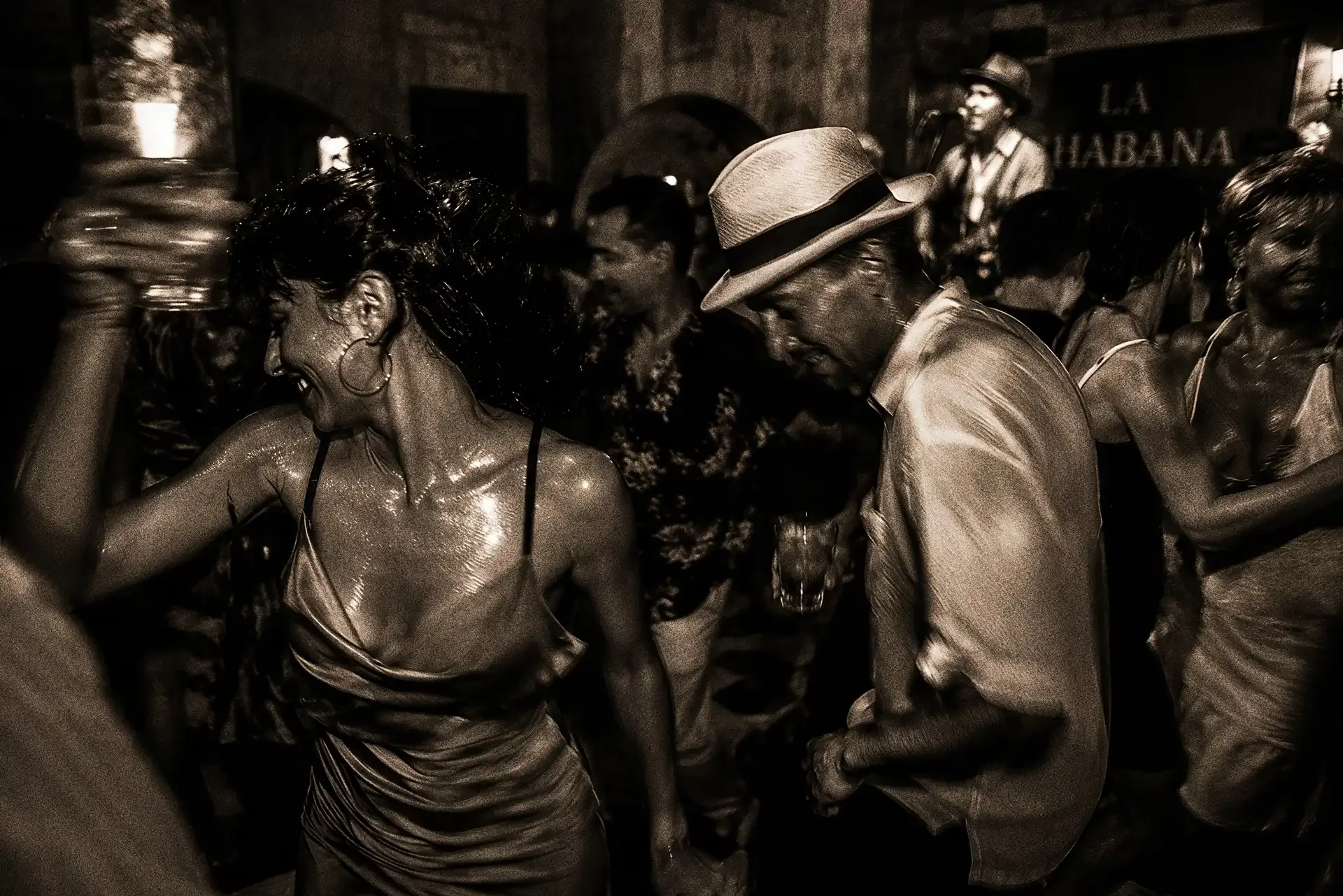
That variety matters because hospitality brands are experienced in fragments. A guest sees the window before the menu, the bartender before the bottle, the coaster before the check. Very few people encounter the identity as a neatly organized brand standards presentation.
They experience a place.
Bar Amarilla was designed accordingly. The name, interiors, signage, menus, spirits, uniforms and smallest pieces of collateral all originate from the same idea, but each expresses it differently. Havana provides warmth and rhythm. San Francisco gives it a home. The golden California poppy and the red-breasted Tocororo provide symbols of each place.
The result is a bar that belongs to both without trying to imitate either.
Project Recap