

Brand Evolution for FATBurger
Founded in Los Angeles in 1952 by Lovie Yancey, FATBURGER grew from a humble hamburger stand into an American restaurant icon. What began as a neighborhood favorite rooted in Southern California culture expanded across the United States and around the world, earning a loyal following through made-to-order burgers, unmistakable personality, and deep connections to music, entertainment, and street culture. Even as the brand grew, it never lost its California roots. FATBURGER remained a distinctly West Coast experience, carrying with it the optimism, individuality, and laid-back confidence that define the region.
While the food remained beloved, the brand itself had begun to lose momentum. The identity felt increasingly disconnected from the culture that made FATBURGER special in the first place. As competitors evolved their experiences and sharpened their positioning, FATBURGER relied heavily on heritage and familiarity. The result was a brand that remained recognizable but felt stuck in place.
The bankruptcy of parent company FAT Brands created an unexpected opportunity. While bankruptcy often carries negative perceptions, it also creates a rare moment for reflection and reinvention. Emerging from that chapter offered FATBURGER the chance to leave behind the weight of corporate turmoil and reconnect with the spirit that fueled its rise. Rather than treating the moment as a recovery effort, this rebrand views it as a rebirth.
This independent rebrand exploration reimagines FATBURGER through the lens of its California heritage, blending vintage charm with contemporary relevance. The goal was not to reinvent the brand, but to rediscover what made it memorable and express it in a way that feels fresh, inviting, and culturally relevant for a new generation of guests.
Year
2026
Client
FATBURGER
Client Type
Restaurant
Location(s)
West Coast, USA
QSR, Quick Serve Restaurant
Category
Services
Brand Strategy, Visual Identity, Verbal Identity, Packaging, Uniform & Apparel, Advertising & Marketing
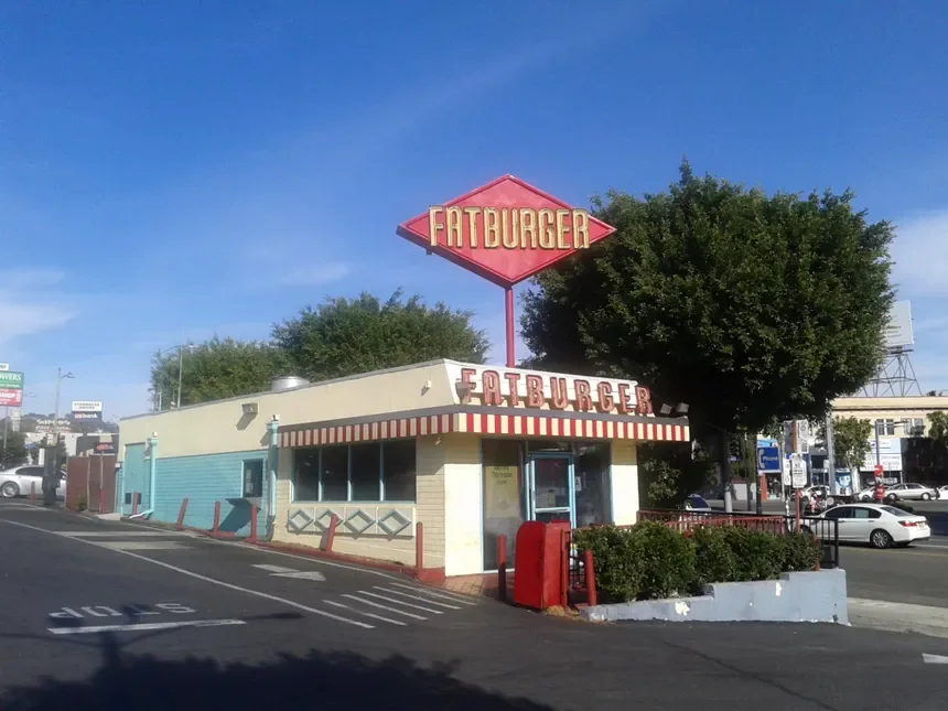

Existing Identity
Shifting the brand Strategy
The strategy centered on reclaiming the California mindset that made FATBURGER iconic. Over time, the brand’s connection to Southern California had become muted, leaving behind visual assets and messaging that lacked the energy and personality associated with its origins. This rebrand sought to bring that spirit back to the forefront and transform it into something people everywhere could embrace. California was treated not as a location, but as a feeling. Freedom, optimism, sunshine, individuality, and a carefree approach to life became the foundation of the brand experience.
At the same time, the rebrand sought to preserve the comfort that comes with familiarity. FATBURGER possesses decades of equity, and abandoning that history would mean abandoning one of the brand’s greatest strengths. Rather than choosing between nostalgia and modernity, the identity was built around both. Vintage influences were refined through a contemporary lens, creating a system that feels timeless rather than dated. The result is a brand that honors its heritage while remaining relevant to today’s audience.
Most importantly, the strategy aimed to restore a sense of fun. The burger category has become increasingly serious, crowded with brands focused on craftsmanship, ingredients, and operational efficiency. While those attributes matter, they do little to create emotional connection. FATBURGER earned its place in culture by being approachable, energetic, and full of personality. This rebrand embraces that heritage by celebrating the carefree spirit, bright colors, and joyful attitude that have long been associated with California culture.
Three personality traits guided every decision throughout the rebrand: California Vibes, Retro, and Happy. Together, they created a framework for developing an experience that feels nostalgic without feeling old, contemporary without feeling sterile, and memorable without taking itself too seriously.
Cali Rooted
Retro
Happy
Restaurant visual identity design
The previous FATBURGER identity carried decades of brand equity, making evolution a far more appropriate path than reinvention. The goal was to preserve the familiarity guests have come to recognize while refining the visual system to better reflect the brand’s renewed energy, California roots, and contemporary relevance.
At the center of the identity is an updated wordmark that builds directly upon the visual language of the original logo. The typography retains the bold, unmistakable presence that has long defined FATBURGER while introducing a cleaner, more refined structure that improves legibility and adaptability across modern applications. The result is a mark that feels familiar at first glance yet noticeably more confident and current upon closer inspection.
One of the most distinctive elements of the new identity is the layered line treatment within the letterforms. While visually unique within the burger category, the detail serves a deeper purpose than decoration alone. The parallel lines subtly reference the marks left behind by a hot grill, creating a mnemonic connection to the cooking process and the flavor experience that has always been central to the brand. By embedding this visual cue directly into the logo, the identity reinforces product quality and craftsmanship without relying on literal illustrations or predictable restaurant clichés.
The surrounding identity system follows the same philosophy. Heritage-inspired shapes and proportions preserve the nostalgic character that guests associate with FATBURGER, while cleaner geometry and a simplified structure bring greater consistency and flexibility to the brand. The result strikes a balance between vintage and modern, allowing the brand to celebrate its history without appearing trapped by it.
Together, these changes create an identity that feels distinctly FATBURGER. It honors the visual equity accumulated over more than seventy years while introducing new assets that increase recognition, improve usability, and reinforce the brand’s renewed positioning. The identity does not attempt to erase the past. Instead, it builds upon it, creating a system that feels both familiar and invigorated, much like the brand itself.

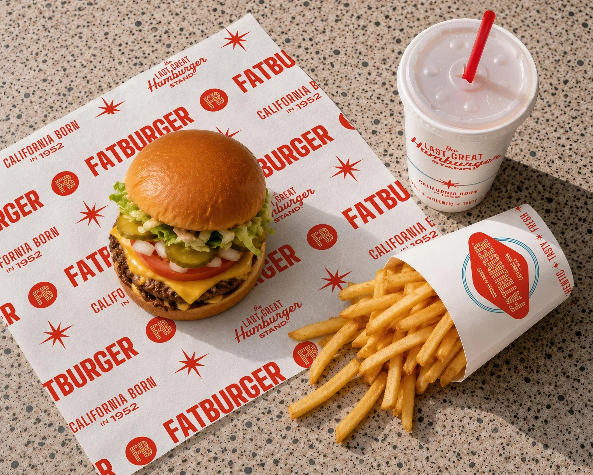


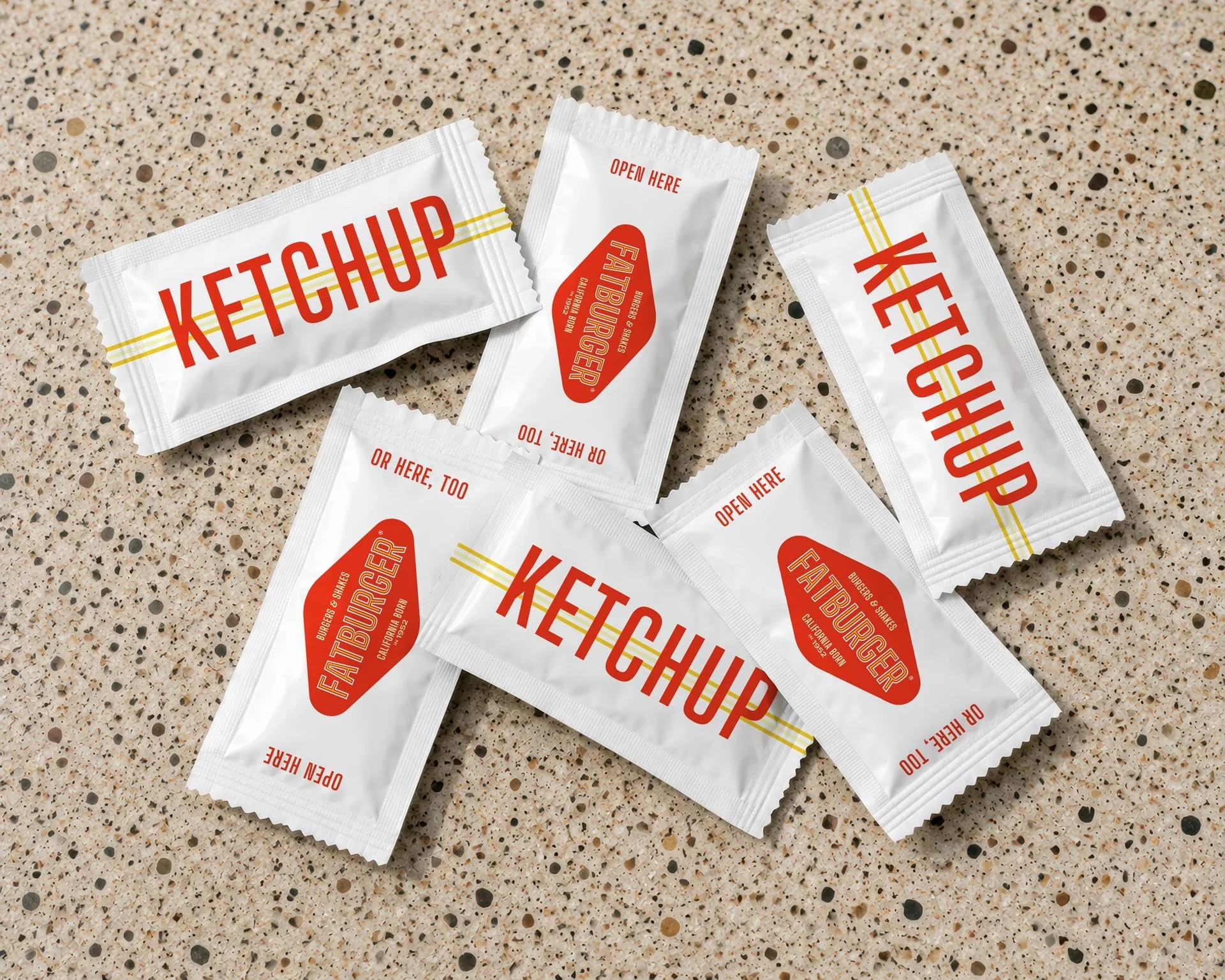
Restaurant packaging Design
Packaging is where the brand leaves the building. It travels home, rides in passenger seats, sits on office desks, and shows up in social feeds. Every bag, cup, wrapper, and condiment packet becomes an opportunity to reinforce what FATBURGER stands for long after the order is placed.
The packaging system was designed to capture the same balance of nostalgia and modernity established in the identity. Drawing inspiration from classic California diners, roadside burger stands, and mid-century design, the system embraces simplicity, confidence, and personality. Bright colors, bold typography, and vintage-inspired details create an experience that feels familiar without feeling dated.
Rather than relying on heavy graphics or cluttered layouts, the packaging uses restraint to create impact. White space allows the identity room to breathe while signature brand elements provide moments of recognition throughout the experience. The result feels cleaner, more premium, and more intentional while remaining approachable and distinctly FATBURGER.
The California influence extends throughout the system. The custom starburst graphic, coastal blue accents, and “California Born in 1952” messaging reinforce the brand’s roots while transforming them into an asset that guests everywhere can connect with. California is presented as a mindset rather than a location. It represents optimism, sunshine, freedom, and a carefree approach to life that has long been associated with the state’s culture.
The packaging was also designed as a complete family rather than a collection of individual pieces. Bags, cups, fry containers, wrappers, and condiments work together as a cohesive system that creates consistency across dine-in, takeout, and delivery experiences. Whether a guest interacts with a single ketchup packet or a full meal spread, every touchpoint contributes to the same visual story.
Small details were intentionally used to inject personality into the experience. Playful messaging, oversized typography, and unexpected moments throughout the system create opportunities for discovery and delight. These details reinforce a brand that no longer feels corporate or transactional. They create a sense of character that mirrors the energy and optimism at the heart of the rebrand.
The result is a packaging system that does more than hold food. It transforms everyday brand touchpoints into reminders of what makes FATBURGER different. It celebrates the brand’s California heritage, reinforces its renewed personality, and creates a recognizable experience that guests can carry with them long after the meal is finished.


Restaurant advertising Design
Advertising is where the brand steps out of the restaurant and into culture.
For FATBURGER, the goal was not simply to promote burgers. It was to reinforce the California spirit that has defined the brand since 1952. Every campaign, activation, and sponsorship was designed to extend that identity beyond the four walls and create a consistent story wherever guests encountered the brand.
The creative system draws heavily from the optimism, freedom, and nostalgia associated with California living. Palm-lined streets, beach culture, classic automobiles, and endless sunshine become visual devices that transform advertising from product promotion into lifestyle expression. The result is work that feels unmistakably FATBURGER while giving the brand territory beyond food photography and discount-driven messaging.
Out-of-home advertising was designed to command attention through simplicity and confidence. Large-format burger photography, bold typography, and playful headlines create immediate impact while reinforcing the brand’s personality. Rather than overwhelming audiences with product details, the work focuses on creating memorable moments that connect appetite with emotion. The advertisements celebrate indulgence, fun, and the carefree energy that sits at the center of the brand.
On-premise activations were approached as extensions of the guest experience rather than standalone marketing materials. Window graphics, promotional displays, and environmental touchpoints work together to create a cohesive atmosphere that reinforces the brand story at the point of purchase. Every surface becomes an opportunity to remind guests what makes FATBURGER different while creating a more immersive dining experience.
The system was also developed to support experiential and sponsorship opportunities. Surf culture provided a natural extension of the brand’s California heritage, leading to branded surfboards and lifestyle-driven sponsorship assets that feel authentic to the story rather than manufactured for marketing purposes. These activations allow FATBURGER to participate in cultural moments that align with its identity while building relevance beyond traditional restaurant advertising.
To further extend the brand into the real world, custom vehicle graphics were created for catering, events, and promotional appearances. Inspired by classic California cruisers and beach culture, the vehicle program transforms transportation into a moving brand experience. Whether serving guests at community events, private parties, or public activations, the vehicles create visibility while reinforcing the brand’s playful and nostalgic character.
Together, these advertising initiatives create a connected ecosystem of touchpoints that move beyond transactional messaging. They transform FATBURGER from a place people visit into a brand people encounter throughout their day. Every billboard, bus shelter, storefront, surfboard, and catering vehicle works toward the same objective: celebrating the California-born spirit that continues to drive the brand forward.
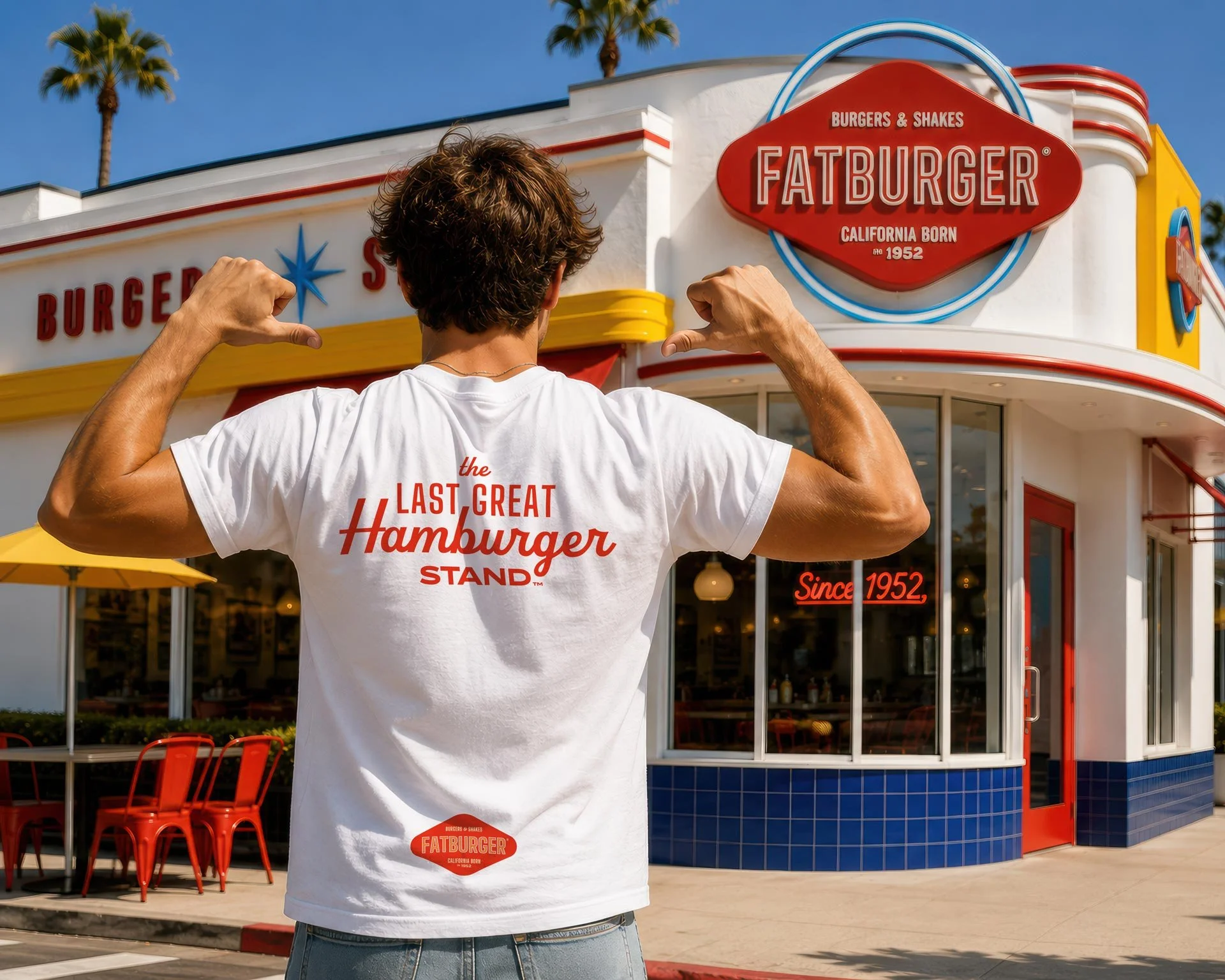

Restaurant Apparel & Merchandise Design
Great restaurant brands do not stop at the transaction. They create symbols people want to carry into their daily lives. Apparel and merchandise provide an opportunity to transform guests into participants, giving them a way to express their connection to the brand beyond the dining experience.
The merchandise program was built around the same California-inspired spirit that guided the broader rebrand. Rather than functioning as promotional giveaways, each piece was designed to feel like something guests would genuinely want to wear, use, and collect. The goal was to create merchandise that could comfortably exist alongside contemporary lifestyle brands while still feeling unmistakably FATBURGER.
The apparel system embraces the confidence and humor that have always been embedded within the brand’s name. Playful statements such as “Fat Boy & Proud” and “Fat Girl & Proud” reclaim the brand’s heritage in a way that feels lighthearted, self-aware, and memorable. These designs celebrate indulgence rather than apologizing for it, reinforcing the unapologetic personality at the center of the brand.
Vintage-inspired typography, retro color palettes, and simplified graphics create a collection that feels rooted in classic California culture. Influences from surf shops, beach towns, roadside attractions, and mid-century souvenir apparel help position the merchandise as an extension of the lifestyle rather than simply another restaurant-branded product.
The collection was also designed to support both guests and team members. Signature logo apparel, heritage graphics, and lifestyle-driven pieces create opportunities for fans to engage with the brand while providing employees with uniforms that feel more connected to the brand’s personality. This creates consistency between the guest experience and the people who represent the brand every day.
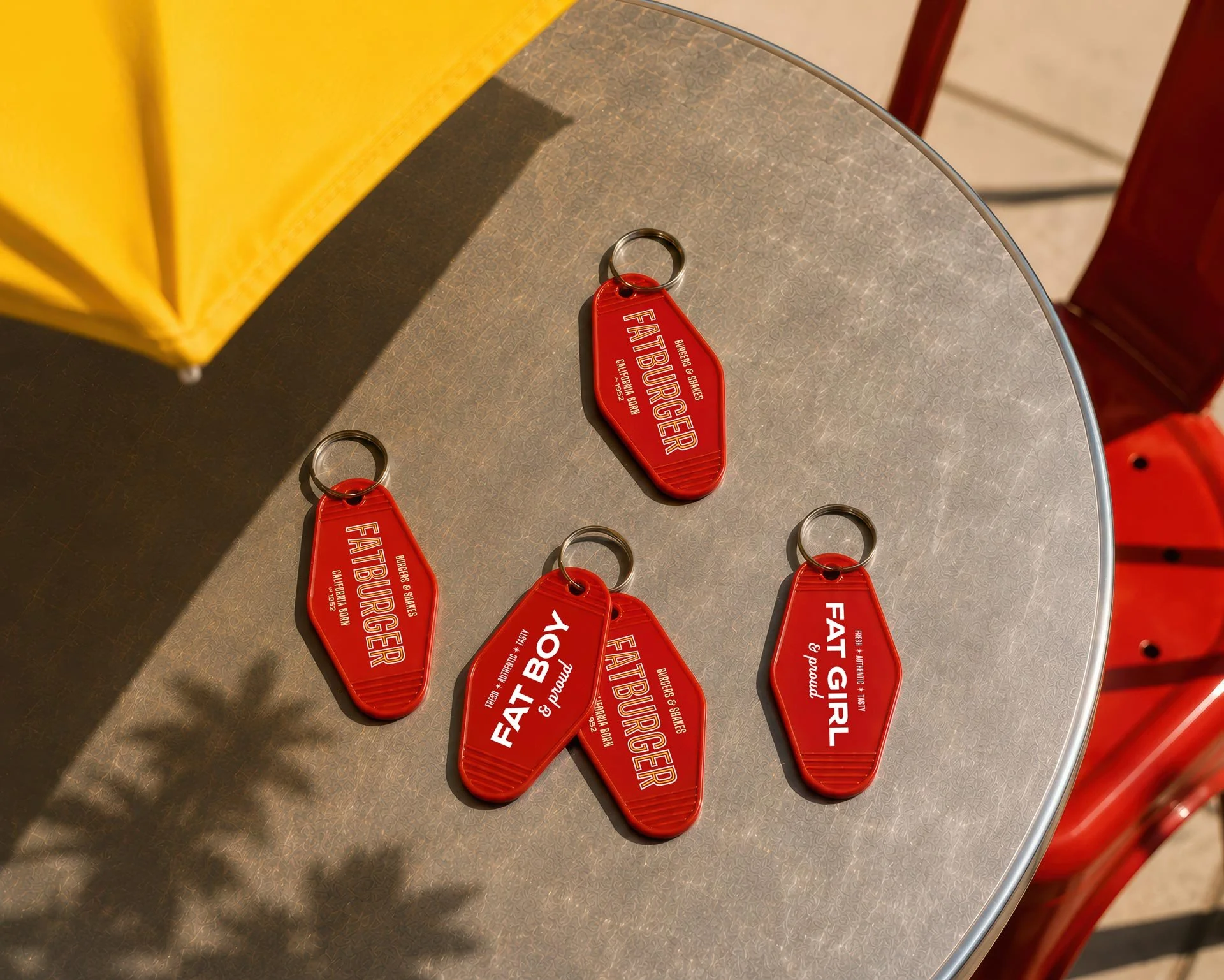
Beyond apparel, merchandise was expanded into collectible items inspired by classic roadside travel culture. Custom motel-style key tags serve as both practical objects and nostalgic keepsakes, drawing inspiration from the golden age of California road trips and destination dining. These small touchpoints reinforce the brand’s heritage while creating highly shareable artifacts that guests can take with them.
The result is a merchandise system that functions as more than branded apparel. It extends the FATBURGER experience beyond the restaurant, builds affinity through participation, and gives guests tangible ways to connect with the brand. By combining nostalgia, humor, and California culture, the collection helps transform customers into advocates and strengthens the emotional connection that great brands are built upon.

Restaurant Interior & Exterior Design
A brand is not experienced through a logo alone. It is experienced through places. The architecture, signage, lighting, materials, furniture, and atmosphere all contribute to how people feel the moment they arrive. To fully explore how the rebrand could come to life, the project extended beyond visual identity and into a complete reimagining of the FATBURGER environment.
Using AI-assisted visualization tools, existing FATBURGER locations were reinterpreted through the lens of the new brand strategy. The goal was not to create futuristic concept stores or dramatic architectural statements. It was to imagine how FATBURGER could reconnect with its California roots while creating a more memorable and emotionally engaging guest experience.
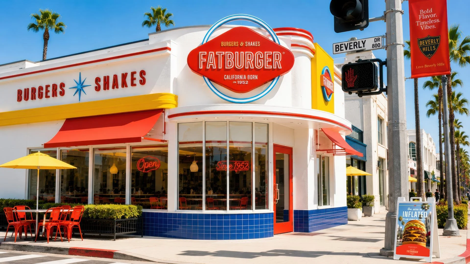
The exterior design draws inspiration from classic Southern California burger stands and mid-century roadside architecture. Bright colors, rounded forms, oversized signage, and large expanses of glass create an inviting presence that feels instantly recognizable from the street. The refreshed façade embraces the optimism and energy associated with California while allowing the updated identity to become a true architectural feature rather than simply applied signage. The result is a restaurant that feels vibrant, approachable, and full of personality.
Inside, the experience balances nostalgia with contemporary comfort. Red vinyl seating, terrazzo flooring, chrome accents, neon signage, and diner-inspired details pay homage to the brand’s heritage while maintaining a clean and modern presentation. Historic photography, branded environmental graphics, and references to California culture help tell the story of the brand throughout the space without overwhelming the guest experience.
Particular attention was given to creating a stronger sense of place. Many restaurant interiors today feel interchangeable, sacrificing personality in favor of efficiency. This concept moves in the opposite direction. Every design decision reinforces the idea that FATBURGER is California born and proud of it. Palm-lined boulevards, beach culture, classic automobiles, and the golden age of burger stands all influence the environment, creating an experience that feels rooted in a specific identity rather than following generic fast-casual trends.
The use of AI throughout this process allowed the brand vision to be explored at a level traditionally reserved for large-scale architectural projects. Instead of relying solely on written descriptions or mood boards, fully realized environments could be visualized and evaluated in context. This enabled the exploration of signage systems, material palettes, lighting approaches, furniture selections, and environmental graphics as part of a cohesive experience.
While these concepts remain speculative, they demonstrate how the rebrand could extend far beyond graphic design. The strongest brands create consistency across every touchpoint, from the sign on the building to the tray on the table. By reimagining both the interior and exterior environments, this project explores what a fully realized FATBURGER experience could look like when its California heritage, retro personality, and optimistic spirit are allowed to shape the entire guest journey.

Project Recap
This project began with a simple question: what would happen if FATBURGER treated a pivotal business moment as an opportunity to evolve rather than simply recover?
The answer was not a reinvention, but a rediscovery. By reconnecting the brand to the California culture, optimism, and personality that fueled its original success, the rebrand establishes a foundation that feels both familiar and relevant. The updated identity, packaging, advertising, merchandise, and environmental concepts work together to create a more cohesive expression of what FATBURGER has always been at its best.
From the grill-inspired typography and retro visual language to the packaging, lifestyle advertising, and reimagined restaurant environments, every decision was guided by the same objective: celebrate the brand’s heritage while giving it renewed energy for the future.
This was never intended to be an exercise in changing FATBURGER for the sake of change. It was an exploration of how a beloved brand could reclaim its story, embrace its roots, and create a stronger emotional connection with a new generation of guests.
California born. Still cruising. Still serving great burgers. Still FATBURGER.