
Brand Evolution for Duck Donuts
Duck Donuts, a beloved donut franchise known for its warm, made-to-order donuts and quirky duck mascot, needed a comprehensive brand evolution to sharpen their market position and deepen connections with their core customers. While the brand had built a loyal following since its beachside origins in Duck, North Carolina, their identity lacked strategic focus and consistency across touchpoints.
I led a complete brand transformation spanning strategic positioning, audience research, visual and verbal identity systems, packaging redesign, and campaign development. The result: a cohesive, emotionally resonant brand that gives busy parents permission to embrace moments of pure joy.
Year
2025
Client
Duck Donuts
Client Type
QSR, Snack
Location(s)
Global
Research, Workshop, Brand Strategy, Audience Profiling, Verbal Identity, Visual Identity, Packaging Design, Advertising, Brand Guidelines
Services
Shifting the brand Strategy
Through stakeholder interviews and market analysis, we repositioned Duck Donuts around a clear strategic framework:
Archetype: The Innocent
We identified The Innocent as the archetype that would best resonate with Duck Donuts' audience—a brand personality that celebrates simple pleasures, playfulness, and optimism. The Innocent archetype gave the brand permission to champion joy without irony and embrace whimsy without apology.
Purpose Statement
Building from this foundation, I developed a purpose that captured the brand's reason for being: "Deliver Moments of Pure Joy"
This purpose acknowledged that Duck Donuts exists to provide brief respites from the demands of modern life, moments where customers can embrace childlike wonder through warm, customizable donuts.
Playful
Creative
Caring


Restaurant Patron Profiling
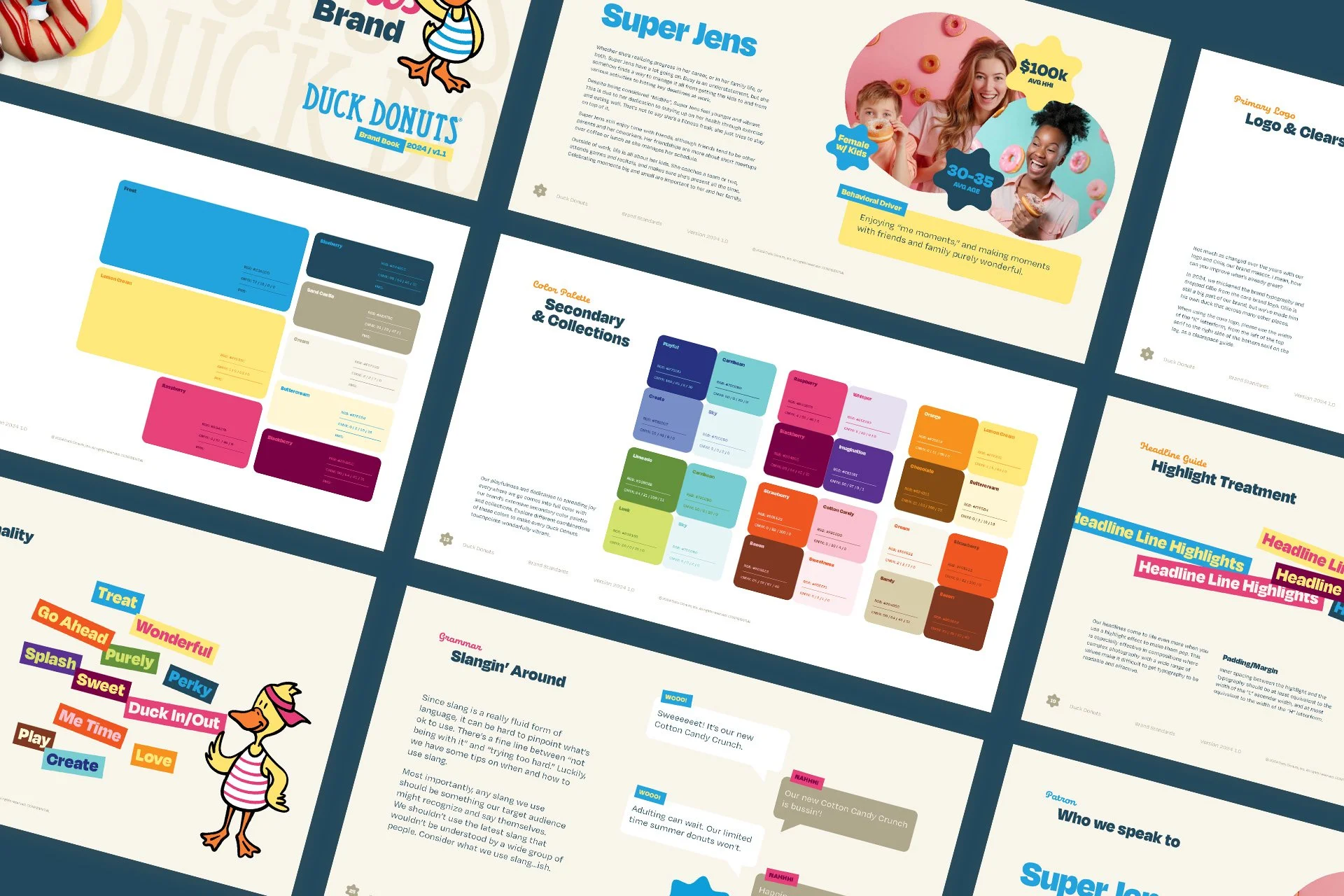
Through extensive research and analysis, we identified Duck Donuts' primary patron group and gave her a name: Super Jens. She's a 30-35-year-old female with children and an average household income of $100k, navigating the peak complexity years of life—advancing in her career while managing the logistics of family life. She's perpetually busy, juggling work deadlines, kids' activities, household management, and trying to maintain her own identity. Despite being "midlife," she doesn't feel middle-aged and actively resists that label. She's health-conscious but realistic, values friendships though interactions are often brief, and makes sure to mark moments big and small with her family.
The key insight that unlocked the entire strategy was understanding her behavioral driver: "Enjoying 'me moments,' and making moments with friends and family purely wonderful." Super Jens seeks permission to step away from responsibilities and embrace simple joys, both alone and with loved ones. Understanding what she wants to project to the world helped shape brand messaging—she wants to be seen as Fun (the entertaining mom and coworker), Youthful (maintaining vibrance despite increasing responsibilities), and On It (reliable, organized, always finding great solutions). Her affinity brands include Kia, Party City, and Etsy for fun; Girl Scouts, Nike, and TikTok for youthfulness; and Stanley, Target, and Real Simple for being on it. This insight informed how Duck Donuts should position itself within Super Jens' brand ecosystem—as a permission-giving treat that supports her identity.


Restaurant Identity Design
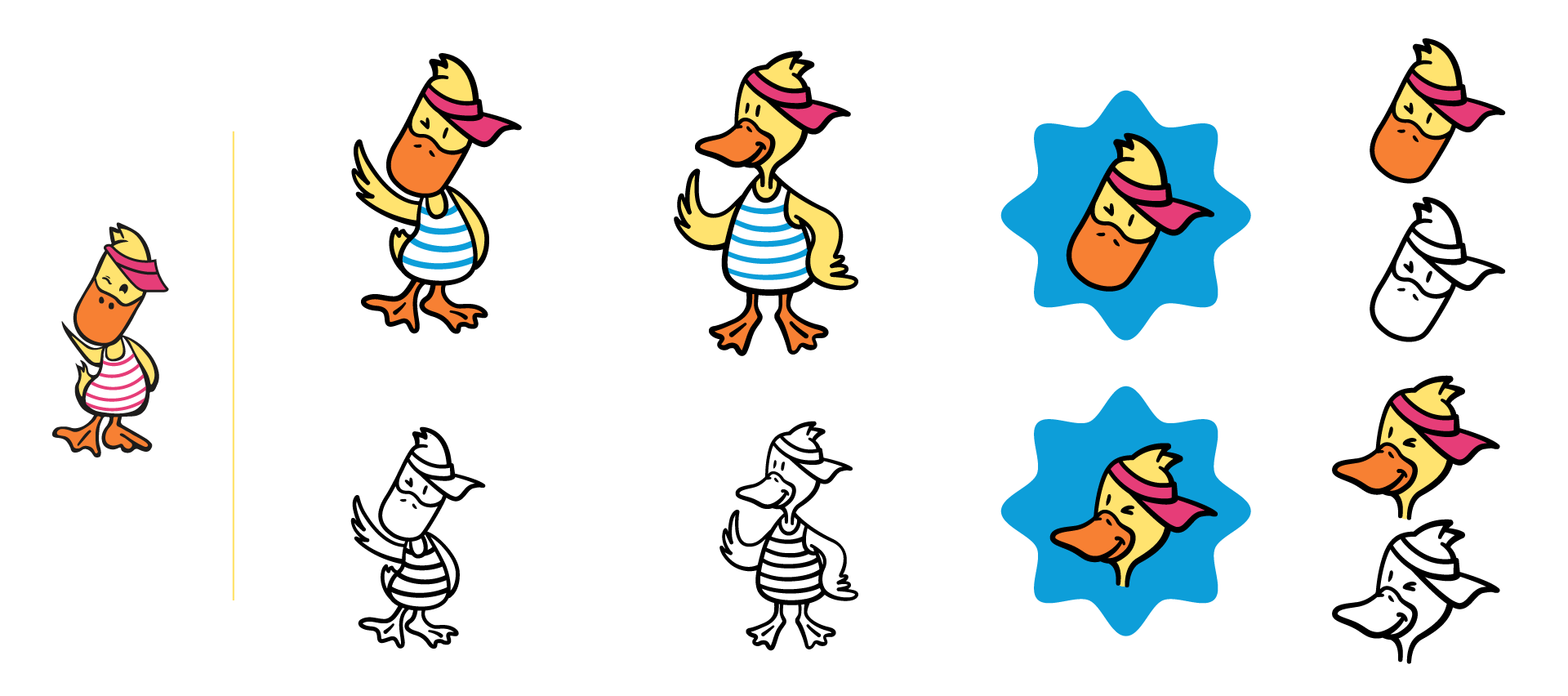
The brand's beloved mascot, Ollie, received a thoughtful modernization that simplified linework for cleaner reproduction at any size, smoothed angles and refined proportions for better visual harmony, and maintained the character's charm while improving technical execution. Rather than prescribing rigid rules, we created a flexible system with versatile applications including full-body Ollie for prominent placements, an Ollie head icon for compact spaces, and black and white versions for single-color applications. This approach allows Ollie to appear in various contexts while maintaining recognizability—standing, sitting, peeking around elements, or integrated with typography.
We selected Degular Display as the headline typeface for its perfect balance of personality and readability, featuring bold, modern letterforms with playful rounded terminals and excellent legibility at distance, which is critical for signage. Eldwin Script serves as the secondary typeface for subtitles and accent treatments, adding a handcrafted, personal touch while reinforcing creative and caring personality traits. We developed a signature approach to headlines that brings playfulness to life through multi-line compositions with alternating angles of plus or minus 1.5 and 3 degrees, varied sizes and weights within a single headline (staying within 30% of each other), creating an energetic, approachable feel without sacrificing readability. Headlines can be enhanced with colored highlight boxes featuring inner padding and high-contrast color combinations from the brand palette, reinforcing key messages and improving legibility over complex photography.
We dramatically expanded Duck Donuts' color palette to deliver on brand personality and provide creative flexibility. The primary colors forming the core brand identity include Frost (vibrant cyan), Lemon Cream (warm yellow), Blueberry (deep teal), Raspberry (magenta), and neutrals like Sand Castle, Cream, Buttercream, and Blackberry. Beyond these, we organized 24-plus secondary colors into themed collections like Playful, Caribbean, Orange, Raspberry, Strawberry, and Limeade for easy selection. This expansion enables seasonal and promotional variety, reflects the customizable nature of Duck Donuts' products, maintains brand recognition while preventing visual fatigue, and provides options for ADA-compliant color combinations. We also introduced graphic elements including the "Donut Star" (an imperfect six-pointed star shape evoking a donut from above) and imperfect circles with an organic, hand-drawn feeling that suggests donut shapes without being literal. These elements should feel spontaneous and playful, never rigid or overly designed, supporting content rather than dominating it.
Restaurant verbal identity
Duck Donuts speaks like that fun-loving friend who always lifts your mood—warm, playful, and genuinely caring, without trying too hard. The voice is conversational with natural, approachable language; optimistic, focusing on joy and positive moments; permission-giving, encouraging indulgence without guilt; and subtly witty, being clever without forcing it. The brand had previously overused forced "duck" puns, so we created clear criteria for effective usage: use puns that are immediately understood on first glance, replace letters close to "duck" (especially "duct"), feel natural and clever rather than forced, and appear occasionally as delightful surprises. Effective examples include Ducklicious, Producktive, Introducktion, Duckadent, and Conducktor, while puns to avoid include those that replace "tic" with "duck" (like Criduck or Acousducks, which are too difficult to parse), reference profanity or inappropriate content, or exist only because they're possible rather than being aligned with the brand.
We introduced a curated word bank aligned with brand personality, including permission and joy words like Go Ahead, Treat, Reward Yourself, Me Time, and Purely; playful action words like Splash, Duck In/Out, Play, and Create; and emotional connection words like Love, Wonderful, Sweet, and Perky. For contemporary language usage, we created parameters to use slang that Super Jens herself might say, lean toward slang-ish expressions like "adulting" or "sweeeeeet," and keep language accessible to a wide age range, while avoiding chasing the latest trending slang, using expressions that require explanation, or alienating customers who aren't extremely online. Grammar and style principles emphasize sentence case for headlines rather than title case, welcoming contractions, short paragraphs for easy scanning, active voice over passive, and humor through implication rather than explicit jokes.
Restaurant packaging Design
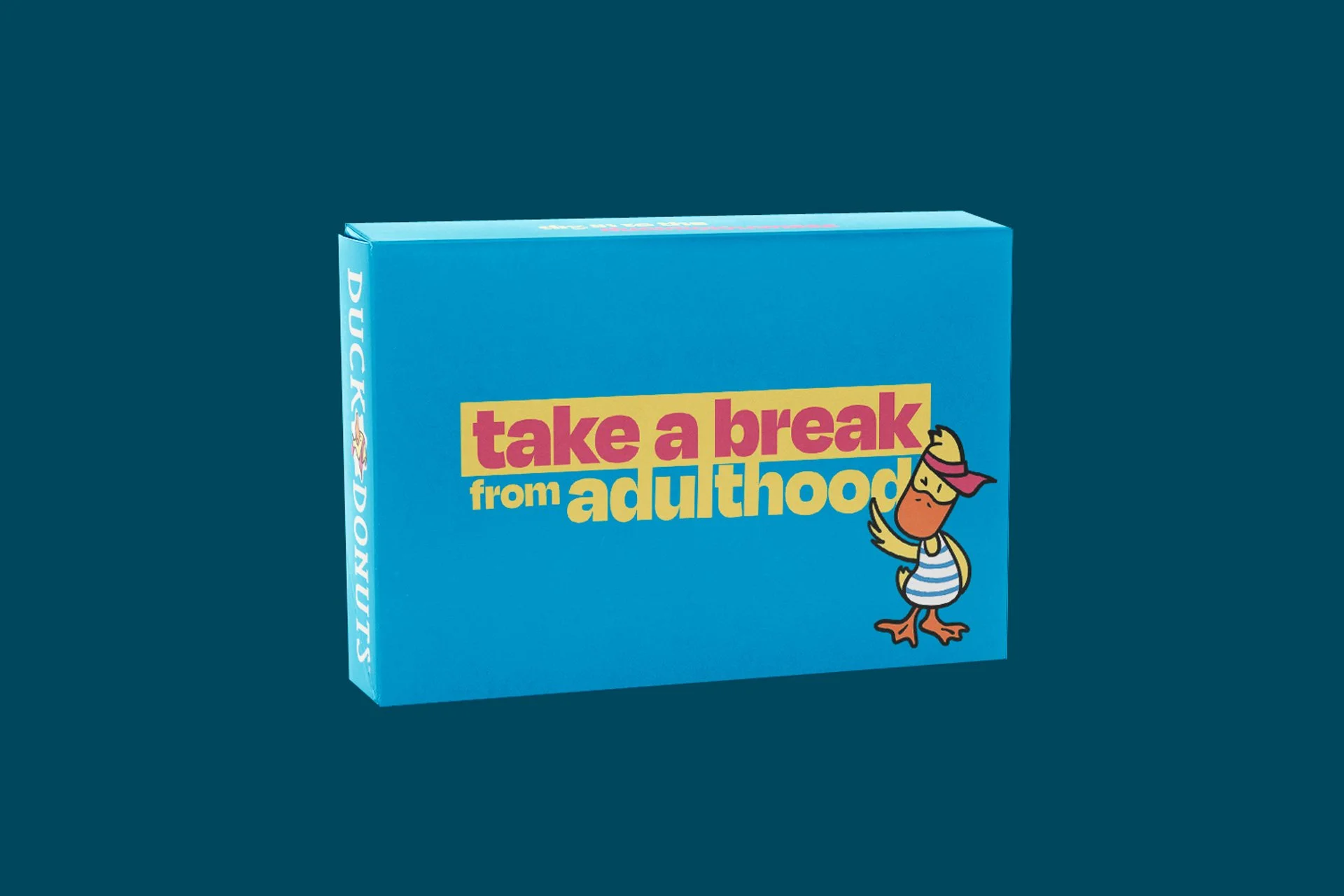
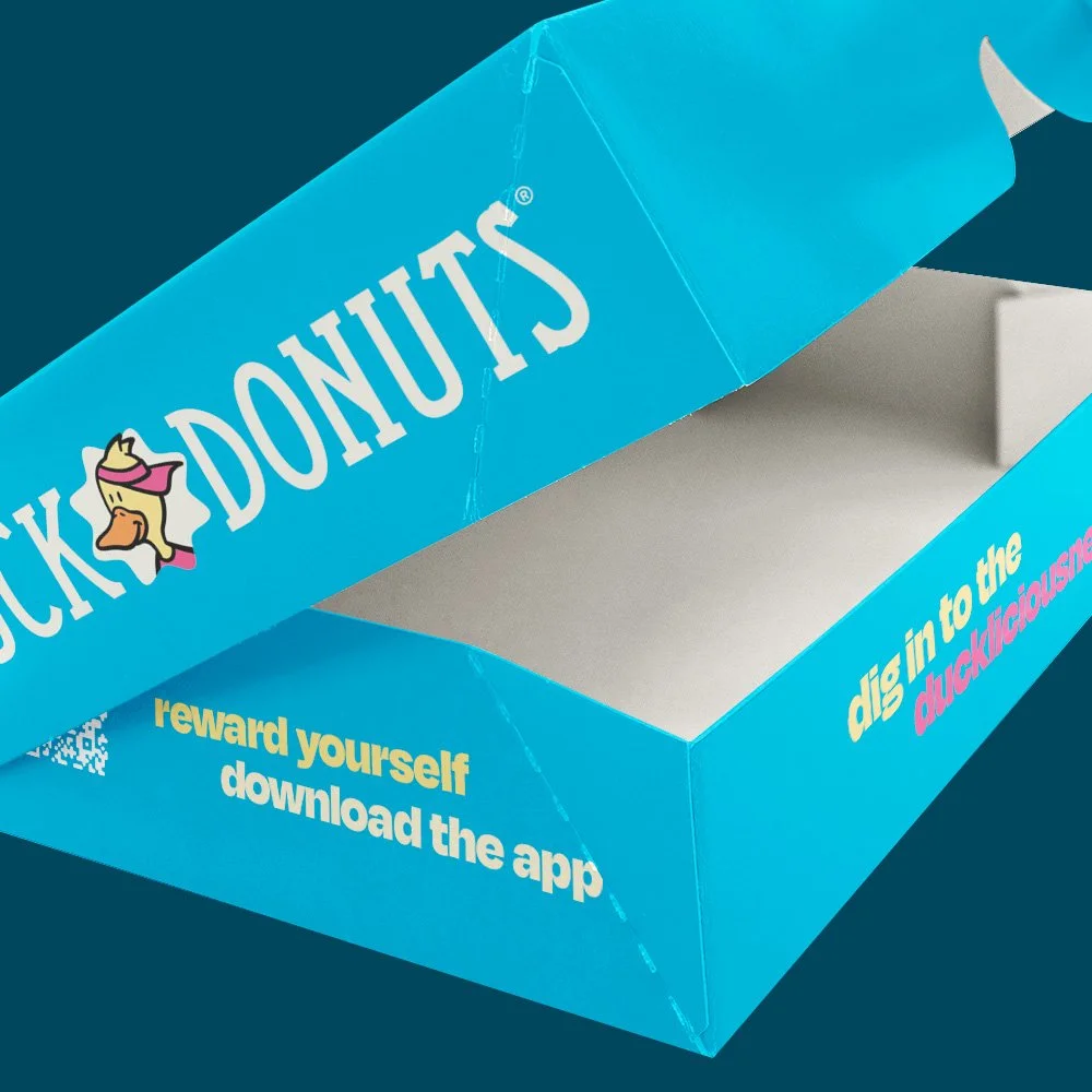
Packaging needed to work hard for Duck Donuts—creating shelf appeal, reinforcing brand identity, and supporting the customer experience from shop to home. The design approach leads with Frost blue as the signature packaging color, features Ollie prominently to build mascot recognition, uses playful typography treatments for flavor names and messaging, and maintains cleanliness and appetite appeal despite vibrant colors. Donut boxes feature a Frost blue base with white typography, the "Take a Break from Adulthood" slogan prominently displayed, the Ollie mascot with striped shirt visible, a clean Duck Donuts logo lockup, promotional callouts like "reward yourself, download the app," and interior messaging visible when opened. The primary color is Frost blue, with seasonal variations in Lemon Cream, Raspberry, and Limeade, plus special collection colors for limited edition holiday releases.
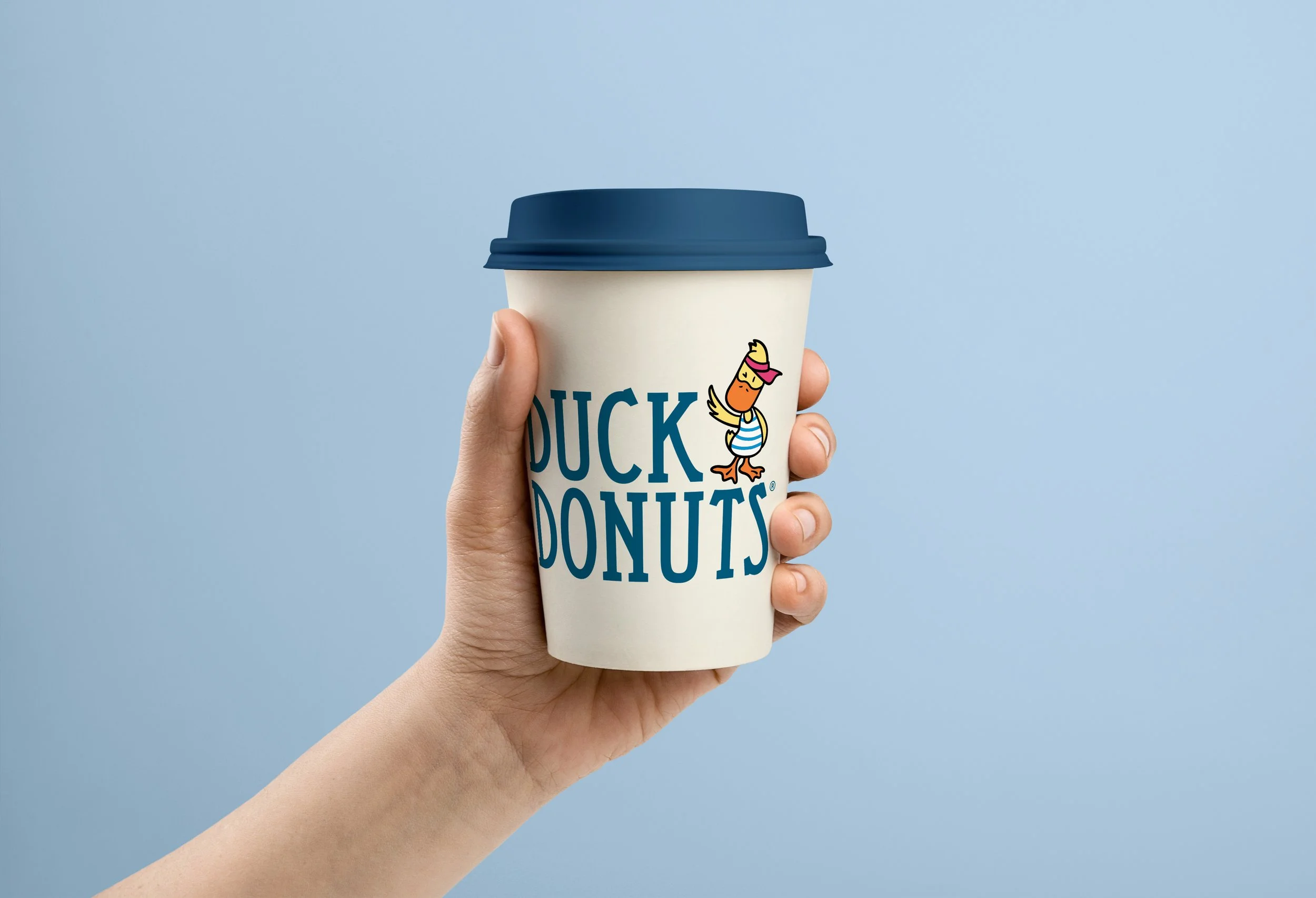
Coffee cups feature a clean white base with Frost blue accents, the Duck Donuts wordmark with Ollie integrated, simplified design for easy recognition, consistent branding across sizes, and navy blue lids for contrast. The high contrast ensures visibility in busy environments, the clean design complements various cafe settings, and the photography-friendly aesthetic encourages social sharing. Supporting packaging including bags uses Frost blue with white Duck Donuts logo and Ollie peeking elements with "dig in to the ducklicious" messaging on the interior, while napkins and accessories take a minimal branding approach with Frost blue or Lemon Cream base colors and only Ollie icon or logo lockup. The cohesive packaging system delivers instant recognition across all touchpoints, an ownable color in Frost blue within a competitive category, shareable moments with packaging designed for social media, a flexible framework supporting seasonal and promotional variations, and premium perception while maintaining approachability.
Restaurant advertising campaign concept Design
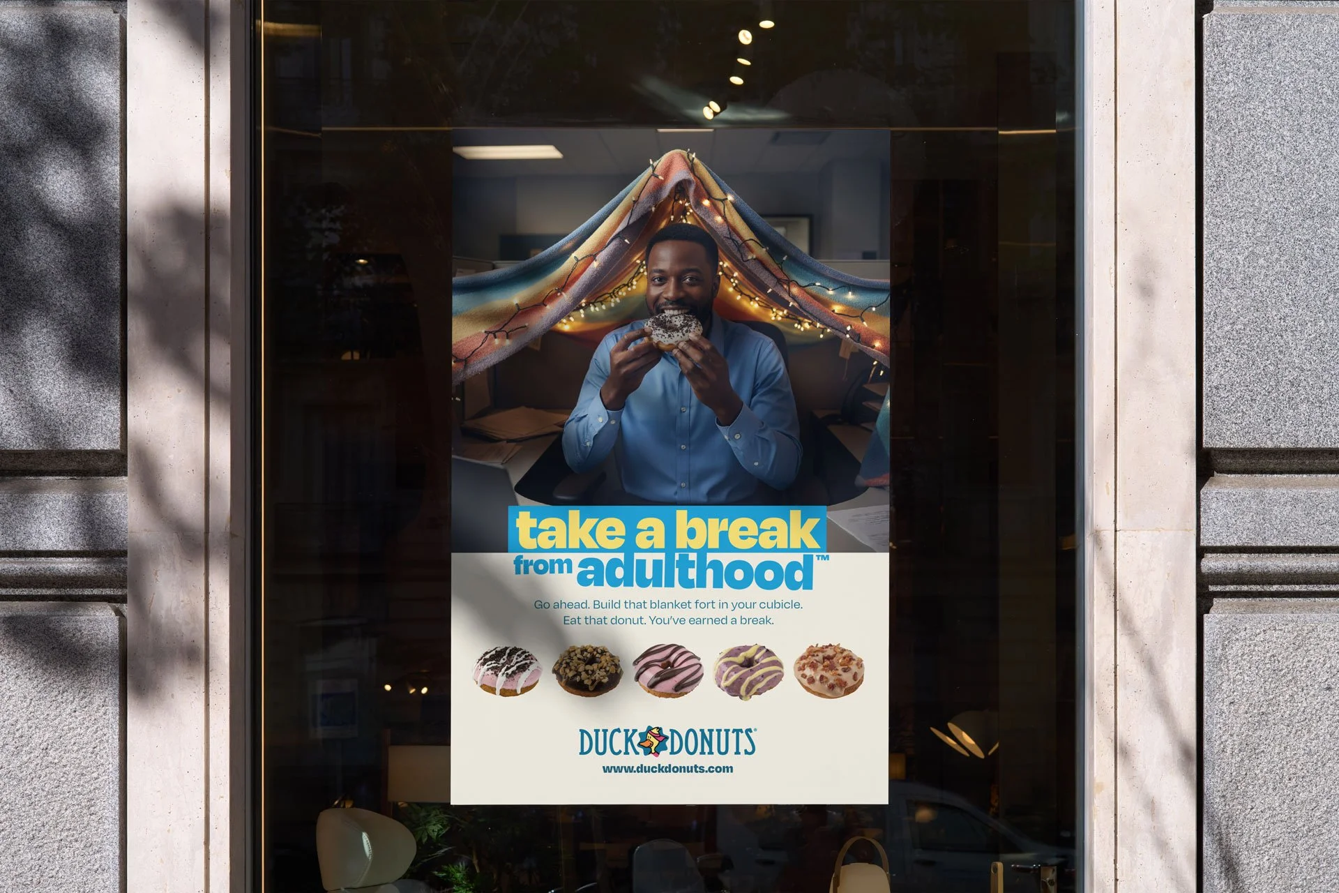
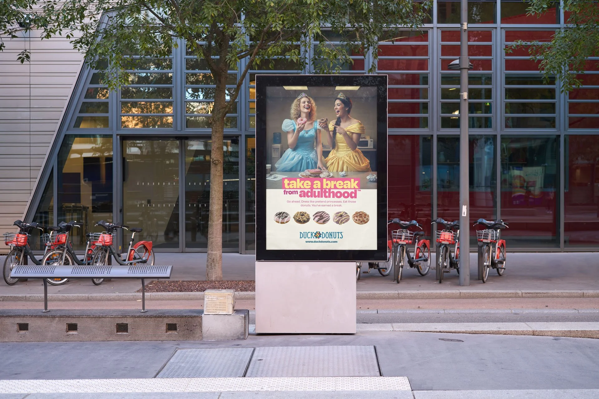
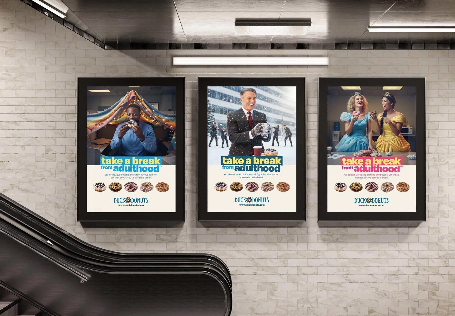
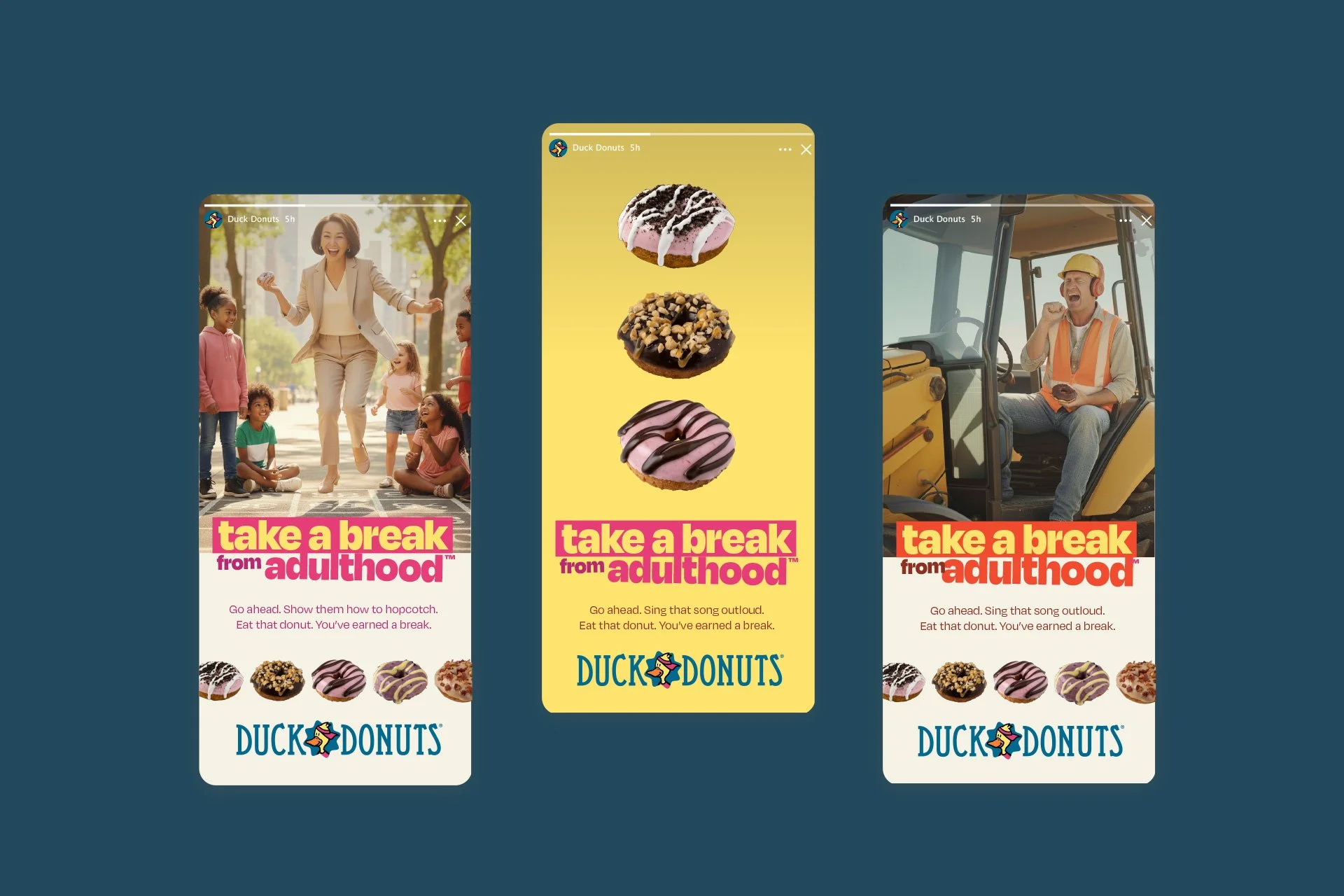
The centerpiece of the brand evolution was a campaign built around the tagline "Take a Break from Adulthood™" that explicitly gave Super Jens permission to embrace joy. In a culture saturated with wellness messaging, productivity hacks, and constant optimization, adults—especially parents—rarely receive permission to simply be playful. This campaign positions Duck Donuts as the judgment-free zone for small indulgences and childlike wonder. Supporting messages reinforce this permission-giving stance with lines like "Go ahead. Build that blanket fort in your cubicle. Eat that donut. You've earned a break," "Dress like pretend princesses. Eat those donuts. You've earned a break," and "Have that snowball fight. Eat that donut. You've earned a break." A secondary slogan, "Duck in for Delicious™," serves as a softer, product-focused call-to-action for tactical marketing.
The photography style features adults unabashedly engaging in childlike activities like building blanket forts in office cubicles, wearing princess or costume dresses, playing in snow while in business attire, and having tea parties with stuffed animals. The tone is joyful, liberating, and permission-giving rather than embarrassed or ironic, with bright energetic lighting, the vibrant color palette from the brand system, a mix of tight portraits and environmental shots, and genuine expressions of delight and laughter. Art direction employs headline treatments using angled, multi-line typography, highlight boxes in complementary brand colors, donut product placement integrated naturally, Ollie appearing contextually rather than forced into every execution, and abundant negative space to prevent a cluttered feeling.
Campaign applications span out-of-home advertising in transit shelter posters in suburban markets, mall advertising near family-oriented retailers, and billboard placements near Duck Donuts locations; in-store materials including window clings with campaign imagery and seasonal offers, interior posters showcasing the full campaign concept, counter cards with "Take a Break from Adulthood" messaging, and donut description cards using playful language; digital and social executions with Instagram carousel posts showing different "breaks from adulthood," Facebook ads targeting parents 28-45, Stories encouraging user-generated content asking "How are you taking a break today?", and email campaigns featuring campaign visuals and promotional offers; plus print materials in local parenting magazine partnerships, direct mail to neighborhoods within a 5-mile radius of locations, and school fundraising program materials. Sample executions included a blanket fort scene featuring a man in business casual building a blanket fort over his cubicle desk with fairy lights and a genuine smile, a princess dress execution with two women in full princess or prom dresses laughing while eating donuts, and a winter businessman scene showing a man in a suit having a snowball fight mid-throw with a joyful expression. The campaign was designed to move awareness through increased brand recall, social media engagement, and user-generated content; consideration through website traffic, mobile app downloads, and store locator searches; conversion through first-time visits, increased transaction size, and email list growth; and loyalty through repeat visit frequency, rewards program enrollment, and social media following growth.
Project Recap
The visual and verbal improvements succeeded because they emerged from solid strategic foundations—understanding Super Jens, defining a clear archetype, and articulating a meaningful purpose. In an age of restriction and optimization, explicitly giving permission for guilt-free enjoyment proved a powerful differentiator, as "Take a Break from Adulthood" tapped into a genuine unmet need in the target audience. Rather than rigid rules, we built flexible systems including color collections, graphic elements, and vocabulary guidelines that empower franchisees and marketers to create on-brand content without constant oversight, while Ollie remained central to the brand but was refined for better performance, keeping the playful spirit intact while becoming more sophisticated and strategically deployed.
Every element—from logo to packaging to advertising to verbal guidelines—reinforces the same strategic positioning, creating a cohesive brand experience that builds recognition and emotional connection. This comprehensive brand evolution transformed Duck Donuts from a regional concept with charm into a strategically positioned brand with national potential, one that deeply understands its audience and gives them exactly what they need: permission to enjoy moments of pure joy.

“Bullhearted captured the soul of this brand where others couldn’t. They brought clarity and a design direction ready to fuel our growth.”