

Brand Evolution for Mac Shack
Born from a food truck and rooted in the unapologetically indulgent tastes of college life, MacShack was serving up gooey macs and crispy chicken nuggies to the students of Florida State University from inside the 1851 Food Hall. But even comfort food can lose its sizzle. Despite a promising start, the brand was beginning to slip—momentum waning, menu bloated, and the overall vibe lacking the cohesion and swagger needed to stand out in a competitive campus environment. That’s where Bullhearted came in.
2022
Year
Client
Cruz Hospitality
QSR - Quick Serve Restaurant, Food Hall
Client Type
Tallahassee, FL
Location(s)
Brand Brief, Visual Identity Design, Menu Engineering & Design, Packaging Design, Marketing Promotions Design, Uniform Design
Services

Preexisting Identity

Shifting the brand Strategy
MacShack’s food had promise, but its brand presentation didn’t. The visual identity felt mismatched and low-effort, with no clear personality or consistency across touchpoints. The menu was overstuffed, making it difficult for students to know what to go for. It lacked a system—both operationally and emotionally. The brand needed sharper focus, better cohesion, and a more compelling reason to crave, swipe, and come back for more.
Retro
Whimsical
Comforting


Restaurant visual identity design
We began with a strategic overhaul—realigning MacShack’s positioning to fully own its lane as Tallahassee’s go-to for playful, indulgent, late-night-style comfort food. From there, we evolved the visual identity to match: bolder colors, tighter typography, and an unapologetic tone of voice. The result? A more cohesive and craveable presence that students could recognize and rally around.
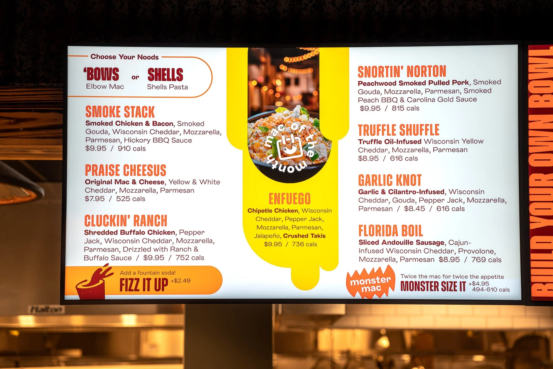


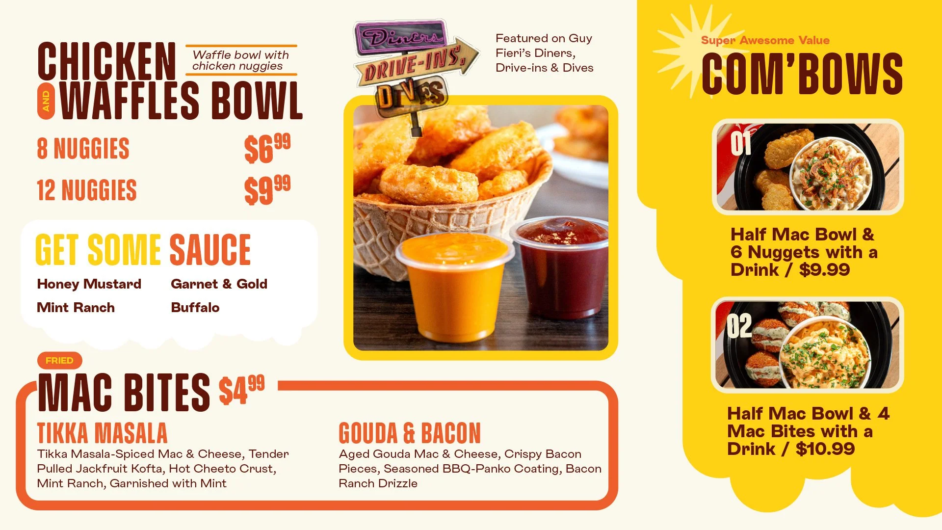
Restaurant MENU Design
The menu was reworked from the inside out. We performed a deep dive into performance metrics to identify what sold, what stalled, and what really hit home in terms of food cost and operational ease. From there, we trimmed the fat and focused the offering.


Restaurant MENU innovation
Then came the real fun—menu innovation. We introduced crave-worthy Crumbles—toppings like Taki Dust, Crushed Doritos, and Flaming Hot Cheetos—that not only added visual punch but also drove sales and repeat orders. We also developed the Monster Mac concept: double the portion, double the price tag, double the delight. Both initiatives became high-ROI drivers.
College food trends shift as fast as class schedules, so we’ve remained an active partner in ongoing semester-to-semester menu engineering. Every new academic term brings fresh data, and we adjust the menu accordingly—keeping performance sharp, items exciting, and the MacShack faithful well-fed.


Restaurant marketing poster Design
We supported the team with creative and campaign development for their summer Swipe-a-thon initiative—encouraging students to burn through their meal plan dollars on MacShack’s best bites. We developed engaging visual touchpoints that made using your card feel like winning the lottery.
When Spuddy’s, their loaded baked potato line extension, was ready for launch, we provided go-to-market strategy and visuals to make sure it hit hard and fast.


Restaurant apparel/uniform Design
We brought the brand’s playful personality into what the team wears, anchoring the uniform design around the phrase “Throwin’ Bows”—a cheeky nod to elbow macaroni and a campus culture that appreciates a bit of swagger. This simple yet punchy line became the cornerstone of employee sweatshirts, giving the crew an identity that felt on-brand and proudly reppin’ the shack. It turned team members into walking, talking extensions of the MacShack energy.


Restaurant packaging Design
When it came to packaging, we leaned all the way in. We tagged MacShack’s to-go materials with the bold and brilliant phrase “Hottest Noods on Campus,” offering a tongue-in-cheek wink to both the comfort food they serve and the student audience they know so well. It’s playful, memorable, and entirely on-brand with the patron profile: a crowd that loves indulgence with a side of innuendo. It also served as a brilliant photo-op moment—cue the selfies, the stories, and the social shareability.
Project Recap
The combination of smart menu engineering, bold innovation, and an unapologetically tight brand identity sparked measurable traction for MacShack. The introduction of high-margin hits like Crumbles and Monster Mac drove a clear uplift in both average ticket size and repeat orders. Semester-over-semester adjustments kept performance sharp and offerings relevant—turning the menu into a living, profit-generating tool.
At the same time, the evolved visual identity and cohesive tone gave MacShack a professional edge it previously lacked. What once felt like a scrappy food truck brand now looked like a campus-ready franchise. That polish didn’t just attract more student attention—it made the brand more palatable to potential partners and new campus locations. In short: we helped MacShack grow from a fun indulgence to a serious player in the campus dining game.


“Our new look feels completely ownable and livable by this company. It captured the creamy vibes of this concept and positioned us for growth on other campuses.”